什么是视口?
浏览器的视口是网页的内容对用户可见的区域。视口的大小不同,它随着网站可见设备的屏幕大小的变化而变化。对于笔记本电脑,与智能手机或平板电脑相比,视口的尺寸更大。
例子:
笔记本电脑屏幕更宽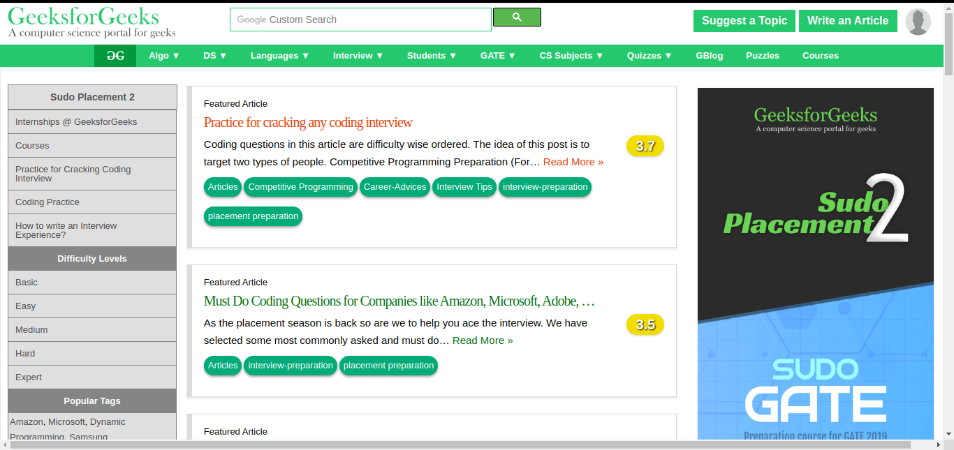
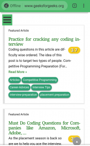
在智能手机上由于屏幕较窄而调整页面
注意:当页面对较小的视口没有响应时,它在较小的屏幕上看起来很糟糕甚至会中断。为了解决这个问题,引入了一个响应式标签来控制视口。此标签最初由 Apple Inc. 为 Safari iOS 引入。
句法:
这是各种移动优化网站中常用的视口设置。 width 属性控制视口的大小。可以根据 CSS 像素将其设置为特定值(“width=600”)。这里它被设置为一个特殊值(“width= device-width”),它是设备的宽度,以 CSS 像素为单位,比例为 100%。第一次加载页面时,initial-scale 属性控制缩放级别。
注意:在 HTML 文档的 head 标签中需要添加 meta 标签。
响应式标签具有以下属性:
- width : 设备虚拟视口的宽度。
- height : 设备虚拟视口的高度。
- initial-scale :第一次访问页面时的缩放级别。
- minimum-scale :用户可以将页面缩放到的最小缩放级别。
- maximum-scale :用户可以缩放页面的最大缩放级别。
- user-scalable :允许设备放大或缩小的标志。(值=是/否)。
例子:
GeeksforGeeks
GeeksforGeeks
A computer science portal for geeks
Prepare for the Recruitment drive of product based companies like
Microsoft, Amazon, Adobe etc with a free online placement preparation
course. The course focuses on various MCQ's & Coding question likely
to be asked in the interviews & make your upcoming placement season
efficient and successful.
An extensive Online Test Series for GATE 2019 to boost the
preparation for GATE 2019 aspirants. Test series is designed
considering the pattern of previous years GATE papers and ensures
to resemble with the standard of GATE. This Test Series will help
the aspirants track and improve the preparation through questions
of various difficulty levels. There will be two Test Series
covering the whole syllabus of GATE, including Mathematics and
Aptitude. Test Series I will cover the basic and medium difficulty,
whereas in Test Series II difficulty will be slightly higher.
输出:
宽屏输出: 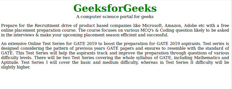
窄屏输出: