使用 ReactJS 的电影 Web 应用程序
本文介绍了如何使用React制作一个完全响应且时尚的电影应用程序。 React 是Facebook提供的 J avaScript 框架,用于构建功能齐全的 Web 应用程序。
我们将按照以下步骤创建我们的应用程序:
第 1 步:创建项目:我们将首先使用 create-react-app 工具创建一个新的 React 项目。您可以使用以下命令创建具有所需名称的命令。请确保系统上安装了 Node 和 npm。
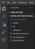
npx create-react-app movie-app项目结构:然后我们将删除所有不需要的文件。删除文件后的文件结构如下:
第 2 步:打开“src”文件夹并选择App.js文件并将以下代码添加到其中。
App.js
import React, { useState } from "react";
import axios from "axios";
import Search from "./components/Search";
import Results from "./components/Results";
import Detail from "./components/Detail";
import "./App.css";
function App() {
const [state, setState] = useState({
s: "sherlock",
results: [],
selected: {},
});
const apiurl = "https://www.omdbapi.com/?apikey=a2526df0";
const searchInput = (e) => {
let s = e.target.value;
setState((prevState) => {
return { ...prevState, s: s };
});
};
const search = (e) => {
if (e.key === "Enter") {
axios(apiurl + "&s=" + state.s).then(({ data }) => {
let results = data.Search;
console.log(results);
setState((prevState) => {
return { ...prevState, results: results };
});
});
}
};
const openDetail = (id) => {
axios(apiurl + "&i=" + id).then(({ data }) => {
let result = data;
setState((prevState) => {
return { ...prevState, selected: result };
});
});
};
const closeDetail = () => {
setState((prevState) => {
return { ...prevState, selected: {} };
});
};
return (
Movie Mania
);
}
export default App;App.css
* {
  margin: 0;
  padding: 0;
  box-sizing: border-box;
}

body {
  font-family: "montserrat", sans-serif;
  background: linear-gradient(to right, #000428, #004e92);
}

header {
  width: 100%;
  padding-top: 2rem;
  padding-bottom: 1rem;
}

header h1 {
  color: #ffffff;
  font-size: 4rem;
  font-weight: 700;
  text-align: center;
}

main {
  width: 100%;
  max-width: 90%;
  margin: 0 auto;
}

.results {
  display: flex;
  flex-wrap: wrap;
  justify-content: center;
  align-items: center;
  /* margin: 0 -15px; */
}

.results .result {
  width: 20%;
  min-width: 250px;
  background: #000000;
  max-height: 500px;
  /* padding: 15px; */
  margin: 20px 25px;
  display: flex;
  flex-direction: column;
  cursor: pointer;
}

.results .not-found {
  display: flex;
  flex-direction: column;
  justify-content: center;
  align-items: center;
  text-align: center;
  margin: 2rem 0.5rem;
}

.results .not-found h2 {
  color: #ffffff;
}

.results .result img {
  /* display: block; */
  width: 100%;
  padding: 10px 2px;
  margin: 0 auto;
  height: 350px;
  width: 230px;
}

.results .result h3 {
  color: #fff;
  font-size: 20px;
  font-weight: 600;
  width: 100%;
  text-align: center;
  padding: 1rem;
  background: #272829;
  flex: 1 100%;
  transition: 0.4s ease-out;
}

.result:hover {
  box-shadow: 0 0 8px 3px #eaf0f7;
  /* background: #dfd8d8; */
}

.results .result h3:hover {
  background: #fff;
  color: #223343;
  box-shadow: 0 0 8px 3px #4484c4;
}

.detail {
  margin: 3rem 5rem;
  overflow-y: scroll;
}

.detail .content .rating {
  margin-left: 2rem;
  font-size: 1.5rem;
  margin-bottom: 0;
  margin-top: 1rem;
  padding-bottom: 0;
}

.detail .content {
  display: block;
  width: 100%;
  height: 100%;
  position: fixed;
  top: 0;
  left: 0;
  max-width: 15000px;
  /* max-height: 600px; */
  padding: 25px;
  background: #000000;
  color: #fff;
  overflow-y: scroll;
}

.detail .content h2 {
  font-size: 3rem;
  padding: 2rem;
  padding-top: 0;
  padding-bottom: 0.5rem;
  font-weight: 600;
}

.detail .content span {
  font-size: 1.4rem;
  margin-left: 2rem;
  margin-bottom: 3rem;
  font-weight: 300;
  color: #ffffff;
}

.detail .content .rating {
  margin-bottom: 30px;
}

.detail .content .about {
  display: flex;
  flex-wrap: wrap;
  margin: 0 -15px 30px;
}

.detail .content .about img {
  flex: 1 1 50%;
  max-width: 300px;
  opacity: none;
  padding: 0 15px;
  margin-left: 2rem;
  margin-top: 1rem;
}

.detail .content .about p {
  flex: 1 50%;
  padding: 15px 25px;
  margin-top: 3rem;
  font-size: 1.5rem;
}

.detail .content .close {
  /* display: inline-block; */
  padding: 15px 30px;
  font-size: 18px;
  /* margin-top: 3rem;
  margin-right: 2rem;
  margin-bottom: 1rem; */
  font-weight: 700;
  background: #223343;
  color: #fff;
  /* border-radius: 8px; */
  border: none;
  outline: none;
  appearance: none;
  cursor: pointer;
  transition: 0.4s ease-out;

  width: 100%;
  display: flex;
  margin: auto;
  margin-top: 5rem;
  justify-content: center;
  align-items: center;
  border-radius: 5px;
}

.detail .content button:hover {
  background: #4484c4;
}

.detail .content .about .close:hover {
  background: #223343;
}

@media screen and (max-width: 1015px) {
  .results {
    justify-content: center;
    align-items: center;
  }

  .detail .content .close {
    width: 100%;
    display: flex;
    margin: auto;
    justify-content: center;
    align-items: center;
    border-radius: 5px;
  }
}

@media screen and (max-width: 683px) {
  .results {
    justify-content: center;
    align-items: center;
  }

  .results .result {
    margin: 10px;
    justify-content: center;
    align-items: center;
  }
}

@media screen and (max-width: 643px) {
  .results .result {
    margin: 15px;
  }
}

@media screen and (max-width: 638px) {
  .results .result {
    margin: 8px;
  }
}

@media screen and (max-width: 410px) {
  header h1 {
    font-size: 2.9rem;
  }

  .results {
    display: flex;
    flex-direction: column;
    justify-content: center;
    align-items: center;
  }

  .detail {
    overflow-y: scroll;
  }

  .detail .content .close {
    width: 100%;
    display: flex;
    margin: auto;
    justify-content: center;
    align-items: center;
    border-radius: 5px;
  }

  .detail .content span {
    margin-left: 0.5rem;
    font-style: italic;
    font-weight: bold;
  }

  .detail .content h2 {
    padding-left: 0.5rem;
    font-size: 2.1rem;
    margin-bottom: 0.5rem;
    font-weight: 100;
  }

  .detail .content .rating {
    margin-left: 0.5rem;
    font-weight: bold;
  }

  .detail .content .about img {
    margin-left: 0.5rem;
  }
}
Detail.js
import React from "react";
function Detail({ selected, closeDetail }) {
return (
{selected.Title}
{selected.Year}
Rating: {selected.imdbRating}

{selected.Plot}
);
}
export default Detail;Result.js
import React from "react";

function Result({ result, openDetail }) {
  return (
     openDetail(result.imdbID)}>

      {result.Title}

  );
}

export default Result;
Results.js
import React from "react";
import Result from "./Result";
function Results({ results, openDetail }) {
return (
{typeof results != "undefined" ? (
results.map((result) => (
Sorry.. Movie not found in the database.
Try checking the name you input
or search for another movie.
)}
);
}
export default Results;Search.js
import React from "react";
import "./Search.css";

function Search({ searchInput, search }) {
  return (


  );
}

export default Search;
Search.css
.search-bar {
  display: flex;
  justify-content: center;
  align-items: center;
  margin: 1rem 0;
}

.search {
  width: 60%;
  display: block;
  padding: 15px;
  border: none;
  outline: none;
  background: none;
  background-color: #fff;
  border-radius: 8px;
  color: dimgrey;
  font-size: 20px;
  font-weight: 300;
  transition: 0.4s ease-out;
}

.search:focus {
  box-shadow: 0 0 8px 3px #4484c4;
}

@media screen and (max-width: 685px) {
  .search {
    width: 75%;
  }
}

@media screen and (max-width: 410px) {
  .search {
    width: 85%;
  }
}
应用程序.css
* {
  margin: 0;
  padding: 0;
  box-sizing: border-box;
}

body {
  font-family: "montserrat", sans-serif;
  background: linear-gradient(to right, #000428, #004e92);
}

header {
  width: 100%;
  padding-top: 2rem;
  padding-bottom: 1rem;
}

header h1 {
  color: #ffffff;
  font-size: 4rem;
  font-weight: 700;
  text-align: center;
}

main {
  width: 100%;
  max-width: 90%;
  margin: 0 auto;
}

.results {
  display: flex;
  flex-wrap: wrap;
  justify-content: center;
  align-items: center;
  /* margin: 0 -15px; */
}

.results .result {
  width: 20%;
  min-width: 250px;
  background: #000000;
  max-height: 500px;
  /* padding: 15px; */
  margin: 20px 25px;
  display: flex;
  flex-direction: column;
  cursor: pointer;
}

.results .not-found {
  display: flex;
  flex-direction: column;
  justify-content: center;
  align-items: center;
  text-align: center;
  margin: 2rem 0.5rem;
}

.results .not-found h2 {
  color: #ffffff;
}

.results .result img {
  /* display: block; */
  width: 100%;
  padding: 10px 2px;
  margin: 0 auto;
  height: 350px;
  width: 230px;
}

.results .result h3 {
  color: #fff;
  font-size: 20px;
  font-weight: 600;
  width: 100%;
  text-align: center;
  padding: 1rem;
  background: #272829;
  flex: 1 100%;
  transition: 0.4s ease-out;
}

.result:hover {
  box-shadow: 0 0 8px 3px #eaf0f7;
  /* background: #dfd8d8; */
}

.results .result h3:hover {
  background: #fff;
  color: #223343;
  box-shadow: 0 0 8px 3px #4484c4;
}

.detail {
  margin: 3rem 5rem;
  overflow-y: scroll;
}

.detail .content .rating {
  margin-left: 2rem;
  font-size: 1.5rem;
  margin-bottom: 0;
  margin-top: 1rem;
  padding-bottom: 0;
}

.detail .content {
  display: block;
  width: 100%;
  height: 100%;
  position: fixed;
  top: 0;
  left: 0;
  max-width: 15000px;
  /* max-height: 600px; */
  padding: 25px;
  background: #000000;
  color: #fff;
  overflow-y: scroll;
}

.detail .content h2 {
  font-size: 3rem;
  padding: 2rem;
  padding-top: 0;
  padding-bottom: 0.5rem;
  font-weight: 600;
}

.detail .content span {
  font-size: 1.4rem;
  margin-left: 2rem;
  margin-bottom: 3rem;
  font-weight: 300;
  color: #ffffff;
}

.detail .content .rating {
  margin-bottom: 30px;
}

.detail .content .about {
  display: flex;
  flex-wrap: wrap;
  margin: 0 -15px 30px;
}

.detail .content .about img {
  flex: 1 1 50%;
  max-width: 300px;
  opacity: none;
  padding: 0 15px;
  margin-left: 2rem;
  margin-top: 1rem;
}

.detail .content .about p {
  flex: 1 50%;
  padding: 15px 25px;
  margin-top: 3rem;
  font-size: 1.5rem;
}

.detail .content .close {
  /* display: inline-block; */
  padding: 15px 30px;
  font-size: 18px;
  /* margin-top: 3rem;
  margin-right: 2rem;
  margin-bottom: 1rem; */
  font-weight: 700;
  background: #223343;
  color: #fff;
  /* border-radius: 8px; */
  border: none;
  outline: none;
  appearance: none;
  cursor: pointer;
  transition: 0.4s ease-out;

  width: 100%;
  display: flex;
  margin: auto;
  margin-top: 5rem;
  justify-content: center;
  align-items: center;
  border-radius: 5px;
}

.detail .content button:hover {
  background: #4484c4;
}

.detail .content .about .close:hover {
  background: #223343;
}

@media screen and (max-width: 1015px) {
  .results {
    justify-content: center;
    align-items: center;
  }

  .detail .content .close {
    width: 100%;
    display: flex;
    margin: auto;
    justify-content: center;
    align-items: center;
    border-radius: 5px;
  }
}

@media screen and (max-width: 683px) {
  .results {
    justify-content: center;
    align-items: center;
  }

  .results .result {
    margin: 10px;
    justify-content: center;
    align-items: center;
  }
}

@media screen and (max-width: 643px) {
  .results .result {
    margin: 15px;
  }
}

@media screen and (max-width: 638px) {
  .results .result {
    margin: 8px;
  }
}

@media screen and (max-width: 410px) {
  header h1 {
    font-size: 2.9rem;
  }

  .results {
    display: flex;
    flex-direction: column;
    justify-content: center;
    align-items: center;
  }

  .detail {
    overflow-y: scroll;
  }

  .detail .content .close {
    width: 100%;
    display: flex;
    margin: auto;
    justify-content: center;
    align-items: center;
    border-radius: 5px;
  }

  .detail .content span {
    margin-left: 0.5rem;
    font-style: italic;
    font-weight: bold;
  }

  .detail .content h2 {
    padding-left: 0.5rem;
    font-size: 2.1rem;
    margin-bottom: 0.5rem;
    font-weight: 100;
  }

  .detail .content .rating {
    margin-left: 0.5rem;
    font-weight: bold;
  }

  .detail .content .about img {
    margin-left: 0.5rem;
  }
}
第 3 步:在src文件夹中创建一个名为Components的新文件夹。在 src 文件夹中,制作文件 - Detail.js 、 Result.js 、 Results.js 、 Search.js 、 和Search.css
第 4 步:现在在相应的文件中添加以下代码。
细节.js
import React from "react";
function Detail({ selected, closeDetail }) {
return (
{selected.Title}
{selected.Year}
Rating: {selected.imdbRating}
{selected.Plot}
);
}
export default Detail;
结果.js
import React from "react";

function Result({ result, openDetail }) {
  return (
     openDetail(result.imdbID)}>

      {result.Title}

  );
}

export default Result;
结果.js
import React from "react";
import Result from "./Result";
function Results({ results, openDetail }) {
return (
{typeof results != "undefined" ? (
results.map((result) => (
Sorry.. Movie not found in the database.
Try checking the name you input
or search for another movie.
)}
);
}
export default Results;
搜索.js
import React from "react";
import "./Search.css";

function Search({ searchInput, search }) {
  return (


  );
}

export default Search;
搜索.css
.search-bar {
  display: flex;
  justify-content: center;
  align-items: center;
  margin: 1rem 0;
}

.search {
  width: 60%;
  display: block;
  padding: 15px;
  border: none;
  outline: none;
  background: none;
  background-color: #fff;
  border-radius: 8px;
  color: dimgrey;
  font-size: 20px;
  font-weight: 300;
  transition: 0.4s ease-out;
}

.search:focus {
  box-shadow: 0 0 8px 3px #4484c4;
}

@media screen and (max-width: 685px) {
  .search {
    width: 75%;
  }
}

@media screen and (max-width: 410px) {
  .search {
    width: 85%;
  }
}
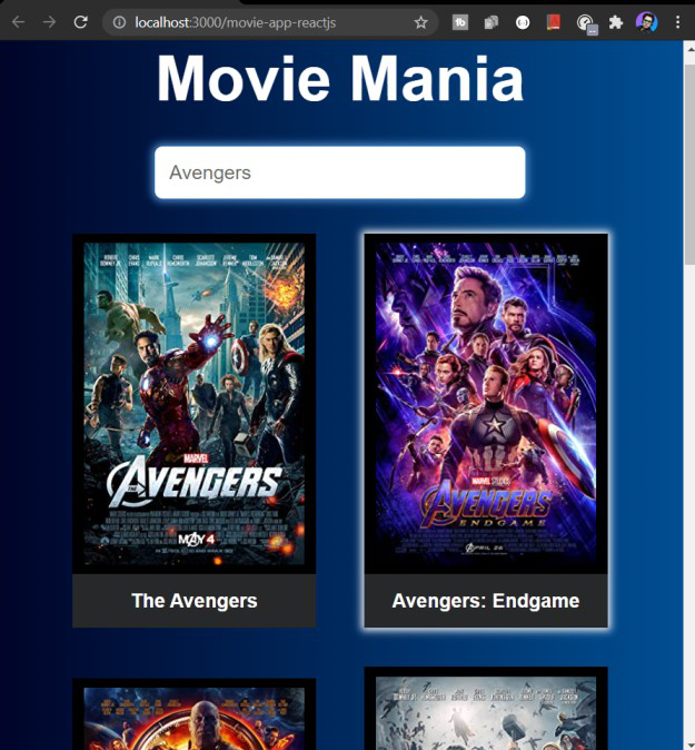
第 5 步:运行和构建应用程序:我们可以使用以下命令运行此应用程序。这将启动 React 的开发服务器,可用于调试我们的应用程序。
npm run start输出:您将在浏览器屏幕上看到以下输出。