一个网站可以分为不同的部分,包括页眉、菜单、内容和页脚,基于这些部分,开发人员可以使用许多不同的布局设计。可以使用 div 标签创建不同的布局,并使用 CSS 属性对其进行样式设置。
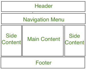
最常见的网站布局结构如下: 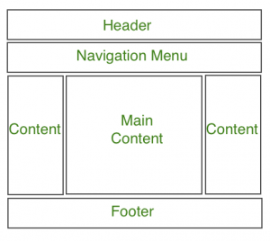
注意:标题部分包含网站徽标、搜索栏和用户个人资料。导航菜单包含指向可用文章的各种类别的链接,内容部分分为 3 个部分(列),左侧和右侧边栏包含指向其他文章和广告的链接,而主要内容部分是包含这篇文章的部分,然后在底部有一个页脚部分,其中包含地址、链接、联系人等。
标题部分:标题部分通常位于网站顶部或顶部导航菜单下方。它通常由网站名称或网站标志组成。
例子:
Website Layouts
GeeksforGeeks
Remaining Section
输出: 
导航菜单:导航栏/菜单基本上是一个链接列表,允许访问者轻松浏览网站。
例子:
Website Layout
GeeksforGeeks
Remaining Section
输出: 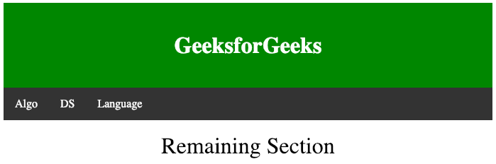
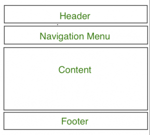
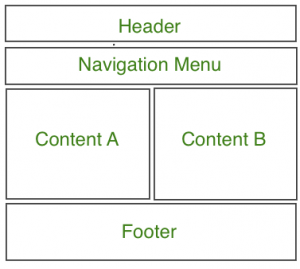
内容部分:内容部分是网站的主体。用户可以在 n 列布局中划分内容部分。
最常见的布局是:
- 1-Column Layout:主要用于移动布局。
- 2 列布局:此网站布局主要用于平板电脑或笔记本电脑。
- 三栏布局:此网站布局主要用于桌面。
用户还可以创建响应式布局,其中布局将根据屏幕大小进行更改。考虑下面的例子,如果屏幕宽度大于 600px 则有 3 列布局,如果屏幕宽度在 400px 到 600px 之间则有 2 列布局,如果屏幕尺寸小于 400px 则 1 列布局将显示。
例子:
Website Layout
GeeksforGeeks
Column A
Prepare for the Recruitment drive of product
based companies like Microsoft, Amazon, Adobe
etc with a free online placement preparation
course. The course focuses on various MCQ's
& Coding question likely to be asked in the
interviews & make your upcoming placement
season efficient and successful.
Column B
Prepare for the Recruitment drive of product
based companies like Microsoft, Amazon, Adobe
etc with a free online placement preparation
course. The course focuses on various MCQ's
& Coding question likely to be asked in the
interviews & make your upcoming placement
season efficient and successful.
Column C
Prepare for the Recruitment drive of product
based companies like Microsoft, Amazon, Adobe
etc with a free online placement preparation
course. The course focuses on various MCQ's
& Coding question likely to be asked in the
interviews & make your upcoming placement
season efficient and successful.
输出:
屏幕尺寸大于 700px 的宽度: 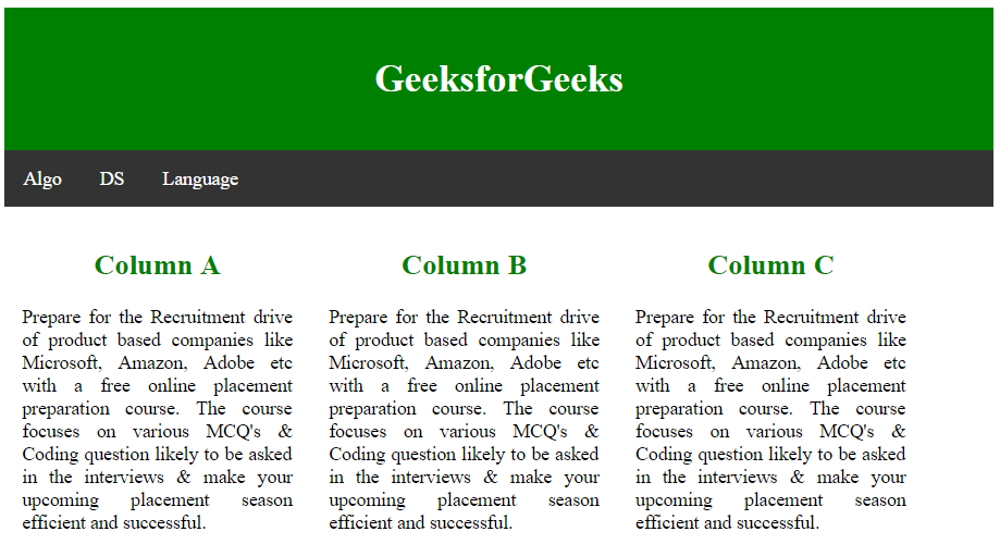
屏幕尺寸大于 400px 小于 600px 的宽度: 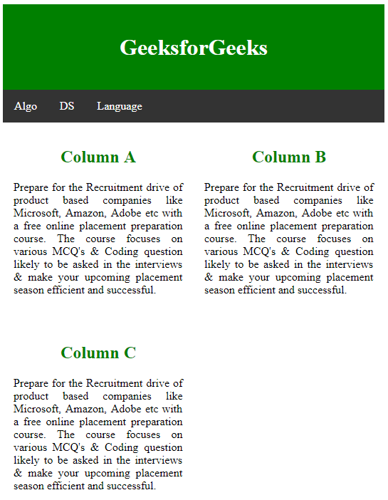
屏幕尺寸小于 400px 的宽度: 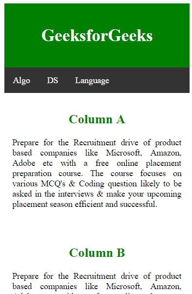
页脚部分:页脚部分位于网页底部,通常包含联系信息、版权、关于我们等信息。
例子:
CSS Website Layout
Upper section
输出: