使用 Seaborn 和 Pandas 创建时间序列图
在本文中,我们将学习如何使用 Seaborn 和 Pandas 创建时间序列图。让我们讨论一些概念:
- Pandas是一个建立在 NumPy 库之上的开源库。它是一个Python包,提供了用于处理数值数据和统计数据的各种数据结构和操作。它主要用于更轻松地导入和分析数据。 Pandas 速度快,对用户来说是高性能和高效的。
- Seaborn是一个巨大的可视化库,用于在Python中绘制统计图形。它提供了漂亮的默认样式和调色板,以形成更具吸引力的统计图。它建立在最高的 matplotlib 库之上,并且与 Pandas 的信息结构紧密集成。
- 时间图(有时称为统计图)根据时钟显示值。它们几乎就像 xy 图,但虽然 xy 图可以绘制“x”变量(例如,身高、体重、年龄)的分布,但时间图只能在 x 轴上显示时间。与饼图和条形图不同,这些图没有类别。时间图非常适合显示数据如何随时间变化。例如,如果您随机抽样数据,这种图表会很好地工作。
需要的步骤
- 导入包
- 导入/加载/创建数据。
- 使用 lineplot 绘制数据的时间序列图(因为自 2020 年 9 月以来 tsplot 已替换为 lineplot)。
例子
在这里,我们借助一些示例创建了一个粗略的数据来理解时间序列图。让我们创建数据:
Python3
# importing packages
import pandas as pd

# creating data
df = pd.DataFrame({'Date': ['2019-10-01', '2019-11-01',
                            '2019-12-01','2020-01-01',
                            '2020-02-01', '2020-03-01',
                            '2020-04-01', '2020-05-01',
                            '2020-06-01'],

                   'Col_1': [34, 43, 14, 15,
                             15, 14, 31, 25, 62],

                   'Col_2': [52, 66, 78, 15, 15,
                             5, 25, 25, 86],

                   'Col_3': [13, 73, 82, 58, 52,
                             87, 26, 5, 56],

                   'Col_4': [44, 75, 26, 15, 15,
                             14, 54, 25, 24]})

# view dataset
display(df)
Python3
# importing packages
import seaborn as sns
import pandas as pd

# creating data
df = pd.DataFrame({'Date': ['2019-10-01', '2019-11-01',
                            '2019-12-01','2020-01-01',
                            '2020-02-01', '2020-03-01',
                            '2020-04-01', '2020-05-01',
                            '2020-06-01'],

                   'Col_1': [34, 43, 14, 15, 15,
                             14, 31, 25, 62],

                   'Col_2': [52, 66, 78, 15, 15,
                             5, 25, 25, 86],

                   'Col_3': [13, 73, 82, 58, 52,
                             87, 26, 5, 56],
                   'Col_4': [44, 75, 26, 15, 15,
                             14, 54, 25, 24]})

# create the time series plot
sns.lineplot(x = "Date", y = "Col_1",
             data = df)

plt.xticks(rotation = 25)
Python3
# importing packages
import seaborn as sns
import pandas as pd

# creating data
df = pd.DataFrame({'Date': ['2019-10-01', '2019-11-01',
                            '2019-12-01','2020-01-01',
                            '2020-02-01', '2020-03-01',
                            '2020-04-01', '2020-05-01',
                            '2020-06-01'],

                   'Col_1': [34, 43, 14, 15, 15,
                             14, 31, 25, 62],

                   'Col_2': [52, 66, 78, 15, 15,
                             5, 25, 25, 86],

                   'Col_3': [13, 73, 82, 58, 52,
                             87, 26, 5, 56],
                   'Col_4': [44, 75, 26, 15, 15,
                             14, 54, 25, 24]})

# create the time series plot
sns.lineplot(x = "Date", y = "Col_1", data = df)
sns.lineplot(x = "Date", y = "Col_2", data = df)
plt.ylabel("Col_1 and Col_2")
plt.xticks(rotation = 25)
Python3
# importing packages
import seaborn as sns
import pandas as pd
import matplotlib.pyplot as plt

# creating data
df = pd.DataFrame({'Date': ['2019-10-01', '2019-11-01',
                            '2019-12-01','2020-01-01',
                            '2020-02-01', '2020-03-01',
                            '2020-04-01', '2020-05-01',
                            '2020-06-01'],

                   'Col_1': [34, 43, 14, 15, 15,
                             14, 31, 25, 62],

                   'Col_2': [52, 66, 78, 15, 15,
                             5, 25, 25, 86],

                   'Col_3': [13, 73, 82, 58, 52,
                             87, 26, 5, 56],
                   'Col_4': [44, 75, 26, 15, 15,
                             14, 54, 25, 24]})
# create the time series subplots
fig,ax =  plt.subplots( 2, 2,
                       figsize = ( 10, 8))

sns.lineplot( x = "Date", y = "Col_1",
             color = 'r', data = df,
             ax = ax[0][0])

ax[0][0].tick_params(labelrotation = 25)
sns.lineplot( x = "Date", y = "Col_2",
             color = 'g', data = df,
             ax = ax[0][1])

ax[0][1].tick_params(labelrotation = 25)
sns.lineplot(x = "Date", y = "Col_3",
             color = 'b', data = df,
             ax = ax[1][0])

ax[1][0].tick_params(labelrotation = 25)

sns.lineplot(x = "Date", y = "Col_4",
             color = 'y', data = df,
             ax = ax[1][1])

ax[1][1].tick_params(labelrotation = 25)
fig.tight_layout(pad = 1.2)
输出:

示例 1:使用 lineplot 的单列简单时间序列图
蟒蛇3
# importing packages
import seaborn as sns
import pandas as pd

# creating data
df = pd.DataFrame({'Date': ['2019-10-01', '2019-11-01',
                            '2019-12-01','2020-01-01',
                            '2020-02-01', '2020-03-01',
                            '2020-04-01', '2020-05-01',
                            '2020-06-01'],

                   'Col_1': [34, 43, 14, 15, 15,
                             14, 31, 25, 62],

                   'Col_2': [52, 66, 78, 15, 15,
                             5, 25, 25, 86],

                   'Col_3': [13, 73, 82, 58, 52,
                             87, 26, 5, 56],
                   'Col_4': [44, 75, 26, 15, 15,
                             14, 54, 25, 24]})

# create the time series plot
sns.lineplot(x = "Date", y = "Col_1",
             data = df)

plt.xticks(rotation = 25)
输出 :

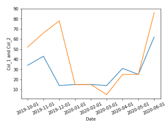
示例 2:(使用折线图绘制多列的简单时间序列图)
蟒蛇3
# importing packages
import seaborn as sns
import pandas as pd

# creating data
df = pd.DataFrame({'Date': ['2019-10-01', '2019-11-01',
                            '2019-12-01','2020-01-01',
                            '2020-02-01', '2020-03-01',
                            '2020-04-01', '2020-05-01',
                            '2020-06-01'],

                   'Col_1': [34, 43, 14, 15, 15,
                             14, 31, 25, 62],

                   'Col_2': [52, 66, 78, 15, 15,
                             5, 25, 25, 86],

                   'Col_3': [13, 73, 82, 58, 52,
                             87, 26, 5, 56],
                   'Col_4': [44, 75, 26, 15, 15,
                             14, 54, 25, 24]})

# create the time series plot
sns.lineplot(x = "Date", y = "Col_1", data = df)
sns.lineplot(x = "Date", y = "Col_2", data = df)
plt.ylabel("Col_1 and Col_2")
plt.xticks(rotation = 25)
输出 :
示例 3:具有多列的多时间序列图
蟒蛇3
# importing packages
import seaborn as sns
import pandas as pd
import matplotlib.pyplot as plt

# creating data
df = pd.DataFrame({'Date': ['2019-10-01', '2019-11-01',
                            '2019-12-01','2020-01-01',
                            '2020-02-01', '2020-03-01',
                            '2020-04-01', '2020-05-01',
                            '2020-06-01'],

                   'Col_1': [34, 43, 14, 15, 15,
                             14, 31, 25, 62],

                   'Col_2': [52, 66, 78, 15, 15,
                             5, 25, 25, 86],

                   'Col_3': [13, 73, 82, 58, 52,
                             87, 26, 5, 56],
                   'Col_4': [44, 75, 26, 15, 15,
                             14, 54, 25, 24]})
# create the time series subplots
fig,ax =  plt.subplots( 2, 2,
                       figsize = ( 10, 8))

sns.lineplot( x = "Date", y = "Col_1",
             color = 'r', data = df,
             ax = ax[0][0])

ax[0][0].tick_params(labelrotation = 25)
sns.lineplot( x = "Date", y = "Col_2",
             color = 'g', data = df,
             ax = ax[0][1])

ax[0][1].tick_params(labelrotation = 25)
sns.lineplot(x = "Date", y = "Col_3",
             color = 'b', data = df,
             ax = ax[1][0])

ax[1][0].tick_params(labelrotation = 25)

sns.lineplot(x = "Date", y = "Col_4",
             color = 'y', data = df,
             ax = ax[1][1])

ax[1][1].tick_params(labelrotation = 25)
fig.tight_layout(pad = 1.2)
输出 :
