Pandas 的时间序列图或线图
先决条件:从列表创建 Pandas DataFrame
Pandas是一个开源库,用于在Python中进行数据操作和分析。它是一个快速而强大的工具,提供数据结构和操作来操作数值表和时间序列。这些数据操作操作的示例包括合并、重塑、选择、数据清理和数据整理。该库允许从各种文件格式(如 SQL、JSON、Microsoft Excel 和逗号分隔值)导入数据。本文介绍了如何使用 pandas 库为给定的数据集生成时间序列图或线图。
线图是一种图形显示,使用多个点(通常按其 x 轴值排序,由直线段连接)直观地表示某些变量之间的相关性或数据随时间的变化。自变量在 x 轴中表示,而 y 轴表示根据 x 轴变量(也称为因变量)而变化的数据。
要使用 Pandas 生成线图,我们通常会使用要绘制的数据集创建一个 DataFrame*。然后,在 DataFrame 上调用 plot.line() 方法。
句法:
DataFrame.plot.line(x, y)
下表解释了该方法的主要参数:Parameter Value Default Value Use x Int or string DataFrame indices Set the values to be represented in the x-axis. y Int or string Remaining columns in DataFrame Set the values to be represented in the y-axis.
其他参数包括颜色(指定线条的颜色)、标题(指定绘图的标题)和种类(指定要使用的绘图类型)。此方法的“kind”参数的默认变量是“line”。因此,您不必为了创建线图而设置它。
示例 1:
该示例说明了如何使用一个 y 轴变量生成 DataFrame 的基本线图。在 Python3 中使用 pandas 绘制某人一周内卡路里摄入量的以下数据,这是我们的数据框。
代码:
Python3
import pandas as pd

# Create a list of data to be represented in x-axis
days = [ 'Saturday' , 'Sunday' , 'Monday' , 'Tuesday' ,
        'Wednesday' , 'Thursday' , 'Friday' ]

# Create a list of data to be
# represented in y-axis
calories = [ 1670 , 2011 , 1853 , 2557 ,
            1390 , 2118 , 2063 ]

# Create a dataframe using the two lists
df_days_calories = pd.DataFrame(
    { 'day' : days , 'calories' : calories })

df_days_calories
Python3
# use plot() method on the dataframe
df_days_calories.plot( 'day' , 'calories' )

# Alternatively, you can use .set_index
# to set the data of each axis as follows:
# df_days_calories.set_index('day')['calories'].plot();
Python3
import pandas as pd

# Create a list of data to
# be represented in x-axis
subjects = [ 'Math' , 'English' , 'History' ,
            'Chem' , 'Geo' , 'Physics' , 'Bio' , 'CS' ]

# Create a list of data to be
# represented in y-axis
stress = [ 9 , 3 , 5 , 1 , 8 , 5 , 10 , 2 ]

# Create second list of data
# to be represented in y-axis
grades = [ 15 , 10 , 7 , 8 , 11 , 8 , 17 , 20 ]

# Create a dataframe using the three lists
df = pd.DataFrame(list(zip( stress , grades )),
                  index = subjects ,
                  columns = [ 'Stress' , 'Grades' ])
df
Python3
# use plot() method on the dataframe.
# No parameters are passed so it uses
# variables given in the dataframe
df.plot()
Python3
import pandas as pd
import matplotlib.pyplot as plt

# Create a list of data
# to be represented in x-axis
subjects = [ 'Math' , 'English' , 'History ',
            'Chem' , 'Geo' , 'Physics' , 'Bio' , 'CS' ]

# Create a list of data
# to be represented in y-axis
stress = [ 9, 3 , 5 , 1 , 8 , 5 , 10 , 2 ]

# Create second list of data to be represented in y-axis
grades = [ 15, 10 , 7 , 8 , 11 , 8 , 17 , 20 ]

# Create a dataframe using the two lists
df_days_calories = pd.DataFrame(
    { 'Subject' : subjects ,
     'Stress': stress ,
     'Grade': grades})

ax = plt.gca()

#use plot() method on the dataframe
df_days_calories.plot( x = 'Subject' , y = 'Stress', ax = ax )
df_days_calories.plot( x = 'Subject' , y = 'Grade' , ax = ax )
Python3
import pandas as pd

#initialize the temperature value at the first day of the month
c = 30

# Create a dataframe using the three lists
# the y-axis variable is a list created using
# a for loops, in each iteration,
# it adds 1 to previous value
# the x-axis variable is a list of values ranging
# from 1 to 31 (31 not included) with a step of 1
df = pd.DataFrame([ c + x for x in range( 0 , 30 )],
                  index = [*range( 1 , 31 , 1 )],
                  columns = [ 'Temperature (C)' ])

# use plot() method on the dataframe.
# No parameters are passed so it uses
# variables given in the dataframe
df.plot(color='red', title = 'Total Coins per Day')
Python3
import pandas as pd

# Create a dataframe using three lists
df = pd.DataFrame(
    {'List1': [ 1 , 2 , 3 , 4 , 5 , 6 ],
     'List2': [ 5 , 10 , 15 , 20 , 25 , 30 ],
     'List3': [ 'a' , 'b' , 'c' , 'd' , 'e' , 'f' ]})

# use plot() method on the dataframe.
# List3 is in the x-axis and List2 in the y-axis
df.plot( 'List3' , 'List2' )
输出:

现在,绘制变量。
蟒蛇3
# use plot() method on the dataframe
df_days_calories.plot( 'day' , 'calories' )

# Alternatively, you can use .set_index
# to set the data of each axis as follows:
# df_days_calories.set_index('day')['calories'].plot();
输出:
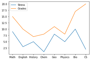
示例 2:
此示例说明如何创建 y 轴中有两个变量的线图。
一名学生被要求在期中周对每个学校科目的压力水平进行评分,评分范围为 1-10(10 是最高的)。他还被问及他在每个期中(满分 20 分)的成绩。
代码:
蟒蛇3
import pandas as pd

# Create a list of data to
# be represented in x-axis
subjects = [ 'Math' , 'English' , 'History' ,
            'Chem' , 'Geo' , 'Physics' , 'Bio' , 'CS' ]

# Create a list of data to be
# represented in y-axis
stress = [ 9 , 3 , 5 , 1 , 8 , 5 , 10 , 2 ]

# Create second list of data
# to be represented in y-axis
grades = [ 15 , 10 , 7 , 8 , 11 , 8 , 17 , 20 ]

# Create a dataframe using the three lists
df = pd.DataFrame(list(zip( stress , grades )),
                  index = subjects ,
                  columns = [ 'Stress' , 'Grades' ])
df
输出:

创建一个显示这三个变量之间关系的线图。
代码:
蟒蛇3
# use plot() method on the dataframe.
# No parameters are passed so it uses
# variables given in the dataframe
df.plot()
输出:
另一种方法是使用 matplotlib.pyplot 库中的 gca() 方法,如下所示:
蟒蛇3
import pandas as pd
import matplotlib.pyplot as plt

# Create a list of data
# to be represented in x-axis
subjects = [ 'Math' , 'English' , 'History ',
            'Chem' , 'Geo' , 'Physics' , 'Bio' , 'CS' ]

# Create a list of data
# to be represented in y-axis
stress = [ 9, 3 , 5 , 1 , 8 , 5 , 10 , 2 ]

# Create second list of data to be represented in y-axis
grades = [ 15, 10 , 7 , 8 , 11 , 8 , 17 , 20 ]

# Create a dataframe using the two lists
df_days_calories = pd.DataFrame(
    { 'Subject' : subjects ,
     'Stress': stress ,
     'Grade': grades})

ax = plt.gca()

#use plot() method on the dataframe
df_days_calories.plot( x = 'Subject' , y = 'Stress', ax = ax )
df_days_calories.plot( x = 'Subject' , y = 'Grade' , ax = ax )
输出:

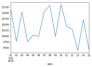
示例 3:
在这个例子中,我们将创建一个没有明确定义变量列表的图。我们还将添加标题并更改颜色。
一个硬币收藏家最初有 30 个硬币。之后,在一个月的时间里,他每天都能找到一枚硬币。用线图显示他在那个月的每一天有多少硬币。
蟒蛇3
import pandas as pd

#initialize the temperature value at the first day of the month
c = 30

# Create a dataframe using the three lists
# the y-axis variable is a list created using
# a for loops, in each iteration,
# it adds 1 to previous value
# the x-axis variable is a list of values ranging
# from 1 to 31 (31 not included) with a step of 1
df = pd.DataFrame([ c + x for x in range( 0 , 30 )],
                  index = [*range( 1 , 31 , 1 )],
                  columns = [ 'Temperature (C)' ])

# use plot() method on the dataframe.
# No parameters are passed so it uses
# variables given in the dataframe
df.plot(color='red', title = 'Total Coins per Day')
输出:

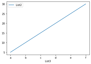
示例 4:
在此示例中,我们将绘制数据帧的特定列。数据框由三个列表组成,但是,我们将选择两个列表仅添加到绘图中。
代码:
蟒蛇3
import pandas as pd

# Create a dataframe using three lists
df = pd.DataFrame(
    {'List1': [ 1 , 2 , 3 , 4 , 5 , 6 ],
     'List2': [ 5 , 10 , 15 , 20 , 25 , 30 ],
     'List3': [ 'a' , 'b' , 'c' , 'd' , 'e' , 'f' ]})

# use plot() method on the dataframe.
# List3 is in the x-axis and List2 in the y-axis
df.plot( 'List3' , 'List2' )
输出: