- AWT事件类(1)
- AWT事件类
- AWT教程(1)
- AWT教程
- Java AWT |选择班
- Java AWT |选择班(1)
- 讨论AWT
- AWT-概述
- AWT-概述(1)
- AWT容器
- AWT容器(1)
- AWT图形类(1)
- AWT图形类
- AWT菜单类(1)
- AWT菜单类
- Java AWT教程
- Java AWT教程(1)
- AWT布局
- AWT布局(1)
- AWT环境设置(1)
- AWT环境设置
- Java AWT对话框(1)
- Java AWT对话框
- Java AWT TextArea(1)
- Java AWT TextArea
- Java AWT-滚动条(1)
- Java AWT-滚动条
- Java AWT List列表
- Java AWT List列表(1)
📅 最后修改于: 2020-11-18 07:46:41 🧑 作者: Mango
每个用户界面都考虑以下三个主要方面:
-
UI元素:这些是用户最终看到并与之交互的核心视觉元素。 GWT提供了大量从基本到复杂的广泛使用和常见元素,我们将在本教程中介绍。
-
布局:它们定义应如何在屏幕上组织UI元素,并为GUI(图形用户界面)提供最终外观。这部分将在“布局”一章中介绍。
-
行为:这些是在用户与UI元素进行交互时发生的事件。这部分将在事件处理一章中介绍。
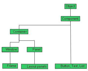
每个AWT控件都从Component类继承属性。
| Sr. No. | Control & Description |
|---|---|
| 1 |
A Component is an abstract super class for GUI controls and it represents an object with graphical representation. |
AWT UI元素:
以下是使用AWT设计GUI时常用控件的列表。
| Sr. No. | Control & Description |
|---|---|
| 1 |
A Label object is a component for placing text in a container. |
| 2 |
This class creates a labeled button. |
| 3 |
A check box is a graphical component that can be in either an on (true) or off (false) state. |
| 4 |
The CheckboxGroup class is used to group the set of checkbox. |
| 5 |
The List component presents the user with a scrolling list of text items. |
| 6 |
A TextField object is a text component that allows for the editing of a single line of text. |
| 7 |
A TextArea object is a text component that allows for the editing of a multiple lines of text. |
| 8 |
A Choice control is used to show pop up menu of choices. Selected choice is shown on the top of the menu. |
| 9 |
A Canvas control represents a rectangular area where application can draw something or can receive inputs created by user. |
| 10 |
An Image control is superclass for all image classes representing graphical images. |
| 11 |
A Scrollbar control represents a scroll bar component in order to enable user to select from range of values. |
| 12 |
A Dialog control represents a top-level window with a title and a border used to take some form of input from the user. |
| 13 |
A FileDialog control represents a dialog window from which the user can select a file. |