Python|使用 XlsxWriter 模块在 Excel 表中绘制图表套装 – 1
先决条件:在 Excel 工作表上创建和书写
XlsxWriter是一个Python库,使用它可以对 excel 文件执行多种操作,例如创建、写入、算术运算和绘图。让我们看看如何使用实时数据绘制具有不同类型数据工具的图表。
图表由至少一系列的一个或多个数据点组成。系列本身由对单元格范围的引用组成。为了在 Excel 表上绘制图表,首先,创建特定图表类型的图表对象(即折线图等)。创建图表对象后,在其中插入数据,最后,将该图表对象添加到工作表对象中。
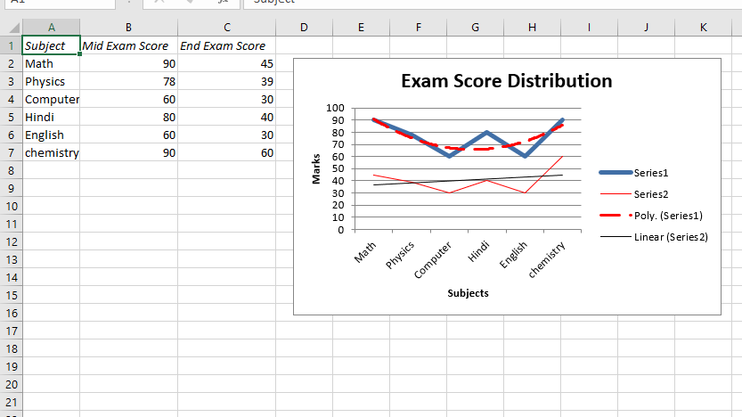
代码 #1:绘制带有趋势线的图表。
要在 Excel 工作表上绘制这种类型的图表,请使用带有图表对象的“趋势线”关键字参数的 add_series() 方法。
Python3
# import xlsxwriter module
import xlsxwriter

# Workbook() takes one, non-optional, argument
# which is the filename that we want to create.
workbook = xlsxwriter.Workbook('Example1_chart.xlsx')

# The workbook object is then used to add new
# worksheet via the add_worksheet() method.
worksheet = workbook.add_worksheet()

# Create a new Format object to formats cells
# in worksheets using add_format() method .

# here we create italic format object
italic = workbook.add_format({'italic': 1})

# Add the worksheet data that the charts will refer to.
Data1 = ['Subject', 'Mid Exam Score', 'End Exam Score']
Data2 = [
    ["Math", "Physics", "Computer", "Hindi", "English", "chemistry"],
    [90, 78, 60, 80, 60, 90],
    [45, 39, 30, 40, 30, 60]
]

# Write a row of data starting from 'A1'
# with bold format .
worksheet.write_row('A1', Data1, italic)

# Write a column of data starting from
# 'A2', 'B2', 'C2' respectively
worksheet.write_column('A2', Data2[0])
worksheet.write_column('B2', Data2[1])
worksheet.write_column('C2', Data2[2])

# set the width of B and C column
worksheet.set_column('B:C', 15)

# Create a chart object that can be added
# to a worksheet using add_chart() method.

# here we create a line chart object .
chart1 = workbook.add_chart({'type': 'line'})

# Add a data series to a chart
# using add_series method.

# Configure the first series.
# with a polynomial trendline.
# = Sheet1 !$A$1 is equivalent to ['Sheet1', 0, 0].

# note : spaces is not inserted in b / w
# = and Sheet1, Sheet1 and !
# if space is inserted it throws warning.
chart1.add_series({
    'categories': '= Sheet1 !$A$2:$A$7',
    'values':     '= Sheet1 !$B$2:$B$7',
    'trendline': {
        'type': 'polynomial',
        'order': 2,
        'line': {
            'color': 'red',
            'width': 2,
            'dash_type': 'long_dash',
        },
    },
})

# Configure the second series with
# a moving average trendline.
chart1.add_series({
    'categories': '= Sheet1 !$A$2:$A$7',
    'values':     '= Sheet1 !$C$2:$C$7',
    'trendline': {'type': 'linear'},
    'line': {
            'color': 'red',
            'width': 1,
            },
})

# Add a chart title.
chart1.set_title({'name': 'Exam Score Distribution'})

# Add x-axis label
chart1.set_x_axis({'name': 'Subjects'})

# Add y-axis label
chart1.set_y_axis({'name': 'Marks'})

# Set an Excel chart style.
chart1.set_style(11)

# add chart to the worksheet with given
# offset values at the top-left corner of
# a chart is anchored to cell D2
worksheet.insert_chart('D2', chart1,
    {'x_offset': 20, 'y_offset': 5})

# Finally, close the Excel file
# via the close() method.
workbook.close()
Python3
# import xlsxwriter module
import xlsxwriter

# Workbook() takes one, non-optional, argument
# which is the filename that we want to create.
workbook = xlsxwriter.Workbook('Example2_chart.xlsx')

# The workbook object is then used to add new
# worksheet via the add_worksheet() method.
worksheet = workbook.add_worksheet()

# Create a new Format object to formats cells
# in worksheets using add_format() method .

# here we create italic format object
italic = workbook.add_format({'italic': 1})

# Add the worksheet data that the charts will refer to.
Data1 = ['Subject', 'Mid Exam Score', 'End Exam Score']
Data2 = [
    ["Math", "Physics", "Computer", "Hindi", "English", "chemistry"],
    [90, 78, 60, 80, 60, 90],
    [45, 39, 30, 40, 30, 60]
]

# Write a row of data starting from 'A1'
# with bold format .
worksheet.write_row('A1', Data1, italic)

# Write a column of data starting from
# 'A2', 'B2', 'C2' respectively
worksheet.write_column('A2', Data2[0])
worksheet.write_column('B2', Data2[1])
worksheet.write_column('C2', Data2[2])

# set the width of B and C column
worksheet.set_column('B:C', 15)

# Create a chart object that can be added
# to a worksheet using add_chart() method.

# here we create a line chart object .
chart2 = workbook.add_chart({'type': 'line'})

# Add a data series to a chart
# using add_series method.

# Configure the first series.
# with a data label and marker.
# = Sheet1 !$A$1 is equivalent to ['Sheet1', 0, 0].

# note : spaces is not inserted in b / w
# = and Sheet1, Sheet1 and !
# if space is inserted it throws warning.
chart2.add_series({
    'categories': '= Sheet1 !$A$2:$A$7',
    'values':     '= Sheet1 !$B$2:$B$7',
    'data_labels': {'value': 1},
    'marker': {'type': 'automatic'},
})

# Configure the second series with
# a moving average trendline.
chart2.add_series({
    'categories': '= Sheet1 !$A$2:$A$7',
    'values':     '= Sheet1 !$C$2:$C$7',
})

# Add a chart title.
chart2.set_title({'name': 'Exam Score Distribution'})

# Add x-axis label
chart2.set_x_axis({'name': 'Subjects'})

# Add y-axis label
chart2.set_y_axis({'name': 'Marks'})

# Set an Excel chart style.
chart2.set_style(11)

# add chart to the worksheet with given
# offset values at the top-left corner of
# a chart is anchored to cell D2
worksheet.insert_chart('D2', chart2,
     {'x_offset': 25, 'y_offset': 10})

# Finally, close the Excel file
# via the close() method.
workbook.close()
Python3
# import xlsxwriter module
import xlsxwriter

# Workbook() takes one, non-optional, argument
# which is the filename that we want to create.
workbook = xlsxwriter.Workbook('Example3_chart.xlsx')

# The workbook object is then used to add new
# worksheet via the add_worksheet() method.
worksheet = workbook.add_worksheet()

# Create a new Format object to formats cells
# in worksheets using add_format() method .

# here we create italic format object
italic = workbook.add_format({'italic': 1})

# Add the worksheet data that the charts will refer to.
Data1 = ['Subject', 'Mid Exam Score', 'End Exam Score']
Data2 = [
    ["Math", "Physics", "Computer", "Hindi", "English", "chemistry"],
    [95, 78, 80, 80, 60, 90],
    [90, 50, 95, 60, 85, 99]
]


# Write a row of data starting from 'A1'
# with bold format .
worksheet.write_row('A1', Data1, italic)

# Write a column of data starting from
# 'A2', 'B2', 'C2' respectively
worksheet.write_column('A2', Data2[0])
worksheet.write_column('B2', Data2[1])
worksheet.write_column('C2', Data2[2])

# set the width of B and C column
worksheet.set_column('B:C', 15)

# Create a chart object that can be added
# to a worksheet using add_chart() method.

# here we create a line chart object .
chart3 = workbook.add_chart({'type': 'line'})

# Add a data series to a chart
# using add_series method.

# Configure the first series.
# with a error bars .
# = Sheet1 !$A$1 is equivalent to ['Sheet1', 0, 0].

# note : spaces is not inserted in b / w
# = and Sheet1, Sheet1 and !
# if space is inserted it throws warning.
chart3.add_series({
    'categories': '= Sheet1 !$A$2:$A$7',
    'values':     '= Sheet1 !$B$2:$B$7',
    'y_error_bars': {'type': 'standard_error'},
})

# Configure the second series.
chart3.add_series({
    'categories': '= Sheet1 !$A$2:$A$7',
    'values': '= Sheet1 !$C$2:$C$7',
})


# Add a chart title.
chart3.set_title({'name': 'Exam Score Distribution'})

# Add x-axis label
chart3.set_x_axis({'name': 'Subjects'})

# Add y-axis label
chart3.set_y_axis({'name': 'Marks'})

# Set an Excel chart style.
chart3.set_style(14)

# add chart to the worksheet with given
# offset values at the top-left corner of
# a chart is anchored to cell D2
worksheet.insert_chart('D2', chart3,
    {'x_offset': 20, 'y_offset': 5})

# Finally, close the Excel file
# via the close() method.
workbook.close()
输出 :
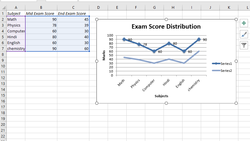
代码 #2:绘制带有数据标签和标记的图表。
要在 Excel 工作表上绘制此类图表,请使用 add_series() 方法和图表对象的“data_labels”和“marker”关键字参数。
Python3
# import xlsxwriter module
import xlsxwriter

# Workbook() takes one, non-optional, argument
# which is the filename that we want to create.
workbook = xlsxwriter.Workbook('Example2_chart.xlsx')

# The workbook object is then used to add new
# worksheet via the add_worksheet() method.
worksheet = workbook.add_worksheet()

# Create a new Format object to formats cells
# in worksheets using add_format() method .

# here we create italic format object
italic = workbook.add_format({'italic': 1})

# Add the worksheet data that the charts will refer to.
Data1 = ['Subject', 'Mid Exam Score', 'End Exam Score']
Data2 = [
    ["Math", "Physics", "Computer", "Hindi", "English", "chemistry"],
    [90, 78, 60, 80, 60, 90],
    [45, 39, 30, 40, 30, 60]
]

# Write a row of data starting from 'A1'
# with bold format .
worksheet.write_row('A1', Data1, italic)

# Write a column of data starting from
# 'A2', 'B2', 'C2' respectively
worksheet.write_column('A2', Data2[0])
worksheet.write_column('B2', Data2[1])
worksheet.write_column('C2', Data2[2])

# set the width of B and C column
worksheet.set_column('B:C', 15)

# Create a chart object that can be added
# to a worksheet using add_chart() method.

# here we create a line chart object .
chart2 = workbook.add_chart({'type': 'line'})

# Add a data series to a chart
# using add_series method.

# Configure the first series.
# with a data label and marker.
# = Sheet1 !$A$1 is equivalent to ['Sheet1', 0, 0].

# note : spaces is not inserted in b / w
# = and Sheet1, Sheet1 and !
# if space is inserted it throws warning.
chart2.add_series({
    'categories': '= Sheet1 !$A$2:$A$7',
    'values':     '= Sheet1 !$B$2:$B$7',
    'data_labels': {'value': 1},
    'marker': {'type': 'automatic'},
})

# Configure the second series with
# a moving average trendline.
chart2.add_series({
    'categories': '= Sheet1 !$A$2:$A$7',
    'values':     '= Sheet1 !$C$2:$C$7',
})

# Add a chart title.
chart2.set_title({'name': 'Exam Score Distribution'})

# Add x-axis label
chart2.set_x_axis({'name': 'Subjects'})

# Add y-axis label
chart2.set_y_axis({'name': 'Marks'})

# Set an Excel chart style.
chart2.set_style(11)

# add chart to the worksheet with given
# offset values at the top-left corner of
# a chart is anchored to cell D2
worksheet.insert_chart('D2', chart2,
     {'x_offset': 25, 'y_offset': 10})

# Finally, close the Excel file
# via the close() method.
workbook.close()
输出 :
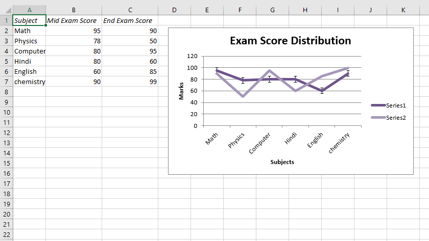
代码#3:绘制带有误差线的图表。
要在 Excel 表上绘制这种类型的图表,请使用 add_series() 方法和图表对象的“y_error_bars”关键字参数。
Python3
# import xlsxwriter module
import xlsxwriter

# Workbook() takes one, non-optional, argument
# which is the filename that we want to create.
workbook = xlsxwriter.Workbook('Example3_chart.xlsx')

# The workbook object is then used to add new
# worksheet via the add_worksheet() method.
worksheet = workbook.add_worksheet()

# Create a new Format object to formats cells
# in worksheets using add_format() method .

# here we create italic format object
italic = workbook.add_format({'italic': 1})

# Add the worksheet data that the charts will refer to.
Data1 = ['Subject', 'Mid Exam Score', 'End Exam Score']
Data2 = [
    ["Math", "Physics", "Computer", "Hindi", "English", "chemistry"],
    [95, 78, 80, 80, 60, 90],
    [90, 50, 95, 60, 85, 99]
]


# Write a row of data starting from 'A1'
# with bold format .
worksheet.write_row('A1', Data1, italic)

# Write a column of data starting from
# 'A2', 'B2', 'C2' respectively
worksheet.write_column('A2', Data2[0])
worksheet.write_column('B2', Data2[1])
worksheet.write_column('C2', Data2[2])

# set the width of B and C column
worksheet.set_column('B:C', 15)

# Create a chart object that can be added
# to a worksheet using add_chart() method.

# here we create a line chart object .
chart3 = workbook.add_chart({'type': 'line'})

# Add a data series to a chart
# using add_series method.

# Configure the first series.
# with a error bars .
# = Sheet1 !$A$1 is equivalent to ['Sheet1', 0, 0].

# note : spaces is not inserted in b / w
# = and Sheet1, Sheet1 and !
# if space is inserted it throws warning.
chart3.add_series({
    'categories': '= Sheet1 !$A$2:$A$7',
    'values':     '= Sheet1 !$B$2:$B$7',
    'y_error_bars': {'type': 'standard_error'},
})

# Configure the second series.
chart3.add_series({
    'categories': '= Sheet1 !$A$2:$A$7',
    'values': '= Sheet1 !$C$2:$C$7',
})


# Add a chart title.
chart3.set_title({'name': 'Exam Score Distribution'})

# Add x-axis label
chart3.set_x_axis({'name': 'Subjects'})

# Add y-axis label
chart3.set_y_axis({'name': 'Marks'})

# Set an Excel chart style.
chart3.set_style(14)

# add chart to the worksheet with given
# offset values at the top-left corner of
# a chart is anchored to cell D2
worksheet.insert_chart('D2', chart3,
    {'x_offset': 20, 'y_offset': 5})

# Finally, close the Excel file
# via the close() method.
workbook.close()
输出 :