📌 相关文章
- 素数的递归程序
- depmod:未找到 - Shell-Bash 代码示例
- 可以刻在矩形中的最大可能的圆
- 如何在python代码示例中打印字符串
- 给定2D数组中的最小和子矩阵
- Python – GTK+ 3 中的网格容器
- 检查数组的素数元素的和是否为素数
- ruby 数组减数组 - Ruby 代码示例
- Python|提取过滤的字典值
- 交换两个数字的Java程序
- python 跟踪表 - Python 代码示例
- html 文本框 - Html 代码示例
- 在 termux 中安装 msf - Shell-Bash 代码示例
- 检查是否可以通过与上一跳重复多次,少跳一次或相同数目的索引重复跳转来到达已排序数组的末尾
- 从0到N的连续数字的汉明差总和|套装2
- Kexilies - 任何代码示例
- nodejs 临时文件 - Javascript 代码示例
- gogole - 任何代码示例
- 微软面试经历 |第 95 组(IDC 校内)
- 我们可以覆盖Java中的私有方法吗?
- mysql 将变量设置为今天的日期 - SQL 代码示例
- 链表中第二小的元素
- 下一页数据表时弹出窗口不起作用 - Javascript代码示例
- 国际空间研究组织 | ISRO CS 2011 |问题 17
- 不等于 java 代码示例
- DXC技术面试体验(校内)
- laravel api 路由 - PHP 代码示例
- 弗吉尼亚技术 - 任何代码示例
- sql代码示例中高于平均工资
- 2的最高幂除以二进制表示的数字
📜 R饼图
📅 最后修改于: 2021-01-08 09:56:28 🧑 作者: Mango
R饼图
R编程语言具有几个用于创建图表的图形库。饼图以不同颜色的圆形切片的形式表示值。切片带有说明标签,并且每个切片对应的数字也显示在图表中。但是,R文档中不建议使用饼图,并且饼图的特性受到限制。作者建议在饼图上使用条形图或点图,因为人们能够比长度更准确地测量长度。
饼图是通过pie()函数创建的,该函数以正数作为向量输入。附加参数用于控制标签,颜色,标题等。
pie()函数的语法如下:
pie(X, Labels, Radius, Main, Col, Clockwise)
这里,
- X是一个向量,其中包含饼图中使用的数值。
- 标签用于对切片进行描述。
- 半径描述饼图的半径。
- Main描述图表的标题。
- Col定义调色板。
- 顺时针是一个逻辑值,指示绘制切片所沿的顺时针或逆时针方向。
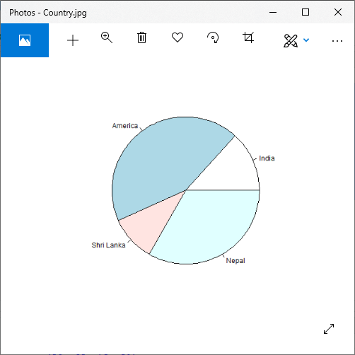
例
# Creating data for the graph.
x <- c(20, 65, 15, 50)
labels <- c("India", "America", "Shri Lanka", "Nepal")
# Giving the chart file a name.
png(file = "Country.jpg")
# Plotting the chart.
pie(x,labels)
# Saving the file.
dev.off()
输出:
标题和颜色
饼图具有更多功能,可通过在pie()函数添加更多参数来使用。我们可以通过传递main参数来为饼图命名。它将饼图的标题告知pie()函数。除此之外,我们可以通过传递col参数在绘制图表时使用彩虹色托盘。
注意:托盘的长度将与图表中的值相同。因此,我们将使用length()函数。
让我们看一个示例,以了解这些方法如何创建带有标题和颜色的精美饼图。
例
# Creating data for the graph.
x <- c(20, 65, 15, 50)
labels <- c("India", "America", "Shri Lanka", "Nepal")
# Giving the chart file a name.
png(file = "title_color.jpg")
# Plotting the chart.
pie(x,labels,main="Country Pie chart",col=rainbow(length(x)))
# Saving the file.
dev.off()
输出:

切片百分比和图表图例
饼图还有两个附加属性,即切片百分比和图表图例。我们可以用百分比的形式显示数据,也可以通过使用legend()函数将图例添加到R中的绘图中。 legend()函数具有以下语法。
legend(x,y=NULL,legend,fill,col,bg)
这里,
- x和y是用于定位图例的坐标。
- 图例是图例的文字
- fill是用于填充图例文本旁边的框的颜色。
- col定义图例文本之外的线条和点的颜色。
- bg是图例框的背景色。
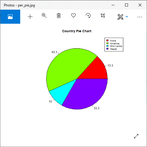
例
# Creating data for the graph.
x <- c(20, 65, 15, 50)
labels <- c("India", "America", "Shri Lanka", "Nepal")
pie_percent<- round(100*x/sum(x), 1)
# Giving the chart file a name.
png(file = "per_pie.jpg")
# Plotting the chart.
pie(x, labels = pie_percent, main = "Country Pie Chart",col = rainbow(length(x)))
legend("topright", c("India", "America", "Shri Lanka", "Nepal"), cex = 0.8,
fill = rainbow(length(x)))
#Saving the file.
dev.off()
输出:
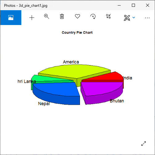
3维饼图
在R中,我们还可以创建一个三维饼图。为此,R提供了一个plotrix软件包,其pie3D()函数用于创建引人注目的3D饼图。 pie3D()函数的参数保持相同馅饼()函数。让我们看一个示例,以了解如何借助此函数创建3D饼图。
例
# Getting the library.
library(plotrix)
# Creating data for the graph.
x <- c(20, 65, 15, 50,45)
labels <- c("India", "America", "Shri Lanka", "Nepal","Bhutan")
# Give the chart file a name.
png(file = "3d_pie_chart1.jpg")
# Plot the chart.
pie3D(x,labels = labels,explode = 0.1, main = "Country Pie Chart")
# Save the file.
dev.off()
输出:
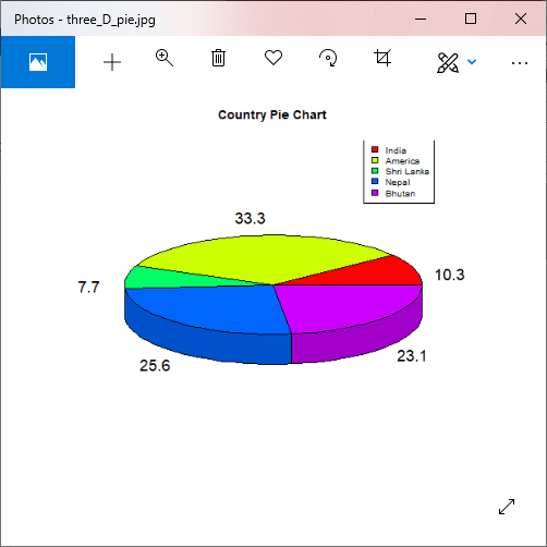
例
# Getting the library.
library(plotrix)
# Creating data for the graph.
x <- c(20, 65, 15, 50,45)
labels <- c("India", "America", "Shri Lanka", "Nepal","Bhutan")
pie_percent<- round(100*x/sum(x), 1)
# Giving the chart file a name.
png(file = "three_D_pie.jpg")
# Plotting the chart.
pie3D(x, labels = pie_percent, main = "Country Pie Chart",col = rainbow(length(x)))
legend("topright", c("India", "America", "Shri Lanka", "Nepal","Bhutan"), cex = 0.8,
fill = rainbow(length(x)))
#Saving the file.
dev.off()
输出: