Python - 滚动绘图
在Python,我们可以使用许多库和函数绘制图形。在本文中,我们的主要重点是向绘图中添加滑块。但是在移向滑块之前,有必要知道如何使用 matplotlib.pyplot 在Python绘制基本图。
滚动绘图
滚动图是当我们使用滑块更改图的比例时会自动更新的图。可以使用 matplotlib 和 plotly 库将滑块添加到绘图中。在本教程中,我们将学习如何使用 matplotlib.pyplot 库生成滑块。
滚动绘图对于每种情况似乎都没有用或必要,但肯定是一个有益的功能。在某些情况下,数据很大,无法放入动态图中,即使适合,图中的点之间也会发生碰撞。因此,使用滑块将减少点之间的碰撞并使其看起来像样和干净。此外,学习起来会很容易。
Slider()函数: Slider()函数是 matplotlib.widgets 中的一个函数,可帮助程序员将滑块添加到绘图中。 matplotlib.widget.Slider() 的基本语法是
Syntax: matplotlib.widgets.Slider(axis, label, val_min, val_max, valinit=0.5, valfmt=None, closed_min=True, closed_max=True, slider_min=None, slider_max=None, dragging=True, val_step=None, orientation=’horizontal’, **kwargs)
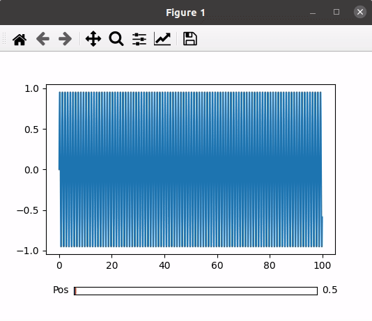
示例 1:滚动滑块。
方法:
- 导入模块
- 将图和轴设置为子图
- 调整滑块小部件的大小
- 设置一些虚拟数据到 x 和 y 轴
- 使用虚拟数据绘制图形
- 设置滑块的位置并绘图
- 定义一个更新函数,当我们移动滑块时,它将改变图形表示
- 使用 on_changed()函数将更新函数设置为滑块以实现更改。
- 将图表与滑块一起绘制。
下面是实现:
Python3
# Import libraries using import keyword
import numpy as np
import matplotlib.pyplot as plt
from matplotlib.widgets import Slider

# Setting Plot and Axis variables as subplots()
# function returns tuple(fig, ax)
Plot, Axis = plt.subplots()

# Adjust the bottom size according to the
# requirement of the user
plt.subplots_adjust(bottom=0.25)

# Set the x and y axis to some dummy data
t = np.arange(0.0, 100.0, 0.1)
s = np.sin(2*np.pi*t)

# plot the x and y using plot function
l = plt.plot(t, s)

# Choose the Slider color
slider_color = 'White'

# Set the axis and slider position in the plot
axis_position = plt.axes([0.2, 0.1, 0.65, 0.03],
                         facecolor = slider_color)
slider_position = Slider(axis_position,
                         'Pos', 0.1, 90.0)

# update() function to change the graph when the
# slider is in use
def update(val):
    pos = slider_position.val
    Axis.axis([pos, pos+10, -1, 1])
    Plot.canvas.draw_idle()

# update function called using on_changed() function
slider_position.on_changed(update)

# Display the plot
plt.show()
Python3
# Importing Libraries using import function
import numpy as np
import matplotlib.pyplot as plt
from matplotlib.widgets import Slider

# Setting Plot and Axis variables as subplots()
# function returns tuple(fig, ax)
fig, ax = plt.subplots()

# Adjust the bottom size according to the
# requirement of the user
plt.subplots_adjust(bottom = 0.25)

# Set the x and y axis to some dummy data
t = np.arange(0.0, 1.0, 0.001)
# Initial values of amplitude anf frequency
# are denoted by a0 and f0
a0 = 6
f0 = 3
s = a0*np.sin(2*np.pi*f0*t)

# plot the x and y using plot function
Plot, = plt.plot(t, s, lw = 3, color = 'green')
plt.axis([0, 1, -10, 10])

# Choose the Slider color
axcolor = "White"

# Set the frequency and amplitude axis
frequency_axis = plt.axes([0.25, 0.1, 0.65, 0.03],
                          facecolor = axcolor)
amplitude_axis = plt.axes([0.25, 0.15, 0.65, 0.03],
                          facecolor = axcolor)

# Set the slider for frequency and amplitude
frequency_slider = Slider(frequency_axis, 'Freq',
                          0.1, 30.0, valinit = f0)
amplitude_slider = Slider(amplitude_axis, 'Amp',
                          0.1, 10.0, valinit = a0)

# update() function to change the graph when the
# slider is in use
def update(val):
    amp = amplitude_slider.val
    freq = frequency_slider.val
    Plot.set_ydata(amp*np.sin(2*np.pi*freq*t))

# update function called using on_changed() function
# for both frequency and amplitude
frequency_slider.on_changed(update)
amplitude_slider.on_changed(update)

# Display the plot
plt.show()
输出:
示例 2:滚动多个滑块。
方法:
- 导入模块
- 将图和轴设置为子图
- 调整滑块小部件的大小。
- 使用一些虚拟数据将振幅设置为 x 轴,将频率设置为 y 轴。
- 使用数据绘制图形,并根据需要给出一些基本功能,例如颜色变化或大小变化。
- 设置幅度滑块、频率滑块和绘图的位置。
- 定义一个更新函数,当我们移动任何滑块时,它将改变图形表示。
- 设置更新函数,通过使用on_changed()函数两个滑块。
- 绘制带有滑块的图形。
下面是实现:
蟒蛇3
# Importing Libraries using import function
import numpy as np
import matplotlib.pyplot as plt
from matplotlib.widgets import Slider

# Setting Plot and Axis variables as subplots()
# function returns tuple(fig, ax)
fig, ax = plt.subplots()

# Adjust the bottom size according to the
# requirement of the user
plt.subplots_adjust(bottom = 0.25)

# Set the x and y axis to some dummy data
t = np.arange(0.0, 1.0, 0.001)
# Initial values of amplitude anf frequency
# are denoted by a0 and f0
a0 = 6
f0 = 3
s = a0*np.sin(2*np.pi*f0*t)

# plot the x and y using plot function
Plot, = plt.plot(t, s, lw = 3, color = 'green')
plt.axis([0, 1, -10, 10])

# Choose the Slider color
axcolor = "White"

# Set the frequency and amplitude axis
frequency_axis = plt.axes([0.25, 0.1, 0.65, 0.03],
                          facecolor = axcolor)
amplitude_axis = plt.axes([0.25, 0.15, 0.65, 0.03],
                          facecolor = axcolor)

# Set the slider for frequency and amplitude
frequency_slider = Slider(frequency_axis, 'Freq',
                          0.1, 30.0, valinit = f0)
amplitude_slider = Slider(amplitude_axis, 'Amp',
                          0.1, 10.0, valinit = a0)

# update() function to change the graph when the
# slider is in use
def update(val):
    amp = amplitude_slider.val
    freq = frequency_slider.val
    Plot.set_ydata(amp*np.sin(2*np.pi*freq*t))

# update function called using on_changed() function
# for both frequency and amplitude
frequency_slider.on_changed(update)
amplitude_slider.on_changed(update)

# Display the plot
plt.show()
输出:
