在 Matplotlib 图的左侧和右侧使用不同的 y 轴
在本文中,我们将讨论如何创建 Matplotlib 图两侧的 y 轴。
有时为了快速分析数据,需要创建一个具有两个不同尺度的数据变量的图形。为此,使用双轴方法,即双 X 或 Y 轴。 matplotlib库的axes 模块中的matplotlib.axes.Axes.twinx()函数用于创建共享X 轴的双轴。
句法 :
matplotlib.axes.Axes.twinx(self)此方法不接受任何参数,如果提供则引发错误。它返回ax_twin对象,该对象指示创建了一个新的 Axes 实例。下面的示例说明了 matplotlib.axes 中的matplotlib.axes.Axes.twinx ()函数:
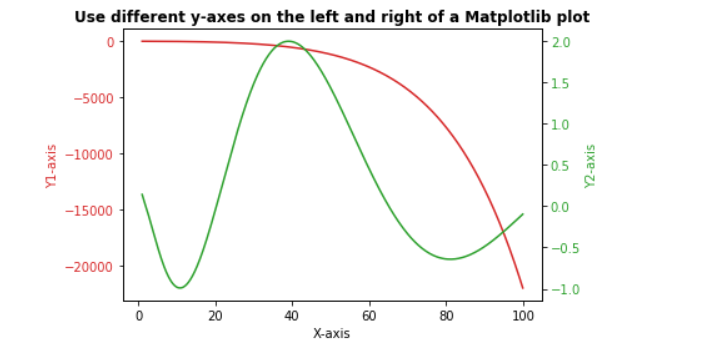
示例 1:
Python3
# import libraries
import numpy as np
import matplotlib.pyplot as plt

# Creating dataset
x = np.arange(1.0, 100.0, 0.191)
dataset_1 = np.exp(x**0.25) - np.exp(x**0.5)
dataset_2 = np.sin(0.4 * np.pi * x**0.5) + np.cos(0.8 * np.pi * x**0.25)

# Creating plot with dataset_1
fig, ax1 = plt.subplots()

color = 'tab:red'
ax1.set_xlabel('X-axis')
ax1.set_ylabel('Y1-axis', color = color)
ax1.plot(x, dataset_1, color = color)
ax1.tick_params(axis ='y', labelcolor = color)

# Adding Twin Axes to plot using dataset_2
ax2 = ax1.twinx()

color = 'tab:green'
ax2.set_ylabel('Y2-axis', color = color)
ax2.plot(x, dataset_2, color = color)
ax2.tick_params(axis ='y', labelcolor = color)

# Adding title
plt.title('Use different y-axes on the left and right of a Matplotlib plot', fontweight ="bold")

# Show plot
plt.show()
Python3
# import libraries
import numpy as np
import matplotlib.pyplot as plt
from matplotlib import rc
rc('mathtext', default='regular')

# Creating dataset
x = np.arange(10)
dataset_1 = np.random.random(10)*30
dataset_2 = np.random.random(10)*60
dataset_3 = np.random.random(10)*100

# Creating figure
fig = plt.figure()

# Plotting dataset_2
ax = fig.add_subplot(111)
ax.plot(x, dataset_2, '-', label='dataset_2')
ax.plot(x, dataset_3, '-', label='dataset_3')

# Creating Twin axes for dataset_1
ax2 = ax.twinx()
ax2.plot(x, dataset_1, '-r', label='dataset_1')

# Adding title
plt.title('Use different y-axes on the left and right of a Matplotlib plot',
          fontweight="bold")

# Adding legend
ax.legend(loc=0)
ax2.legend(loc=0)

# Sdding grid
ax.grid()

# Adding labels
ax.set_xlabel("X-axis")
ax.set_ylabel(r"Y1-axis")
ax2.set_ylabel(r"Y2-axis")

# Setting Y limits
ax2.set_ylim(0, 35)
ax.set_ylim(-20, 100)

# Show plot
plt.show()
输出:
示例 2:
蟒蛇3
# import libraries
import numpy as np
import matplotlib.pyplot as plt
from matplotlib import rc
rc('mathtext', default='regular')

# Creating dataset
x = np.arange(10)
dataset_1 = np.random.random(10)*30
dataset_2 = np.random.random(10)*60
dataset_3 = np.random.random(10)*100

# Creating figure
fig = plt.figure()

# Plotting dataset_2
ax = fig.add_subplot(111)
ax.plot(x, dataset_2, '-', label='dataset_2')
ax.plot(x, dataset_3, '-', label='dataset_3')

# Creating Twin axes for dataset_1
ax2 = ax.twinx()
ax2.plot(x, dataset_1, '-r', label='dataset_1')

# Adding title
plt.title('Use different y-axes on the left and right of a Matplotlib plot',
          fontweight="bold")

# Adding legend
ax.legend(loc=0)
ax2.legend(loc=0)

# Sdding grid
ax.grid()

# Adding labels
ax.set_xlabel("X-axis")
ax.set_ylabel(r"Y1-axis")
ax2.set_ylabel(r"Y2-axis")

# Setting Y limits
ax2.set_ylim(0, 35)
ax.set_ylim(-20, 100)

# Show plot
plt.show()
输出:
