Python的3D 热图
热图是可视化数据集的好方法,用于可视化数据的方法越来越不断摸索和3D是热图的方式来绘图数据之一。让我们学习如何在Python绘制 3D 数据。我们将使用 matplotlib 和 mplot3d 在Python绘制 3D 热图。我们需要通过在控制台中运行以下命令来显式安装 matplotlib:
pip3 install matplotlib创建 3D 热图
- 在此代码示例中,首先我们使用语句%matplotlib来显示 jupyter notebook 中内联的所有 matplotlib 图。然后我们导入了运行此代码示例所需的所有必要库——mplot3d 库用于绘制 3d 图,pyplot 主要用于绘制图形及其配置。
- 在此之后,我们使用 NumPy randint函数为我们的 3d 热图创建了一个随机数据集,以创建一个随机整数数组。
- 使用plt.figure ,我们分别创建了一个大小为 10×10 宽度和高度的图形,默认情况下 matplotlib 将生成 2D 绘图,因此要将其指定为 3d 绘图,我们使用带有投影 ='3d' 的add_subplot函数来创建一个 3d阴谋。
- 我们正在使用set_array()函数将整数数组映射为我们的绘图的 RGBA 颜色。
- 之后,我们用我们的 3d 数据集创建一个散点图,并通过将标记值设置为s我们将每个数据点显示为方形。它们的颜色取决于我们之前创建的名为colo的数组。
- 最后,我们使用 set_label函数设置了 x、y、z 标签和标题,并使用show ()函数显示了绘图。
代码:
Python3
# 3D Heatmap in Python using matplotlib

# to make plot interactive
%matplotlib

# importing required libraries
from mpl_toolkits.mplot3d import Axes3D
import matplotlib.pyplot as plt
import numpy as np
from pylab import *

# creating a dummy dataset
x = np.random.randint(low=100, high=500, size=(1000,))
y = np.random.randint(low=300, high=500, size=(1000,))
z = np.random.randint(low=200, high=500, size=(1000,))
colo = [x + y + z]

# creating figures
fig = plt.figure(figsize=(10, 10))
ax = fig.add_subplot(111, projection='3d')

# setting color bar
color_map = cm.ScalarMappable(cmap=cm.Greens_r)
color_map.set_array(colo)

# creating the heatmap
img = ax.scatter(x, y, z, marker='s',
                 s=200, color='green')
plt.colorbar(color_map)

# adding title and labels
ax.set_title("3D Heatmap")
ax.set_xlabel('X-axis')
ax.set_ylabel('Y-axis')
ax.set_zlabel('Z-axis')

# displaying plot
plt.show()
Python3
# 3D Heatmap in Python using matplotlib

# to make plot interactive
%matplotlib inline

# importing required libraries
from mpl_toolkits.mplot3d import Axes3D
import matplotlib.pyplot as plt
import numpy as np
from pylab import *

# creating a dummy dataset
x = np.random.randint(low=10, high=1000, size=(1000,))
y = np.random.randint(low=20, high=1000, size=(1000,))
z = np.random.randint(low=1, high=1000, size=(1000,))
colo = np.random.randn(10, 1000)*1000

# creating 3d figures
fig = plt.figure(figsize=(10, 10))
ax = Axes3D(fig)

# configuring colorbar
color_map = cm.ScalarMappable(cmap=cm.gray)
color_map.set_array(colo)

# creating the heatmap
img = ax.scatter(x, y, z, marker='s',
                 s=100, color='gray')
plt.colorbar(color_map)

# adding title and labels
ax.set_title("3D Heatmap")
ax.set_xlabel('X-axis')
ax.set_ylabel('Y-axis')
ax.set_zlabel('Z-axis')

# displaying plot
plt.show()
Python3
#!/usr/bin/python3
# 3D Heatmap in Python using matplotlib

# to make plot interactive
%matplotlib inline

# importing required libraries
from mpl_toolkits.mplot3d import Axes3D
import matplotlib.pyplot as plt
import numpy as np
import pandas as pd
from pylab import *

# reading a dummy dataset
dataset = pd.read_csv("/data.csv")
x = dataset["Col.1"].tolist()
y = dataset["Col.2"].tolist()
z = dataset["Col.3"].tolist()

colo = dataset["total"].tolist()

# creating 3d figures
fig = plt.figure(figsize=(8, 5))
ax = fig.add_subplot(111, projection='3d')

# configuring colorbar
color_map = cm.ScalarMappable(cmap=cm.gray)
color_map.set_array(colo)

# creating the heatmap
img = ax.scatter(x, y, z, marker='s',
                 s=99, color='gray')
plt.colorbar(color_map)

# adding title and labels
ax.set_title("3D Heatmap")
ax.set_xlabel('X')
ax.set_ylabel('Y')
ax.set_zlabel('')

# displaying plot
plt.show()
输出:
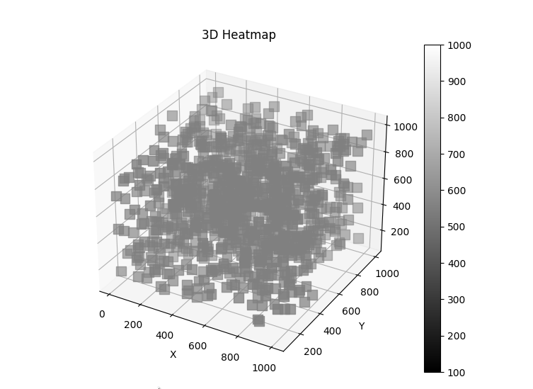
使用方差数据集创建 3D 热图
- 我们使用 NumPy randint函数为我们的 3d 热图创建了一个随机数据集,以创建一个随机整数数组。
- 使用 plt.figure,我们分别创建了一个 10×10 宽度和高度的图形,默认情况下,matplotlib 将生成 2D 绘图,因此要将其指定为 3d 绘图,我们使用 Axes3D 创建一个 3d 绘图。我们正在使用 set_array()函数将整数数组映射为我们的绘图的 RGBA 颜色。
- 之后,我们用我们的 3d 数据集创建一个散点图,并通过将标记值设置为 s 我们将每个数据点显示为方形。它们的颜色取决于我们之前创建的名为 colo 的数组。
- 最后,我们使用 set_label函数设置了 x、y、z 标签和标题,并使用 show()函数显示了绘图。
代码 :
蟒蛇3
# 3D Heatmap in Python using matplotlib

# to make plot interactive
%matplotlib inline

# importing required libraries
from mpl_toolkits.mplot3d import Axes3D
import matplotlib.pyplot as plt
import numpy as np
from pylab import *

# creating a dummy dataset
x = np.random.randint(low=10, high=1000, size=(1000,))
y = np.random.randint(low=20, high=1000, size=(1000,))
z = np.random.randint(low=1, high=1000, size=(1000,))
colo = np.random.randn(10, 1000)*1000

# creating 3d figures
fig = plt.figure(figsize=(10, 10))
ax = Axes3D(fig)

# configuring colorbar
color_map = cm.ScalarMappable(cmap=cm.gray)
color_map.set_array(colo)

# creating the heatmap
img = ax.scatter(x, y, z, marker='s',
                 s=100, color='gray')
plt.colorbar(color_map)

# adding title and labels
ax.set_title("3D Heatmap")
ax.set_xlabel('X-axis')
ax.set_ylabel('Y-axis')
ax.set_zlabel('Z-axis')

# displaying plot
plt.show()
输出:
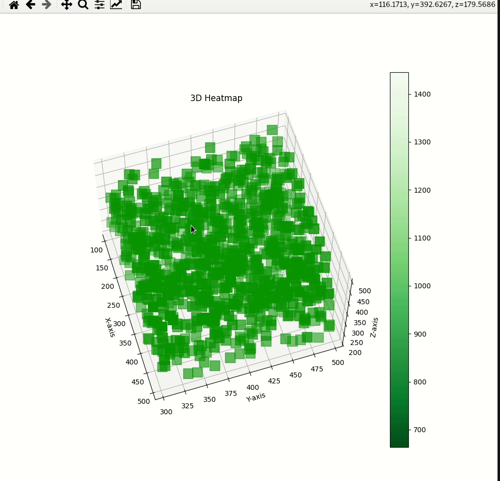
使用 CSV 文件创建 3D 热图
- 我们正在使用已加载数据集的 Pandas,我们使用 3 列进行绘图,使用 1 列作为颜色条。您可以随意操作数据。
- 使用 plt.figure,我们分别创建了一个大小为 8×5 宽度和高度的图形,默认情况下 matplotlib 将生成 2D 绘图,因此要将其指定为 3d 绘图,我们使用带有投影 ='3d' 的 add_subplot函数来创建一个 3d阴谋。我们正在使用 set_array()函数将整数数组映射为我们的绘图的 RGBA 颜色。
- 之后,我们用我们的 3d 数据集创建一个散点图,并通过将标记值设置为 s 我们将每个数据点显示为方形。它们的颜色取决于我们之前创建的名为 colo 的数组。
- 最后,我们使用 set_label函数设置了 x、y、z 标签和标题,并使用 show()函数显示了绘图。
从这里下载数据集。
蟒蛇3
#!/usr/bin/python3
# 3D Heatmap in Python using matplotlib

# to make plot interactive
%matplotlib inline

# importing required libraries
from mpl_toolkits.mplot3d import Axes3D
import matplotlib.pyplot as plt
import numpy as np
import pandas as pd
from pylab import *

# reading a dummy dataset
dataset = pd.read_csv("/data.csv")
x = dataset["Col.1"].tolist()
y = dataset["Col.2"].tolist()
z = dataset["Col.3"].tolist()

colo = dataset["total"].tolist()

# creating 3d figures
fig = plt.figure(figsize=(8, 5))
ax = fig.add_subplot(111, projection='3d')

# configuring colorbar
color_map = cm.ScalarMappable(cmap=cm.gray)
color_map.set_array(colo)

# creating the heatmap
img = ax.scatter(x, y, z, marker='s',
                 s=99, color='gray')
plt.colorbar(color_map)

# adding title and labels
ax.set_title("3D Heatmap")
ax.set_xlabel('X')
ax.set_ylabel('Y')
ax.set_zlabel('')

# displaying plot
plt.show()
输出: