在 R 中创建热图
热图是一种表示数据的图形方式。它最常用于数据分析。在数据分析中,我们探索数据集并从数据集中汲取洞察力,我们尝试通过对数据进行可视化分析来找到数据中隐藏的模式。热图用颜色可视化矩阵的值,颜色越亮表示值越高,颜色越浅表示值越低。在热图中,我们使用温暖来冷却配色方案。热图是所谓的热图,因为在热图中,我们将颜色映射到数据集中的不同值上。
在本文中,我们将讨论如何在 R 编程语言中创建热图。
方法 1:使用 ggplot2 包中的 geom_tile()
geom_tile()用于创建一个二维热图,其中包含平面矩形图块。它预装了用于 R 编程的ggplot2包。
Syntax:
geom_tile( mapping =NULL, data=NULL, stat=”Identity”,…)
Parameter:
- mapping: It can be “aes”. “aes” is an acronym for aesthetic mapping. It describes how variables in the data are mapped to the visual properties of the geometry.
- data: It holds the dataset variable, a variable where we have stored our dataset in the script.
- stat: It is used to perform any kind of statistical operation on the dataset.
要创建热图,首先导入所需的库,然后创建或加载数据集。现在只需使用适当的参数值调用 geom_tile()函数。
例子:
R
# Plotting Heatmap in R

# adding ggplot2 library for plotting
library(ggplot2)

# Creating random dataset
# with 20 alphabets and 20 animal names
letters <- LETTERS[1:20]
animal_names <- c("Canidae","Felidae","Cat","Cattle",
                  "Dog","Donkey","Goat","Guinea pig",
                  "Horse","Pig","Rabbit","Badger",
                  "Bald eagle","Bandicoot","Barnacle",
                  "Bass","Bat","Bear","Beaver","Bedbug",
                  "Bee","Beetle")

data <- expand.grid(X=letters, Y=animal_names)
data$count <- runif(440, 0, 6)

# pltotting the heatmap
plt <- ggplot(data,aes( X, Y,fill=count))
plt <- plt + geom_tile()

# furthur customizing the heatmap by
# appltying colors and title
plt <- plt + theme_minimal()

# setting gradient color as red and white
plt <- plt + scale_fill_gradient(low="white", high="red")

# setting the title and subtitles using
# title and subtitle
plt <- plt + labs(title = "Heatmap")
plt <- plt + labs(subtitle = "A simplte heatmap using geom_tile()")

# setting x and y labels using labs
plt <- plt + labs(x ="Alphabets", y ="Random column names")

# plotting the Heatmap
plt
R
# Plotting Heatmap in R

# adding ggplot2 library for plotting
library(ggplot2)

# Creating random dataset
# with 20 alphabets and 20 animal names
letters <- LETTERS[1:20]
animal_names <- c("Canidae","Felidae","Cat","Cattle",
                  "Dog","Donkey","Goat","Guinea pig",
                  "Horse","Pig","Rabbit","Badger",
                  "Bald eagle","Bandicoot","Barnacle",
                  "Bass","Bat","Bear","Beaver","Bedbug",
                  "Bee","Beetle")

data <- expand.grid(X=letters, Y=animal_names)
data$count <- runif(440, 0, 6)

# pltotting the heatmap
plt <- ggplot(data,aes( X, Y,fill=count))
plt <- plt + geom_tile()

# further customizing the heatmap by
# appltying colors and title
plt <- plt + theme_minimal()

# setting gradient color as red and white
plt <- plt + scale_fill_gradient(low="white", high="red")

# setting the title and subtitles using
# title and subtitle
plt <- plt + labs(title = "Heatmap")
plt <- plt + labs(subtitle = "A simplte heatmap using geom_tile()")

# setting x and y labels using labs
plt <- plt + labs(x ="Alphabets", y ="Random column names")

# plotting the Heatmap
plt
R
# Heatplot from Base R
# using default mtcars dataset from the R
x  <- as.matrix(mtcars)

# custom colors
new_colors <- colorRampPalette(c("cyan", "darkgreen"))

# plotting the heatmap
plt <- heatmap(x,
               # assigning new colors
               col = new_colors(100),

               # adding title
               main = "Heatmap for mtcars dataset",

               # adding some margin so that
               # it doesn not drawn over the
               # y-axis label
               margins = c(5,10),

               # adding x-axis labels
               xlab = "variables",

               # adding y-axis labels
               ylab = "Car Models",

               # to scaled the values into
               # column direction
               scale = "column"
)
电阻
# Plotting Heatmap in R

# adding ggplot2 library for plotting
library(ggplot2)

# Creating random dataset
# with 20 alphabets and 20 animal names
letters <- LETTERS[1:20]
animal_names <- c("Canidae","Felidae","Cat","Cattle",
                  "Dog","Donkey","Goat","Guinea pig",
                  "Horse","Pig","Rabbit","Badger",
                  "Bald eagle","Bandicoot","Barnacle",
                  "Bass","Bat","Bear","Beaver","Bedbug",
                  "Bee","Beetle")

data <- expand.grid(X=letters, Y=animal_names)
data$count <- runif(440, 0, 6)

# pltotting the heatmap
plt <- ggplot(data,aes( X, Y,fill=count))
plt <- plt + geom_tile()

# further customizing the heatmap by
# appltying colors and title
plt <- plt + theme_minimal()

# setting gradient color as red and white
plt <- plt + scale_fill_gradient(low="white", high="red")

# setting the title and subtitles using
# title and subtitle
plt <- plt + labs(title = "Heatmap")
plt <- plt + labs(subtitle = "A simplte heatmap using geom_tile()")

# setting x and y labels using labs
plt <- plt + labs(x ="Alphabets", y ="Random column names")

# plotting the Heatmap
plt
输出:
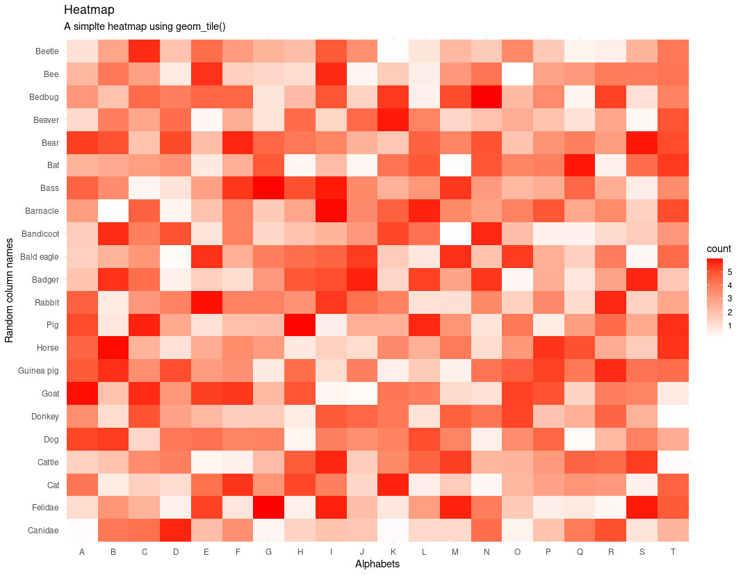
使用 ggplot2 的热图
方法二:使用base R的heatmap()函数
heatmap()函数带有 Base R 的默认安装。如果他不想安装任何额外的包,也可以使用默认的 heatmap()。我们可以使用 R 中的这个热图函数绘制数据集的热图。
Syntax:
heatmap(data,main = NULL, xlab = NULL, ylab = NULL,…)
Parameter:
data: data specifies the matrix of the data for which we wanted to plot a Heatmap.
main: main is a string argument, and it specifies the title of the plot.
xlab: xlab is used to specify the x-axis labels.
ylab: ylab is used to specify the y-axis labels.
这里的任务很简单。您只需要输入函数heatmap() 需要的值。
例子:
电阻
# Heatplot from Base R
# using default mtcars dataset from the R
x  <- as.matrix(mtcars)

# custom colors
new_colors <- colorRampPalette(c("cyan", "darkgreen"))

# plotting the heatmap
plt <- heatmap(x,
               # assigning new colors
               col = new_colors(100),

               # adding title
               main = "Heatmap for mtcars dataset",

               # adding some margin so that
               # it doesn not drawn over the
               # y-axis label
               margins = c(5,10),

               # adding x-axis labels
               xlab = "variables",

               # adding y-axis labels
               ylab = "Car Models",

               # to scaled the values into
               # column direction
               scale = "column"
)
输出:
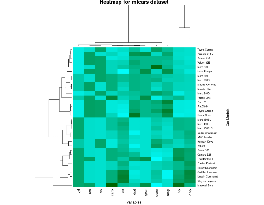
热图