R ggplot2 - 边际图
边缘图是在 x 轴和 y 轴边缘具有直方图、箱线图或点图的散点图。它允许研究 2 个数值变量之间的关系。基图显示了 x 轴和 y 轴变量之间的相关性。它通常是散点图或密度图。边缘图表通常绘制在基础图的顶部和右侧边缘,它们使用直方图、条形图或密度图显示 x 轴和 y 轴变量的分布。这有助于我们可视化沿两个轴的不同变量值的分布强度。
为了在 R 语言中绘制边缘图,我们将使用 R 语言的 ggExtra 包。 ggExtra 是用于增强 ggplot2 的函数和层的集合。 ggMarginal()函数可用于将边际直方图/箱线图/密度图添加到 ggplot2 散点图。
安装:
要安装我们使用的 ggExtra 包:
install.packages("ggExtra")创建边际图
为了创建边际图,我们使用以下函数制作带有散点图的边际直方图。
Syntax: ggMarginal( plot, type )
Parameters:
- plot: Determines the base scatter plot over which marginal plot has to be added.
- type: Determines the type of marginal plot i.e. histogram, boxplot and density.
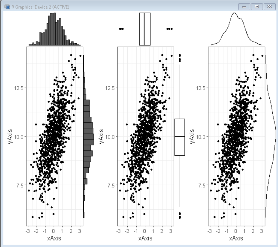
示例:使用 ggExtra 包的 grid.arrange()函数将边缘直方图、密度图和箱线图全部排列在页面上的基本散点图。
R
# load library tidyverse, gridExtra and ggExtra
library(tidyverse)
library(ggExtra)
library(gridExtra)

# set theme
theme_set(theme_bw(12))

# create x and y vector
xAxis <- rnorm(1000)
yAxis <- rnorm(1000) + xAxis + 10

# create sample data frame
sample_data <- data.frame(xAxis, yAxis)

# create scatter plot using ggplot() function
plot <- ggplot(sample_data, aes(x=xAxis, y=yAxis))+
          geom_point()+
        theme(legend.position="none")

# use ggMarginal function to create
# marginal histogram, boxplot and density plot
plot1 <- ggMarginal(plot, type="histogram")
plot2 <- ggMarginal(plot, type="boxplot")
plot3 <- ggMarginal(plot, type="density")

# combine plots in a grid
grid.arrange( plot1, plot2, plot3, ncol=3)
R
# load library tidyverse, gridExtra and ggExtra
library(tidyverse)
library(ggExtra)
library(gridExtra)

# set theme
theme_set(theme_bw(12))

# create x and y vector
xAxis <- rnorm(1000)
yAxis <- rnorm(1000) + xAxis + 10

# create sample data frame
sample_data <- data.frame(xAxis, yAxis)

# create scatter plot using ggplot() function
plot <- ggplot(sample_data, aes(x=xAxis, y=yAxis))+
          geom_point()+
        theme(legend.position="none")

# use ggMarginal function to create
# marginal histogram, boxplot and density plot
# fill, colo and size property is used for customization
plot1 <- ggMarginal(plot, type="histogram", fill= "green", size=10)
plot2 <- ggMarginal(plot, type="boxplot", color="yellow" )
plot3 <- ggMarginal(plot, type="density", color="green")

# combine plots in a grid
grid.arrange( plot1, plot2, plot3, ncol=3)
R
# load library tidyverse, gridExtra and ggExtra
library(tidyverse)
library(ggExtra)
library(gridExtra)

# set theme
theme_set(theme_bw(12))

# create x and y vector
xAxis <- rnorm(1000)
yAxis <- rnorm(1000) + xAxis + 10

# create sample data frame
sample_data <- data.frame(xAxis, yAxis)

# create scatter plot using ggplot() function
plot <- ggplot(sample_data, aes(x=xAxis, y=yAxis))+
          geom_point()+
        theme(legend.position="none")

# use ggMarginal function to create
# marginal histogram on x-axis
plot1 <- ggMarginal(plot, type="histogram", margins='x')

# use ggMarginal function to
# create marginal histogram on y-axis
plot2 <- ggMarginal(plot, type="histogram", margins='y')

# combine plots in a grid
grid.arrange( plot1, plot2, ncol=2)
输出:
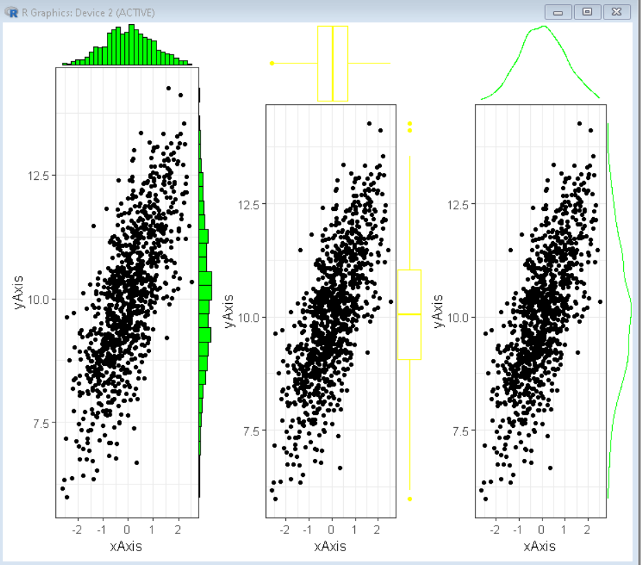
颜色和尺寸定制
我们可以自定义 ggmarginal()函数的参数来为我们的边缘图创建所需的外观。我们可以使用 ggmarginal()函数的大小、填充和颜色参数来分别改变边缘图的相对大小、背景填充颜色和常规颜色。
Syntax: ggMarginal( plot, type, fill, color, size )
Parameters:
- plot: Determines the base scatter plot over which marginal plot has to be added.
- type: Determines the type of marginal plot i.e. histogram, boxplot, and density.
- fill: Determines the background fill color of the marginal plot
- color: Determines the outline color of the marginal plot
- size: determines the relative size of plot elements.
示例:在这里,我们使用自定义颜色和大小参数修改了上面示例中的绘图。
R
# load library tidyverse, gridExtra and ggExtra
library(tidyverse)
library(ggExtra)
library(gridExtra)

# set theme
theme_set(theme_bw(12))

# create x and y vector
xAxis <- rnorm(1000)
yAxis <- rnorm(1000) + xAxis + 10

# create sample data frame
sample_data <- data.frame(xAxis, yAxis)

# create scatter plot using ggplot() function
plot <- ggplot(sample_data, aes(x=xAxis, y=yAxis))+
          geom_point()+
        theme(legend.position="none")

# use ggMarginal function to create
# marginal histogram, boxplot and density plot
# fill, colo and size property is used for customization
plot1 <- ggMarginal(plot, type="histogram", fill= "green", size=10)
plot2 <- ggMarginal(plot, type="boxplot", color="yellow" )
plot3 <- ggMarginal(plot, type="density", color="green")

# combine plots in a grid
grid.arrange( plot1, plot2, plot3, ncol=3)
输出:
仅一个轴的边际图
有时我们只需要在 x 轴或 y 轴的一个轴上绘制边缘图。在这种情况下,我们使用 ggmarginal()函数的边距参数。我们希望边际图出现的轴作为参数边距的值给出。
Syntax: ggMarginal( plot, type, margins )
Parameters:
- plot: Determines the base scatter plot over which marginal plot has to be added.
- type: Determines the type of marginal plot i.e. histogram, boxplot, and density.
- margins: Determines the axis where the marginal plot is required
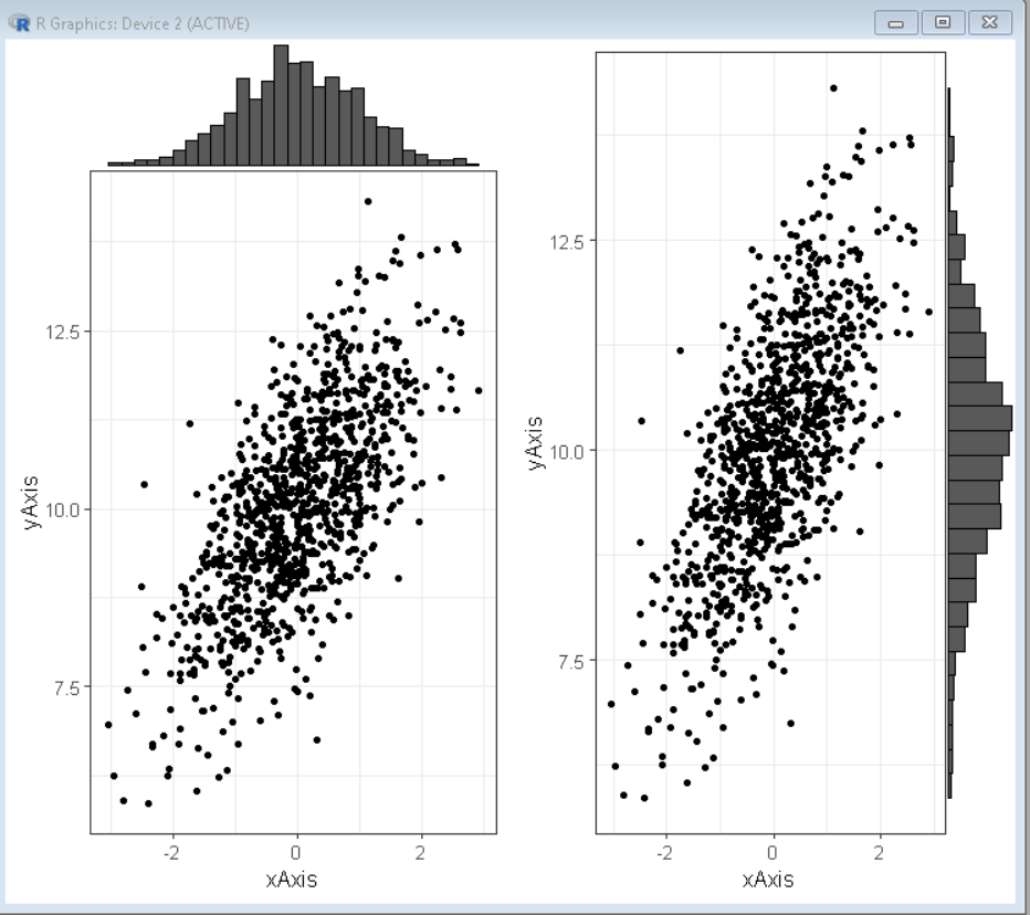
示例:这里有两个图,其中一个在 x 轴上,另一个在 y 轴上。
R
# load library tidyverse, gridExtra and ggExtra
library(tidyverse)
library(ggExtra)
library(gridExtra)

# set theme
theme_set(theme_bw(12))

# create x and y vector
xAxis <- rnorm(1000)
yAxis <- rnorm(1000) + xAxis + 10

# create sample data frame
sample_data <- data.frame(xAxis, yAxis)

# create scatter plot using ggplot() function
plot <- ggplot(sample_data, aes(x=xAxis, y=yAxis))+
          geom_point()+
        theme(legend.position="none")

# use ggMarginal function to create
# marginal histogram on x-axis
plot1 <- ggMarginal(plot, type="histogram", margins='x')

# use ggMarginal function to
# create marginal histogram on y-axis
plot2 <- ggMarginal(plot, type="histogram", margins='y')

# combine plots in a grid
grid.arrange( plot1, plot2, ncol=2)
输出: