基础 CSS 默认媒体查询
Foundation CSS是由 ZURB 基金会于 2011 年 9 月构建的开源和响应式前端框架,它使设计美观的响应式网站、应用程序和电子邮件变得容易,这些网站、应用程序和电子邮件看起来很棒并且可以在任何设备上访问。该框架建立在类似 SaaS 的引导程序之上。它更加复杂、灵活且易于定制。它还带有 CLI,因此很容易与模块捆绑器一起使用。它提供了 Fastclick.js 工具,用于在移动设备上更快地呈现。它被许多公司使用,例如 Facebook、eBay、Mozilla、Adobe,甚至迪士尼。该框架建立在类似 SaaS 的引导程序之上。它更加复杂、灵活且易于定制。它还带有 CLI,因此很容易与模块捆绑器一起使用。它提供了 Fastclick.js 工具,用于在移动设备上更快地呈现。
基础 CSS媒体查询包括媒体功能,如宽度、高度、颜色,并根据指定的屏幕分辨率显示内容。简而言之,此功能使响应式设计真正起作用。
默认媒体查询: Foundation 使用以下默认媒体查询,它们是三个核心断点:
- small:此媒体查询断点类适用于任何屏幕。
- medium:此媒体查询断点类适用于 640 像素或更宽的屏幕。
- large:这个媒体查询断点类适用于 1024 像素或更宽的屏幕。
但是,可以使用特殊的断点类在不同的屏幕尺寸下修改许多组件。最常见的例子之一是网格。在下面的代码中,左侧列在小屏幕上是六列宽,因此是 .small-6 。在中型屏幕上, .medium-4类覆盖了小样式,因此将列更改为四列宽。
句法:
...
CSS 版本:如果您使用的是 Foundation CSS 的 CSS 版本,则必须使用以下媒体查询来遵循核心断点:
/* Small only */
@media screen and (max-width: 39.9375em) {}
/* Medium and up */
@media screen and (min-width: 40em) {}
/* Medium only */
@media screen and (min-width: 40em) and (max-width: 63.9375em) {}
/* Large and up */
@media screen and (min-width: 64em) {}
/* Large only */
@media screen and (min-width: 64em) and (max-width: 74.9375em) {}
示例 1:
HTML
Foundation CSS Default Media Queries
GeeksforGeeks
Foundation CSS Default Media Queries
Helloworld This is line 01.
Helloworld This is line 02.
Helloworld This is line 03.
Helloworld This is line 04.
Helloworld This is line 05.
Helloworld This is line 06.
HTML
Foundation CSS Default Media Queries
GeeksforGeeks
Foundation CSS Default Media Queries
Helloworld This is line 01.
Helloworld This is line 02.
Helloworld This is line 03.
Helloworld This is line 04.
Helloworld This is line 05.
Helloworld This is line 06.
输出:
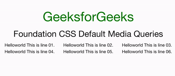
Foundation CSS 默认媒体查询
示例 2:
HTML
Foundation CSS Default Media Queries
GeeksforGeeks
Foundation CSS Default Media Queries
Helloworld This is line 01.
Helloworld This is line 02.
Helloworld This is line 03.
Helloworld This is line 04.
Helloworld This is line 05.
Helloworld This is line 06.
输出:
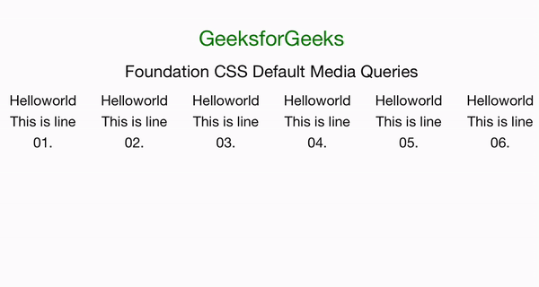
Foundation CSS 默认媒体查询
参考: https://get.foundation/sites/docs/media-queries.html#default-media-queries