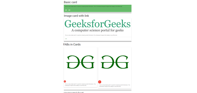
卡片是显示不同类型相关内容的便捷方式。 Materialise 使用卡片来呈现类似的对象,其大小和动作可以根据要求进行更改。这是一张基本卡的例子。
Materialise 根据需求提供不同类型的卡片,名称如下:
- Image Card :它用于在图像缩略图的帮助下的标准卡片。为此卡片图像类添加到卡片类中。
- 卡片中的 FAB :在图像卡片中,可以添加不同大小的浮动操作按钮。
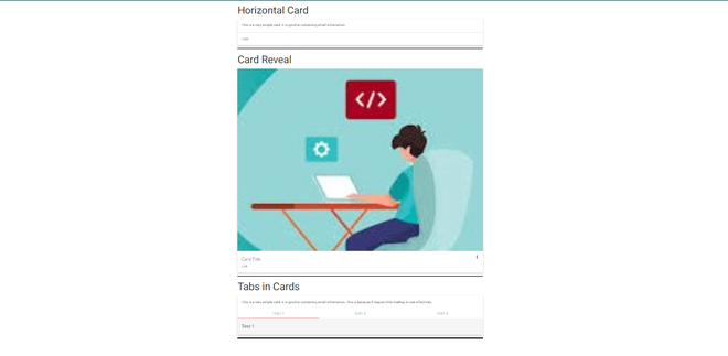
- 水平卡片:在这种情况下,空间被分为两个块,一侧用于图像,另一侧用于信息。
- Cards Reveal :这用于添加可以通过单击访问的额外信息。为此, card-reveal div 被添加到span card-title 类中,并且为了打开卡片显示, activator 类被添加到卡片内的元素中。
- 卡片中的标签:用于在卡片中添加不同的标签。为了添加这一点,在标题和选项卡内容之间添加了cards-tabs 类。
- 卡片面板:这用于需要带有填充和阴影效果的最小标记的简单卡片。
这是一个使用上述所有卡片的示例:
例子:
Basic card
This is a very simple card.
It is good at containing small
information. This is convenient
because It require little markup
to use effectively.
Image card with link

This is a very simple card.
It is good at containing small
information.This is because It
require little markup to use
effectively.
FABs in Cards
This is a very simple
card. It is good at
containing small information.
This is because It require
little markup to use effectively.
This is a very simple card.
It is good at containing small
information. This is because It
require little markup to use
effectively.
Horizontal Card
![]()
This is a very simple card.
It is good at containing
small information.
Card Reveal
![]() Card Title
more_vert
Card Title
close
Card Title
more_vert
Card Title
close
Here is some more information that
will be only revealed once clicked on.
Tabs in Cards
This is a very simple card.
It is good at containing small
information. This is because
It require little markup to use
effectively.
Test 1
Test 2
Test 3
输出:


