📌 相关文章
- 未按下按钮时的 tkinter - Python (1)
- Python Tkinter按钮(1)
- Python Tkinter按钮
- 未按下按钮时的 tkinter - Python 代码示例
- Python Tkinter – 检查按钮小部件
- Python Tkinter – 检查按钮小部件(1)
- tkinter 给按钮 2 个命令 - Python (1)
- tkinter 中的按钮图像 - Python (1)
- Python Tkinter 按钮图像 - Python (1)
- 如何在 tkinter 中添加按钮 - Python (1)
- tkinter 按钮位置 - Python (1)
- tkinter 给按钮 2 个命令 - Python 代码示例
- Python Tkinter 按钮图像 - Python 代码示例
- tkinter 中的按钮图像 - Python 代码示例
- 禁用 tkinter 按钮 - Python (1)
- tkinter 中按钮的功能 - Python (1)
- 如何在 tkinter 中添加按钮 - Python 代码示例
- Python|在 tkinter 中创建一个按钮
- tkinter 按钮位置 - Python 代码示例
- 在 tkinter 上添加一个按钮 - Python (1)
- 单击按钮时 tkinter python (1)
- tkinter - Python (1)
- Python Tkinter
- Python Tkinter(1)
- 禁用 tkinter 按钮 - Python 代码示例
- 中心按钮 tkinter - Python (1)
- Tkinter 如何移动按钮 - Python (1)
- Python Tkinter菜单按钮
- Python Tkinter菜单按钮(1)
📜 Python Tkinter检查按钮
📅 最后修改于: 2020-10-25 03:52:26 🧑 作者: Mango
Python Tkinter检查按钮
Checkbutton用于跟踪提供给应用程序的用户选择。换句话说,我们可以说Checkbutton用于实现开/关选择。
Checkbutton可以包含文本或图像。 Checkbutton主要用于向用户提供许多选择,其中,用户需要选择一个。它通常实现许多选择中的许多选择。
下面给出了使用复选按钮的语法。
句法
w = checkbutton(master, options)
下面列出了可能的选项。
| SN | Option | Description |
|---|---|---|
| 1 | activebackground | It represents the background color when the checkbutton is under the cursor. |
| 2 | activeforeground | It represents the foreground color of the checkbutton when the checkbutton is under the cursor. |
| 3 | bg | The background color of the button. |
| 4 | bitmap | It displays an image (monochrome) on the button. |
| 5 | bd | The size of the border around the corner. |
| 6 | command | It is associated with a function to be called when the state of the checkbutton is changed. |
| 7 | cursor | The mouse pointer will be changed to the cursor name when it is over the checkbutton. |
| 8 | disableforeground | It is the color which is used to represent the text of a disabled checkbutton. |
| 9 | font | It represents the font of the checkbutton. |
| 10 | fg | The foreground color (text color) of the checkbutton. |
| 11 | height | It represents the height of the checkbutton (number of lines). The default height is 1. |
| 12 | highlightcolor | The color of the focus highlight when the checkbutton is under focus. |
| 13 | image | The image used to represent the checkbutton. |
| 14 | justify | This specifies the justification of the text if the text contains multiple lines. |
| 15 | offvalue | The associated control variable is set to 0 by default if the button is unchecked. We can change the state of an unchecked variable to some other one. |
| 16 | onvalue | The associated control variable is set to 1 by default if the button is checked. We can change the state of the checked variable to some other one. |
| 17 | padx | The horizontal padding of the checkbutton |
| 18 | pady | The vertical padding of the checkbutton. |
| 19 | relief | The type of the border of the checkbutton. By default, it is set to FLAT. |
| 20 | selectcolor | The color of the checkbutton when it is set. By default, it is red. |
| 21 | selectimage | The image is shown on the checkbutton when it is set. |
| 22 | state | It represents the state of the checkbutton. By default, it is set to normal. We can change it to DISABLED to make the checkbutton unresponsive. The state of the checkbutton is ACTIVE when it is under focus. |
| 24 | underline | It represents the index of the character in the text which is to be underlined. The indexing starts with zero in the text. |
| 25 | variable | It represents the associated variable that tracks the state of the checkbutton. |
| 26 | width | It represents the width of the checkbutton. It is represented in the number of characters that are represented in the form of texts. |
| 27 | wraplength | If this option is set to an integer number, the text will be broken into the number of pieces. |
方法
下表描述了可以使用“检查按钮”调用的方法。
| SN | Method | Description |
|---|---|---|
| 1 | deselect() | It is called to turn off the checkbutton. |
| 2 | flash() | The checkbutton is flashed between the active and normal colors. |
| 3 | invoke() | This will invoke the method associated with the checkbutton. |
| 4 | select() | It is called to turn on the checkbutton. |
| 5 | toggle() | It is used to toggle between the different Checkbuttons. |
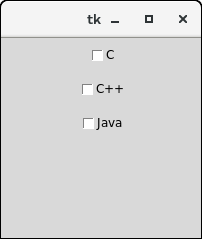
例
from tkinter import *

top = Tk()

top.geometry("200x200")

checkvar1 = IntVar()

checkvar2 = IntVar()

checkvar3 = IntVar()

chkbtn1 = Checkbutton(top, text = "C", variable = checkvar1, onvalue = 1, offvalue = 0, height = 2, width = 10)

chkbtn2 = Checkbutton(top, text = "C++", variable = checkvar2, onvalue = 1, offvalue = 0, height = 2, width = 10)

chkbtn3 = Checkbutton(top, text = "Java", variable = checkvar3, onvalue = 1, offvalue = 0, height = 2, width = 10)

chkbtn1.pack()

chkbtn2.pack()

chkbtn3.pack()

top.mainloop()
输出:
