package com.tutorialspoint.client;
import com.google.gwt.core.client.EntryPoint;
import com.google.gwt.event.dom.client.ClickEvent;
import com.google.gwt.event.dom.client.ClickHandler;
import com.google.gwt.user.client.ui.CheckBox;
import com.google.gwt.user.client.ui.Composite;
import com.google.gwt.user.client.ui.HorizontalPanel;
import com.google.gwt.user.client.ui.RootPanel;
import com.google.gwt.user.client.ui.TextBox;
public class HelloWorld implements EntryPoint {
/**
* A composite of a TextBox and a CheckBox that optionally enables it.
*/
private static class OptionalTextBox extends Composite implements
ClickHandler {
private TextBox textBox = new TextBox();
private CheckBox checkBox = new CheckBox();
private boolean enabled = true;
public boolean isEnabled() {
return enabled;
}
public void setEnabled(boolean enabled) {
this.enabled = enabled;
}
/**
* Style this widget using .optionalTextWidget CSS class.
* Style textbox using .optionalTextBox CSS class.
* Style checkbox using .optionalCheckBox CSS class.
* Constructs an OptionalTextBox with the given caption
* on the check.
* @param caption the caption to be displayed with the check box
*/
public OptionalTextBox(String caption) {
// place the check above the text box using a vertical panel.
HorizontalPanel panel = new HorizontalPanel();
// panel.setBorderWidth(1);
panel.setSpacing(10);
panel.add(checkBox);
panel.add(textBox);
// all composites must call initWidget() in their constructors.
initWidget(panel);
//set style name for entire widget
setStyleName("optionalTextWidget");
//set style name for text box
textBox.setStyleName("optionalTextBox");
//set style name for check box
checkBox.setStyleName("optionalCheckBox");
textBox.setWidth("200");
// Set the check box's caption, and check it by default.
checkBox.setText(caption);
checkBox.setValue(enabled);
checkBox.addClickHandler(this);
enableTextBox(enabled,checkBox.getValue());
}
public void onClick(ClickEvent event) {
if (event.getSource() == checkBox) {
// When the check box is clicked,
//update the text box's enabled state.
enableTextBox(enabled,checkBox.getValue());
}
}
private void enableTextBox(boolean enable,boolean isChecked){
enable = (enable && isChecked) || (!enable && !isChecked);
textBox.setStyleDependentName("disabled", !enable);
textBox.setEnabled(enable);
}
}
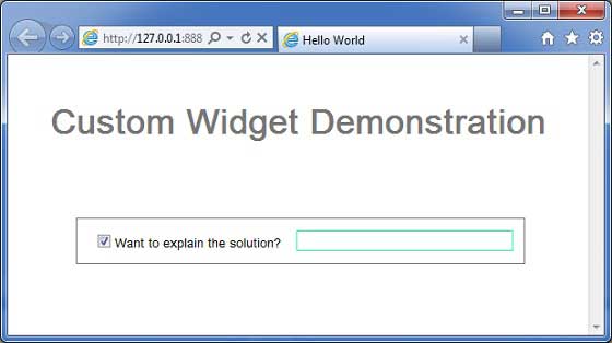
public void onModuleLoad() {
// Create an optional text box and add it to the root panel.
OptionalTextBox otb = new OptionalTextBox(
"Want to explain the solution?");
otb.setEnabled(true);
RootPanel.get().add(otb);
}
}