📌 相关文章
- ASP.Net Web表单示例
- ASP.Net Web表单示例(1)
- asp.net web 表单 - C# 代码示例
- ASP.Net Web表单功能
- ASP.Net Web表单功能(1)
- ASP.NET简介(1)
- ASP.Net简介
- ASP.Net简介(1)
- ASP.NET-简介
- ASP.NET-简介(1)
- ASP.NET简介
- ASP.Net Web表单身份验证
- ASP.Net Web表单身份验证(1)
- ASP.Net Web表单模型绑定
- ASP.Net Web表单模型绑定(1)
- ASP.NET-Web服务
- ASP.NET-Web服务(1)
- ASP.Net Web表单必填字段验证器
- ASP.Net Web表单必填字段验证器(1)
- Asp.net - C# 代码示例
- ASP.NET MVC-Web API(1)
- ASP.NET MVC-Web API
- asp.net 问题 - C# (1)
- 在 asp.net mvc 中保存表单 - C# (1)
- MVC框架-ASP.NET表单(1)
- MVC框架-ASP.NET表单
- ASP.Net Web窗体项目
- ASP.Net Web窗体项目(1)
- 在 asp.net mvc 中保存表单 - C# 代码示例
📜 ASP.Net Web表单简介
📅 最后修改于: 2020-12-27 13:21:53 🧑 作者: Mango
ASP.NET Web表单
Web表单是基于ASP.NET技术构建的网页。它在服务器上执行并生成输出到浏览器。它与任何浏览器兼容.NET公共语言运行时支持的任何语言。它很灵活,允许我们创建和添加自定义控件。
我们可以使用Visual Studio创建ASP.NET Web窗体。它是一个IDE(集成开发环境),允许我们将服务器控件拖放到Web表单中。它还允许我们设置控件的属性,事件和方法。要编写业务逻辑,我们可以选择任何.NET语言,例如:Visual Basic或Visual C#。
Web窗体由两个组件组成:可视部分(ASPX文件)和窗体后面的代码(位于单独的类文件中)。

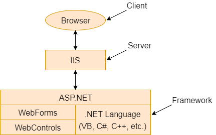
图:此图显示了ASP.NET的组件
Web窗体的主要目的是克服ASP的局限性以及将视图与应用程序逻辑分开。
ASP.NET提供了各种控件,例如:服务器控件和Web窗体的HTML控件。我们在下面列出了所有这些控件。
服务器控件
下表包含Web窗体的服务器端控件。
| Control Name | Applicable Events | Description |
|---|---|---|
| Label | None | It is used to display text on the HTML page. |
| TextBox | TextChanged | It is used to create a text input in the form. |
| Button | Click, Command | It is used to create a button. |
| LinkButton | Click, Command | It is used to create a button that looks similar to the hyperlink. |
| ImageButton | Click | It is used to create an imagesButton. Here, an image works as a Button. |
| Hyperlink | None | It is used to create a hyperlink control that responds to a click event. |
| DropDownList | SelectedIndexChanged | It is used to create a dropdown list control. |
| ListBox | SelectedIndexCnhaged | It is used to create a ListBox control like the HTML control. |
| DataGrid | CancelCommand, EditCommand, DeleteCommand, ItemCommand, SelectedIndexChanged, PageIndexChanged, SortCommand, UpdateCommand, ItemCreated, ItemDataBound | It used to create a frid that is used to show data. We can also perform paging, sorting, and formatting very easily with this control. |
| DataList | CancelCommand, EditCommand, DeleteCommand, ItemCommand, SelectedIndexChanged, UpdateCommand, ItemCreated, ItemDataBound | It is used to create datalist that is non-tabular and used to show data. |
| Repeater | ItemCommand, ItemCreated, ItemDataBound | It allows us to create a non-tabular type of format for data. You can bind the data to template items, which are like bits of HTML put together in a specific repeating format. |
| CheckBox | CheckChanged | It is used to create checkbox. |
| CheckBoxList | SelectedIndexChanged | It is used to create a group of check boxes that all work together. |
| RadioButton | CheckChanged | It is used to create radio button. |
| RadioButtonList | SelectedIndexChanged | It is used to create a group of radio button controls that all work together. |
| Image | None | It is used to show image within the page. |
| Panel | None | It is used to create a panel that works as a container. |
| PlaceHolder | None | It is used to set placeholder for the control. |
| Calendar | SelectionChanged, VisibleMonthChanged, DayRender | It is used to create a calendar. We can set the default date, move forward and backward etc. |
| AdRotator | AdCreated | It allows us to specify a list of ads to display. Each time the user re-displays the page. |
| Table | None | It is used to create table. |
| XML | None | It is used to display XML documents within the HTML. |
| Literal | None | It is like a label in that it displays a literal, but allows us to create new literals at runtime and place them into this control. |
HTML控件
这些控件由浏览器呈现。我们还可以将HTML控件作为服务器控件。我们将在本教程的进一步内容中对此进行讨论。
| Controls Name | Description |
|---|---|
| Button | It is used to create HTML button. |
| Reset Button | Resets all other HTML form elements on a form to a default value |
| Submit Button | Automatically POSTs the form data to the specified page listed in the Action attribute in the FORM tag |
| Text Field | Gives the user an input area on an HTML form |
| Text Area | Used for multi-line input on an HTML form |
| File Field | Places a text field and a Browse button on a form and allows the user to select a file name from their local machine when the Browse button is clicked |
| Password Field | An input area on an HTML form, although any characters typed into this field are displayed as asterisks |
| CheckBox | Gives the user a check box that they can select or clear |
| Radio Button | Used two or more to a form, and allows the user to choose one of the controls |
| Table | Allows you to present information in a tabular format |
| Image | Displays an image on an HTML form |
| ListBox | Displays a list of items to the user. You can set the size from two or more to specify how many items you wish show. If there are more items than will fit within this limit, a scroll bar is automatically added to this control. |
| Dropdown | Displays a list of items to the user, but only one item at a time will appear. The user can click a down arrow from the side of this control and a list of items will be displayed. |
| Horizontal Rule | Displays a horizontal line across the HTML page |