如何在 R 中创建相关热图
在本文中,让我们看看如何在 R 编程语言中绘制相关热图。
分析数据通常涉及对每个特征及其相互关联的详细分析。找出每个特征之间关系的强度,或者换句话说,两个变量如何相互关联是至关重要的。如果变量在同一方向上一起增长,则为正相关,否则为负相关。这种相关性可以通过各种图表(例如散点图等)进行可视化。
加载数据中
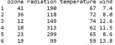
让我们加载环境数据集并使用 head()函数查看前 6 行数据。
R
# Loading package,data and
# viwing 1st 6 rows of data

install.packages("lattice")
library(lattice)

# Load the New York City
# environmental dataset.
data(environmental)

data <-environmental
head(data)
R
# create a coorelation matrix of the data

# rounding to 2 decimal places
corr_mat <- round(cor(data),2)
head(corr_mat)
R
# Install and load reshape2 package
install.packages("reshape2")
library(reshape2)

# creating correlation matrix
corr_mat <- round(cor(data),2)

# reduce the size of correlation matrix
melted_corr_mat <- melt(corr_mat)
# head(melted_corr_mat)

# plotting the correlation heatmap
library(ggplot2)
ggplot(data = melted_corr_mat, aes(x=Var1, y=Var2,
                                   fill=value)) +
geom_tile()
R
# Code to plot a reorederd heatmap

# Install and load reshape2 package
install.packages("reshape2")
library(reshape2)

# creating correlation matrix
corr_mat <- round(cor(data),2)

# reorder corr matrix
# using corr coefficient as distance metric
dist <- as.dist((1-corr_mat)/2)

# hierarchical clustering the dist matrix
hc <- hclust(dist)
corr_mat <-corr_mat[hc$order, hc$order]

# reduce the size of correlation matrix
melted_corr_mat <- melt(corr_mat)
#head(melted_corr_mat)

#plotting the correlation heatmap
library(ggplot2)
ggplot(data = melted_corr_mat, aes(x=Var1, y=Var2, fill=value)) +
geom_tile()
R
# Install and load reshape2 package
install.packages("reshape2")
library(reshape2)

# creating correlation matrix
corr_mat <- round(cor(data),2)

# reduce the size of correlation matrix
melted_corr_mat <- melt(corr_mat)
head(melted_corr_mat)

# plotting the correlation heatmap
library(ggplot2)
ggplot(data = melted_corr_mat, aes(x=Var1, y=Var2,
                                   fill=value)) +
geom_tile() +
geom_text(aes(Var2, Var1, label = value),
          color = "black", size = 4)
R
# Load and install heatmaply package
install.packages("heatmaply")
library(heatmaply)

# plotting corr heatmap
heatmaply_cor(x = cor(data), xlab = "Features",
              ylab = "Features", k_col = 2, k_row = 2)
R
# load and install ggcorplot
install.packages("ggcorplot")
library(ggcorrplot)

# plotting corr heatmap
ggcorrplot::ggcorrplot(cor(data))
R
# get the corr matrix
corr_mat <- round(cor(data),2)

# replace NA with upper triangle matrix
corr_mat[upper.tri(corr_mat)] <- NA

# reduce the corr matrix
melted_corr_mat <- melt(corr_mat)

# plotting the corr heatmap
library(ggplot2)
ggplot(data = melted_corr_mat, aes(x=Var1,
                                   y=Var2,
                                   fill=value)) +
  geom_tile()
R
# get the corr matrix
corr_mat <- round(cor(data),2)

# replace NA with lower triangle matrix
corr_mat[lower.tri(corr_mat)] <- NA

# reduce the corr matrix
melted_corr_mat <- melt(corr_mat)

# plotting the corr heatmap
library(ggplot2)
ggplot(data = melted_corr_mat, aes(x=Var1, y=Var2,
                                   fill=value)) +
  geom_tile()
R
# install and load the plotly package
install.packages("plotly")
library(plotly)
library(ggcorrplot)

# create corr matrix and
# coressponding p-value matrix
corr_mat <- round(cor(data),2)
p_mat <- cor_pmat(data)

# plotting the interactive corr heatmap
corr_mat <- ggcorrplot(
  corr_mat, hc.order = TRUE, type = "lower",
  outline.col = "white",
  p.mat = p_mat
)

ggplotly(corr_mat)输出:
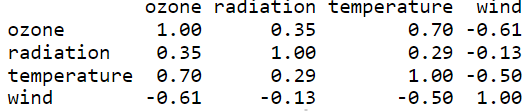
创建相关矩阵
让我们使用 cor()函数为我们的数据创建一个相关矩阵,并将每个值四舍五入到小数点后 2 位。该矩阵可用于轻松创建热图。
R
# create a coorelation matrix of the data

# rounding to 2 decimal places
corr_mat <- round(cor(data),2)
head(corr_mat)
输出:
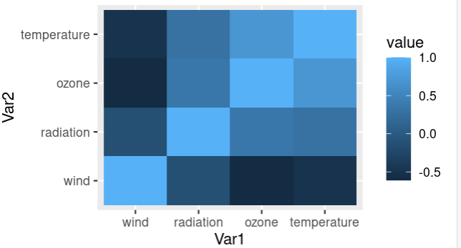
使用 ggplot2 的相关热图
使用 ggplot2 让我们在热图上可视化相关矩阵。
Function: ggplot(data = NULL, mapping = aes(), … , environment = parent.frame())
Arguments:
- data – Default dataset to use for plot.
- mapping – Default list of aesthetic mappings to use for plot
- environment – DEPRECATED. Used prior to tidy evaluation
让我们通过使用 melt()函数绘制热图并使用 ggplot 绘制热图来减小相关矩阵的大小。从这个热图中,我们可以很容易地解释哪些变量/特征更相关,并将它们用于深入的数据分析。 ggplot函数采用简化的相关矩阵和美学映射。
R
# Install and load reshape2 package
install.packages("reshape2")
library(reshape2)

# creating correlation matrix
corr_mat <- round(cor(data),2)

# reduce the size of correlation matrix
melted_corr_mat <- melt(corr_mat)
# head(melted_corr_mat)

# plotting the correlation heatmap
library(ggplot2)
ggplot(data = melted_corr_mat, aes(x=Var1, y=Var2,
                                   fill=value)) +
geom_tile()
输出:

重新排序相关矩阵并绘制热图
根据系数对相关矩阵进行重新排序或排序有助于我们轻松识别特征/变量之间的模式。让我们看看如何使用 hclust( )函数通过对特征进行分层聚类(分层聚类)来重新排序相关矩阵。
R
# Code to plot a reorederd heatmap

# Install and load reshape2 package
install.packages("reshape2")
library(reshape2)

# creating correlation matrix
corr_mat <- round(cor(data),2)

# reorder corr matrix
# using corr coefficient as distance metric
dist <- as.dist((1-corr_mat)/2)

# hierarchical clustering the dist matrix
hc <- hclust(dist)
corr_mat <-corr_mat[hc$order, hc$order]

# reduce the size of correlation matrix
melted_corr_mat <- melt(corr_mat)
#head(melted_corr_mat)

#plotting the correlation heatmap
library(ggplot2)
ggplot(data = melted_corr_mat, aes(x=Var1, y=Var2, fill=value)) +
geom_tile()
输出:
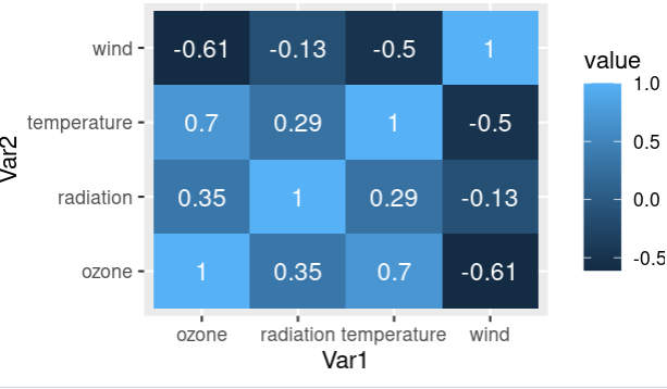
将相关系数添加到热图
相关系数是表示两个变量之间关系有多强的度量。系数的绝对值越高,相关性越高。
让我们使用相关矩阵中的“值”列作为文本来可视化相关热图以及地图上的相关系数。使用 geom_text()函数可以在热图上添加注释并使用“值”作为标签。
R
# Install and load reshape2 package
install.packages("reshape2")
library(reshape2)

# creating correlation matrix
corr_mat <- round(cor(data),2)

# reduce the size of correlation matrix
melted_corr_mat <- melt(corr_mat)
head(melted_corr_mat)

# plotting the correlation heatmap
library(ggplot2)
ggplot(data = melted_corr_mat, aes(x=Var1, y=Var2,
                                   fill=value)) +
geom_tile() +
geom_text(aes(Var2, Var1, label = value),
          color = "black", size = 4)
输出:
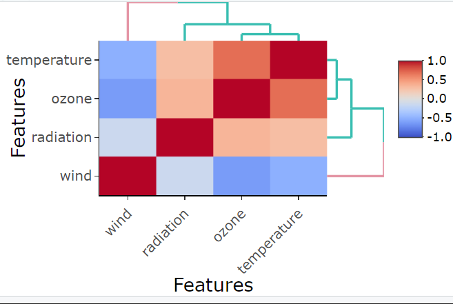
使用热图的相关热图
让我们使用 R 中的 heatmaply 包,使用 heatmaply_cor()函数绘制相关热图。数据的相关性是输入矩阵,“特征”列作为 x 和 y 轴参数。
Function: heatmaply_cor(x, limits = c(-1, 1), xlab, ylab, colors = cool_warm,k_row, k_col …)
Arguments:
- x – can either be a heatmapr object, or a numeric matrix
- limits – a two dimensional numeric vector specifying the data range for the scale
- colors – a vector of colors to use for heatmap color
- k_row – an integer scalar with the desired number of groups by which to color the dendrogram’s
- branches in the rows
- k_col – an integer scalar with the desired number of groups by which to color the dendrogram’s branches in the columns
- xlab – A character title for the x axis.
- ylab – A character title for the y axis.
R
# Load and install heatmaply package
install.packages("heatmaply")
library(heatmaply)

# plotting corr heatmap
heatmaply_cor(x = cor(data), xlab = "Features",
              ylab = "Features", k_col = 2, k_row = 2)
输出:
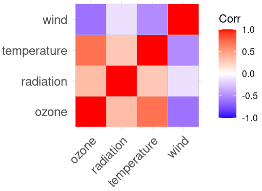
使用 ggcorplot 的相关热图
让我们使用 R 中的 ggcorplot 包使用 ggcorrplot()函数绘制相关热图。数据的相关矩阵作为输入 corr 矩阵给出。
Function: ggcorrplot(corr,method = c(“square”, “circle”) … )
Arguments:
- corr – the correlation matrix to visualize
- method – character, the visualization method of correlation matrix to be used
R
# load and install ggcorplot
install.packages("ggcorplot")
library(ggcorrplot)

# plotting corr heatmap
ggcorrplot::ggcorrplot(cor(data))
输出:
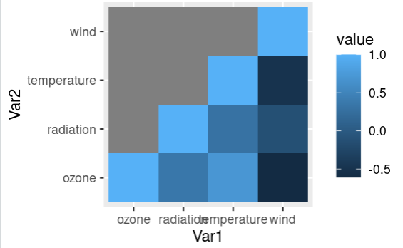
绘制相关热图的下三角形
让我们看看如何绘制相关热图的下三角形并将其可视化。这可以通过将相关矩阵的上三角值替换为 NA 来完成,然后通过熔化过程减少该矩阵并绘制出来。
R
# get the corr matrix
corr_mat <- round(cor(data),2)

# replace NA with upper triangle matrix
corr_mat[upper.tri(corr_mat)] <- NA

# reduce the corr matrix
melted_corr_mat <- melt(corr_mat)

# plotting the corr heatmap
library(ggplot2)
ggplot(data = melted_corr_mat, aes(x=Var1,
                                   y=Var2,
                                   fill=value)) +
  geom_tile()
输出:
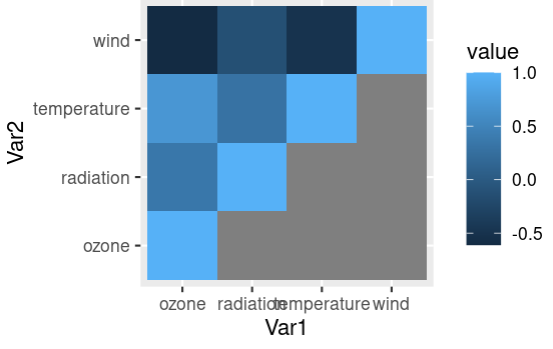
绘制相关热图的上三角形
让我们看看如何绘制相关热图的上三角形并将其可视化。这可以通过将相关矩阵的下三角值替换为 NA 来完成,然后通过熔化过程减少该矩阵并绘制出来。
R
# get the corr matrix
corr_mat <- round(cor(data),2)

# replace NA with lower triangle matrix
corr_mat[lower.tri(corr_mat)] <- NA

# reduce the corr matrix
melted_corr_mat <- melt(corr_mat)

# plotting the corr heatmap
library(ggplot2)
ggplot(data = melted_corr_mat, aes(x=Var1, y=Var2,
                                   fill=value)) +
  geom_tile()
输出:
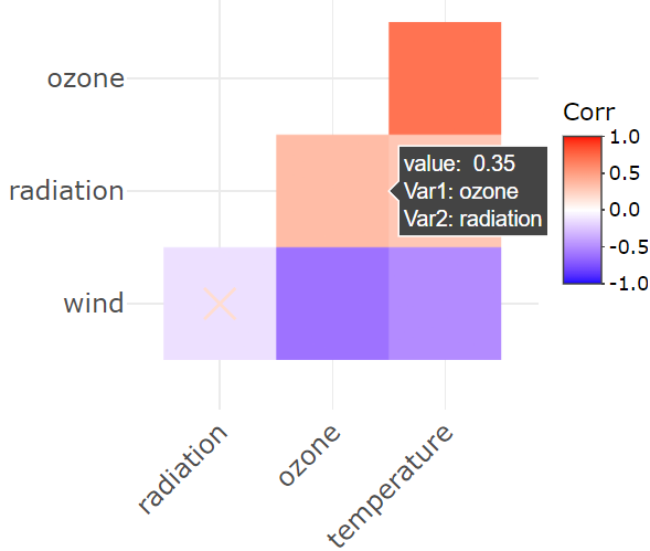
创建交互式相关热图
当用户将鼠标悬停在绘图上时,交互式绘图会显示每个数据点的详细信息。让我们看看如何使用相关矩阵和 p 值矩阵绘制交互式相关热图。 ggplotly( )函数接受数据的相关矩阵并给出交互式热图,并且可以在将鼠标悬停在地图上时查看详细信息。
Function: ggplotly( p = ggplot2::last_plot(), width = NULL, height = NULL … )
Arguments:
- p – a ggplot object
- width – Width of the plot in pixels (optional, defaults to automatic sizing)
- height – Height of the plot in pixels (optional, defaults to automatic sizing)
R
# install and load the plotly package
install.packages("plotly")
library(plotly)
library(ggcorrplot)

# create corr matrix and
# coressponding p-value matrix
corr_mat <- round(cor(data),2)
p_mat <- cor_pmat(data)

# plotting the interactive corr heatmap
corr_mat <- ggcorrplot(
  corr_mat, hc.order = TRUE, type = "lower",
  outline.col = "white",
  p.mat = p_mat
)

ggplotly(corr_mat)
输出: