在 R 中使用 ggplot2 散点图综合指南
在本文中,我们将了解如何在 R 编程语言中使用 ggplot2 使用散点图。
ggplot2 包是 R 语言中广泛使用的免费、开源、易用的可视化包。它是 Hadley Wickham 编写的最强大的可视化包。这个包可以使用 R函数install.packages() 安装。
install.packages("ggplot2")散点图使用点来表示两个不同数值变量的值,并用于观察这些变量之间的关系。要绘制散点图,我们将使用geom_point()函数。以下是有关 ggplot函数geom_point() 的简要信息。
Syntax : geom_point(size, color, fill, shape, stroke)
Parameter :
- size : Size of Points
- color : Color of Points/Border
- fill : Color of Points
- shape : Shape of Points in in range from 0 to 25
- stroke : Thickness of point border
- Return : It creates scatterplots.
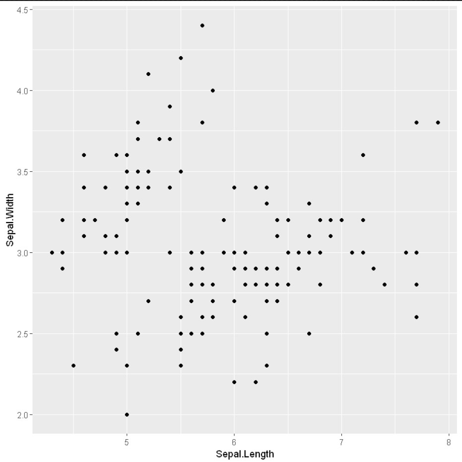
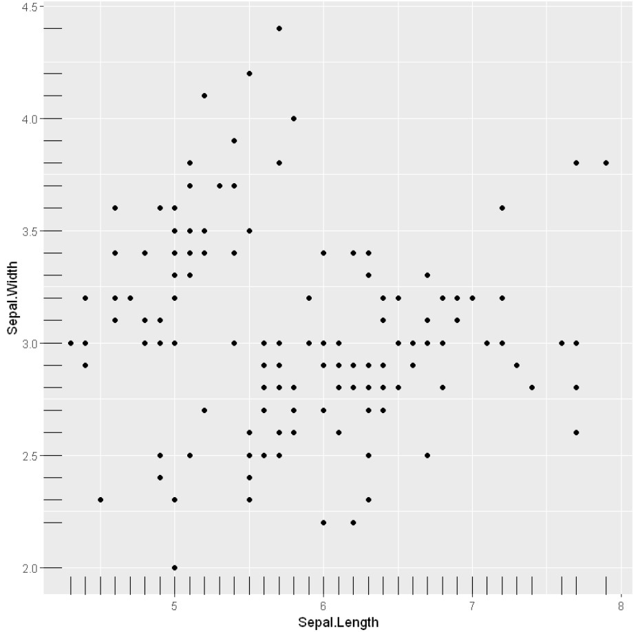
示例:简单散点图
R
library(ggplot2)
ggplot(iris, aes(x = Sepal.Length, y = Sepal.Width)) +
    geom_point()
R
# Scatter plot with groups

ggplot(iris, aes(x = Sepal.Length, y = Sepal.Width)) +
    geom_point(aes(color = factor(Sepal.Width)))
R
# Changing color

ggplot(iris) +
    geom_point(aes(x = Sepal.Length,
                   y = Sepal.Width,
                   color = Species))
R
# Changing point shapes in a ggplot scatter plot
# Changing color

ggplot(iris) +
    geom_point(aes(x = Sepal.Length, y = Sepal.Width,
                   shape = Species , color = Species))
R
# Changing the size aesthetic mapping in a
# ggplot scatter plot

ggplot(iris) +
    geom_point(aes(x = Sepal.Length,
                   y = Sepal.Width,
                   size = .5))
R
# Label points in the scatter plot

ggplot(iris, aes(x = Sepal.Length, y = Sepal.Width)) +
    geom_point() +
    geom_text(label=rownames(iris))
R
# Add regression lines with stat_smooth
ggplot(iris, aes(x = Sepal.Length, y = Sepal.Width)) +
    geom_point() +
    stat_smooth(method=lm)
R
# Add regression lines with stat_smooth
ggplot(iris, aes(x = Sepal.Length, y = Sepal.Width)) +
    geom_point() +
    stat_smooth()
R
# Add regression lines with geom_smooth
ggplot(iris, aes(x = Sepal.Length, y = Sepal.Width)) +
    geom_point() +
    geom_smooth()
R
# Add regression lines with geom_smooth
ggplot(iris, aes(x = Sepal.Length, y = Sepal.Width)) +
    geom_point() +
    geom_smooth(method=lm, se=FALSE)
R
# Add regression lines with geom_smooth
ggplot(iris, aes(x = Sepal.Length, y = Sepal.Width)) +
    geom_point() +
    geom_smooth(intercept = 37, slope = -5, color="red",
                 linetype="dashed", size=1.5)
R
# Change the point color/shape/size manually
library(ggplot2)

# Change point shapes and colors manually
ggplot(iris, aes(x = Sepal.Length, y = Sepal.Width, color = Species)) +
    geom_point() +
    geom_smooth(method=lm, se=FALSE, fullrange=TRUE)+
    scale_shape_manual(values=c(3, 16, 17))+
    scale_color_manual(values=c('#999999','#E69F00', '#56B4E9'))+
    theme(legend.position="top")
R
# Add marginal rugs to a scatter plot
# Changing point shapes in a ggplot scatter plot
# Changing color

ggplot(iris) +
    geom_point(aes(x = Sepal.Length, y = Sepal.Width,
                   shape = Species , color = Species))+
    geom_rug()
R
# Add marginal rugs to a scatter plot

ggplot(iris, aes(x = Sepal.Length, y = Sepal.Width)) +
    geom_point()+
    geom_rug()
R
# Scatter plots with the 2d density estimation

ggplot(iris, aes(x = Sepal.Length, y = Sepal.Width)) +
    geom_point()+
    geom_density_2d()
R
ggplot(iris, aes(x = Sepal.Length, y = Sepal.Width)) +
    geom_point()+
    geom_density_2d(alpha = 0.5)+
    geom_density_2d_filled()
R
# Scatter plots with the 2d density estimation

ggplot(iris, aes(x = Sepal.Length, y = Sepal.Width)) +
    geom_point()+
    stat_density_2d()
R
# Scatter plots with ellipses

ggplot(iris, aes(x = Sepal.Length, y = Sepal.Width)) +
    geom_point()+
    stat_ellipse()
输出:
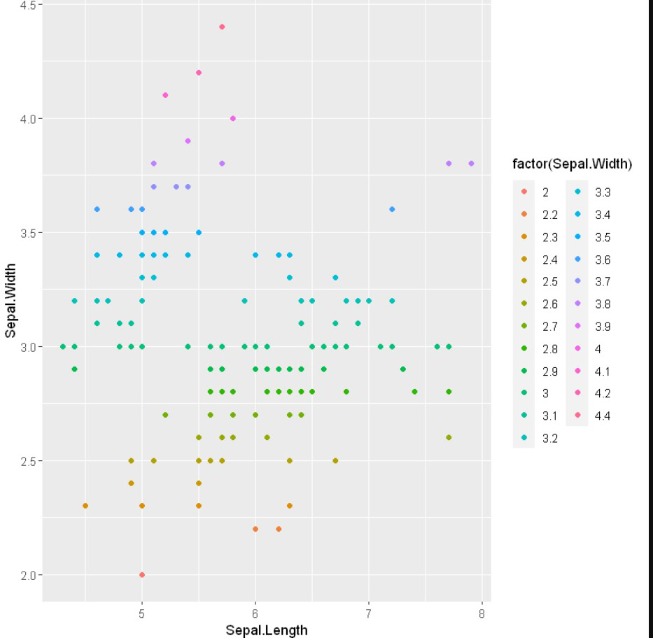
带组的散点图
在这里,我们将使用一组数据(即因子级别数据)来区分值。 aes()函数控制组的颜色,它应该是因子变量。
句法:
aes(color = factor(variable))
示例:包含组的散点图
R
# Scatter plot with groups

ggplot(iris, aes(x = Sepal.Length, y = Sepal.Width)) +
    geom_point(aes(color = factor(Sepal.Width)))
输出:
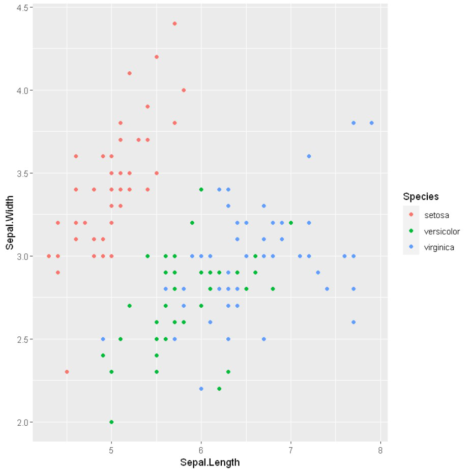
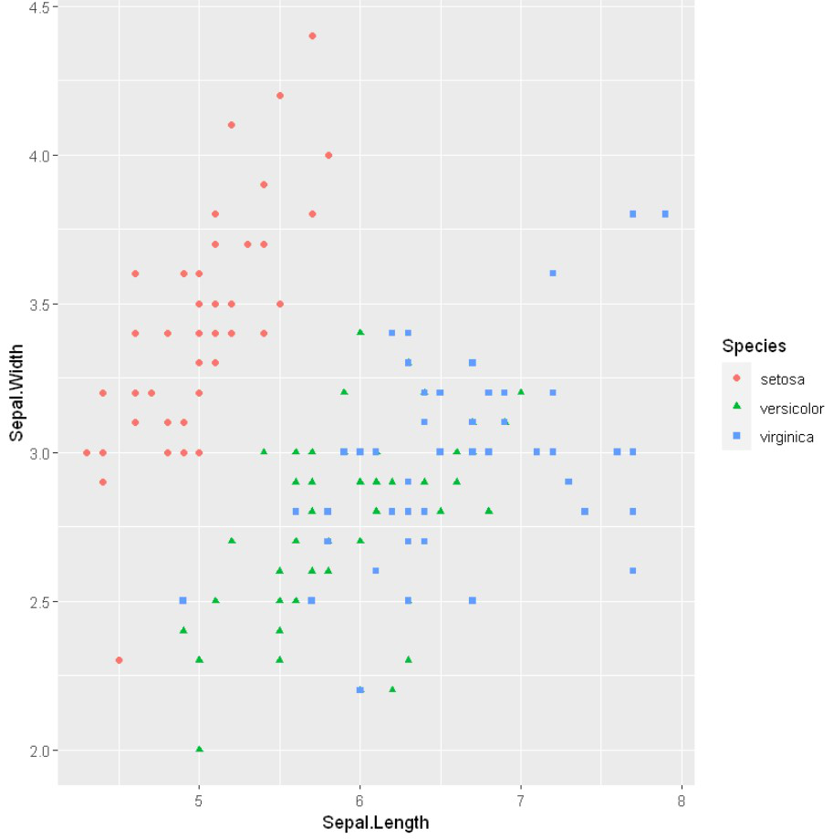
改变颜色
在这里,我们使用aes() 方法颜色属性来更改具有特定变量的数据点的颜色。
示例:更改颜色
R
# Changing color

ggplot(iris) +
    geom_point(aes(x = Sepal.Length,
                   y = Sepal.Width,
                   color = Species))
输出:
改变形状
要更改数据点的形状,我们将使用带有 aes() 方法的形状属性。
示例:改变形状
R
# Changing point shapes in a ggplot scatter plot
# Changing color

ggplot(iris) +
    geom_point(aes(x = Sepal.Length, y = Sepal.Width,
                   shape = Species , color = Species))
输出:
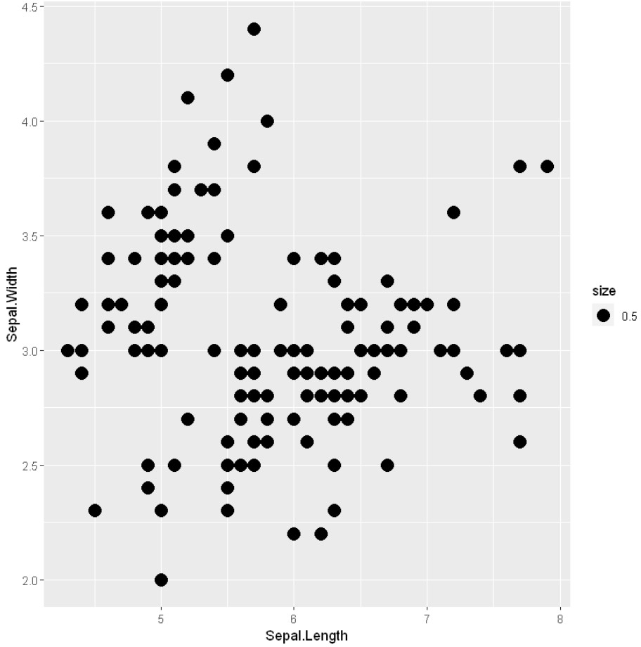
改变尺寸美学
为了改变美学或数据点,我们将在 aes() 方法中使用大小属性。
示例:更改大小
R
# Changing the size aesthetic mapping in a
# ggplot scatter plot

ggplot(iris) +
    geom_point(aes(x = Sepal.Length,
                   y = Sepal.Width,
                   size = .5))
输出:
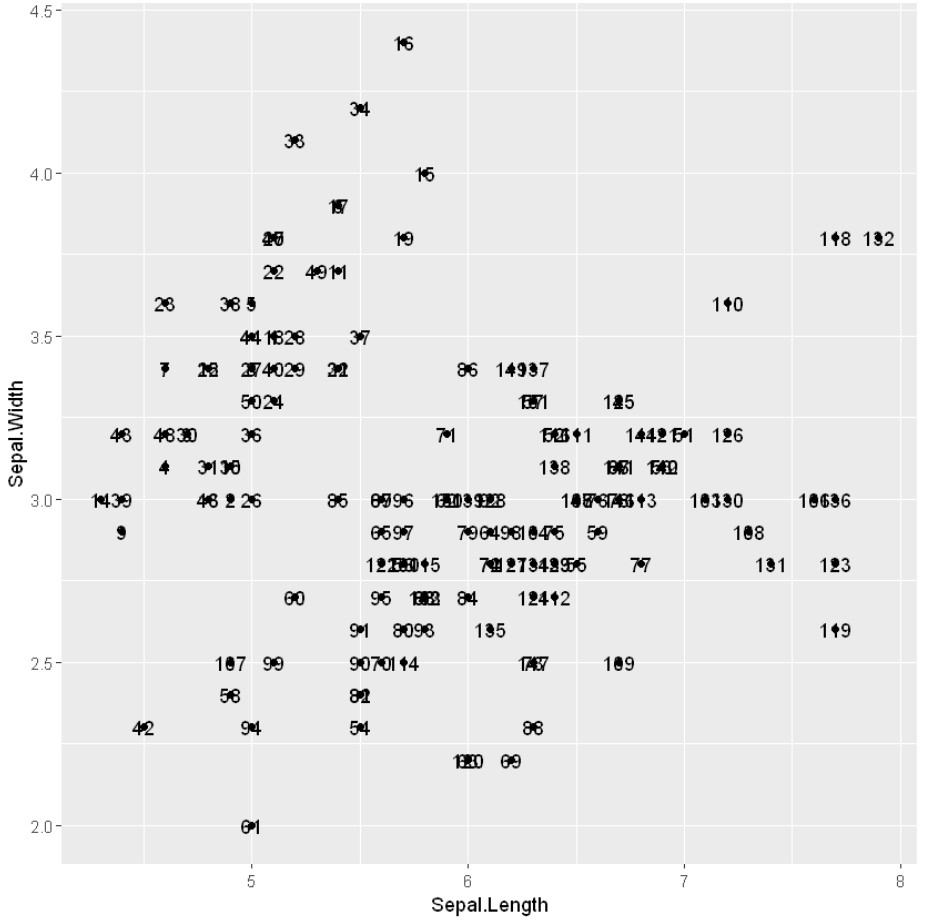
在散点图中标注点
为了在数据点上部署标签,我们将在geom_text() 方法中使用标签。
示例:在散点图中标注点
R
# Label points in the scatter plot

ggplot(iris, aes(x = Sepal.Length, y = Sepal.Width)) +
    geom_point() +
    geom_text(label=rownames(iris))
输出:
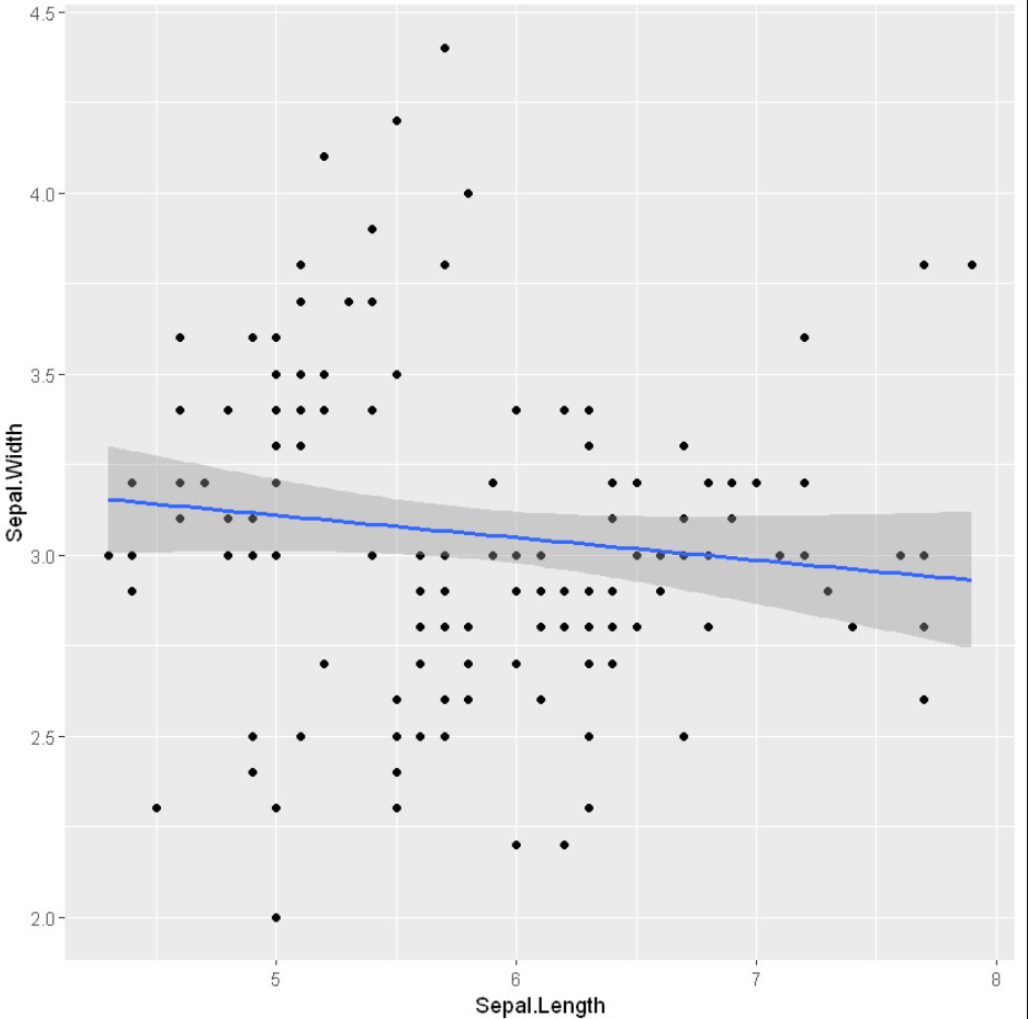
ggplot2中的回归线
回归模型是一个目标预测值支持的独立变量,主要用于找出变量之间的关系和预测。在 R 中,我们可以使用 stat_smooth()函数来平滑可视化。
Syntax: stat_smooth(method=”method_name”, formula=fromula_to_be_used, geom=’method name’)
Parameters:
- method: It is the smoothing method (function) to use for smoothing the line
- formula: It is the formula to use in the smoothing function
- geom: It is the geometric object to use display the data
示例:回归线
R
# Add regression lines with stat_smooth
ggplot(iris, aes(x = Sepal.Length, y = Sepal.Width)) +
    geom_point() +
    stat_smooth(method=lm)
输出:
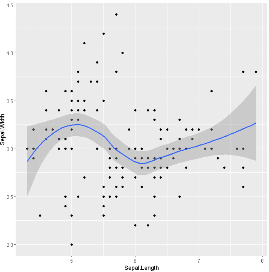
示例:在黄土模式下使用 stat_mooth
R
# Add regression lines with stat_smooth
ggplot(iris, aes(x = Sepal.Length, y = Sepal.Width)) +
    geom_point() +
    stat_smooth()
输出:
geom_smooth()函数来表示回归线并平滑可视化。
Syntax: geom_smooth(method=”method_name”, formula=fromula_to_be_used)
Parameters:
- method: It is the smoothing method (function) to use for smoothing the line
- formula: It is the formula to use in the smoothing function
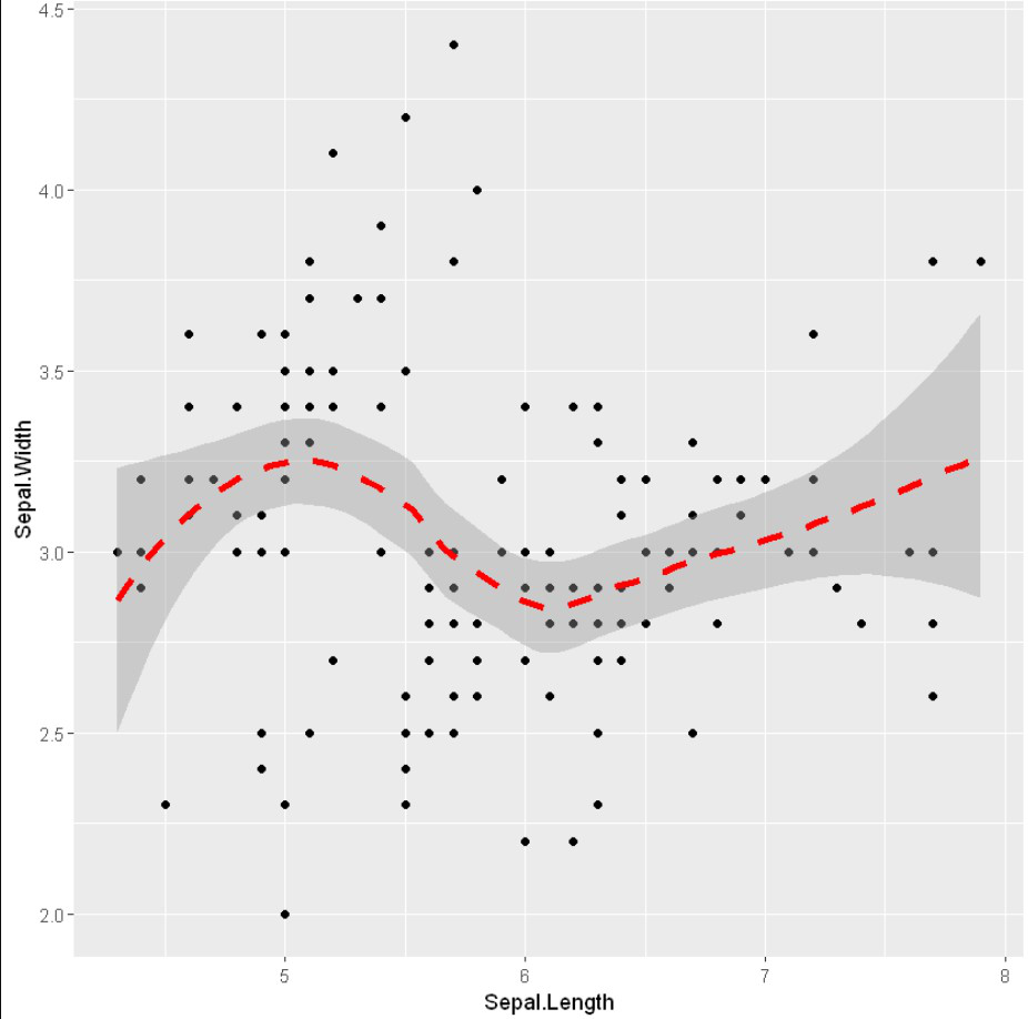
示例:使用 geom_smooth()
R
# Add regression lines with geom_smooth
ggplot(iris, aes(x = Sepal.Length, y = Sepal.Width)) +
    geom_point() +
    geom_smooth()
输出:

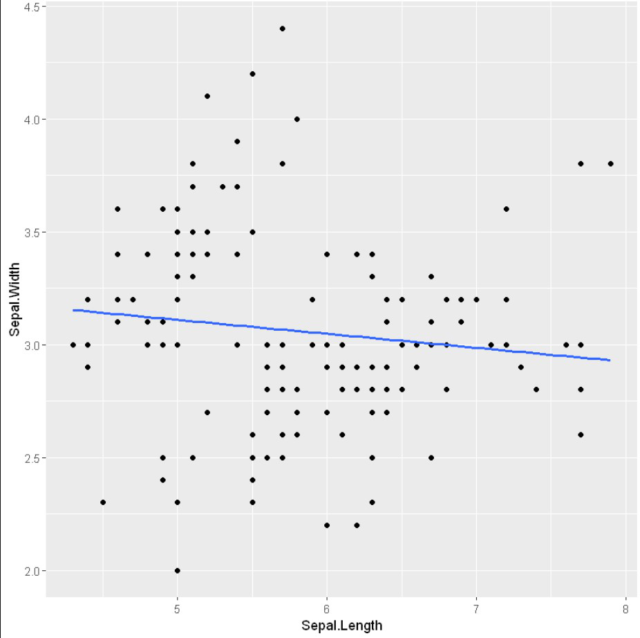
为了借助 geom_smooth()函数在图形介质上显示回归线,我们将方法传递为“loess”,使用的公式为 y ~ x。
示例: geom_smooth 与黄土模式
R
# Add regression lines with geom_smooth
ggplot(iris, aes(x = Sepal.Length, y = Sepal.Width)) +
    geom_point() +
    geom_smooth(method=lm, se=FALSE)
输出:
截距和斜率可以通过 lm()函数轻松计算,该函数用于线性回归,然后是 coefficients()。
示例:截距和坡度
R
# Add regression lines with geom_smooth
ggplot(iris, aes(x = Sepal.Length, y = Sepal.Width)) +
    geom_point() +
    geom_smooth(intercept = 37, slope = -5, color="red",
                 linetype="dashed", size=1.5)
输出:
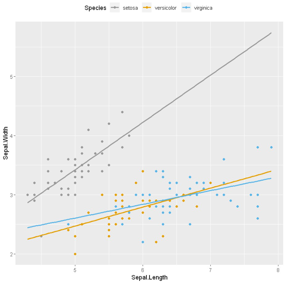
手动更改点颜色/形状/大小
scale_fill_manual、scale_size_manual、scale_shape_manual、scale_linetype_manual 是为分类数据分配所需颜色的内置类型,我们使用其中之一 scale_color_manual()函数,用于缩放(地图)。
Syntax :
- scale_shape_manualValue) for point shapes
- scale_color_manual(Value) for point colors
- scale_size_manual(Value) for point sizes
Parameter :
- values : A set of aesthetic values to map the data. Here we take desired set of colors.
Return : Scale the manual values of colors on data
示例:改变美学
R
# Change the point color/shape/size manually
library(ggplot2)

# Change point shapes and colors manually
ggplot(iris, aes(x = Sepal.Length, y = Sepal.Width, color = Species)) +
    geom_point() +
    geom_smooth(method=lm, se=FALSE, fullrange=TRUE)+
    scale_shape_manual(values=c(3, 16, 17))+
    scale_color_manual(values=c('#999999','#E69F00', '#56B4E9'))+
    theme(legend.position="top")
输出:
边际地毯到散点图
要将边际地毯添加到散点图中,我们将使用 geom_rug() 方法。
示例:边缘地毯
R
# Add marginal rugs to a scatter plot
# Changing point shapes in a ggplot scatter plot
# Changing color

ggplot(iris) +
    geom_point(aes(x = Sepal.Length, y = Sepal.Width,
                   shape = Species , color = Species))+
    geom_rug()
输出:

在这里,我们将边际地毯添加到散点图中
示例:边缘地毯
R
# Add marginal rugs to a scatter plot

ggplot(iris, aes(x = Sepal.Length, y = Sepal.Width)) +
    geom_point()+
    geom_rug()
输出:
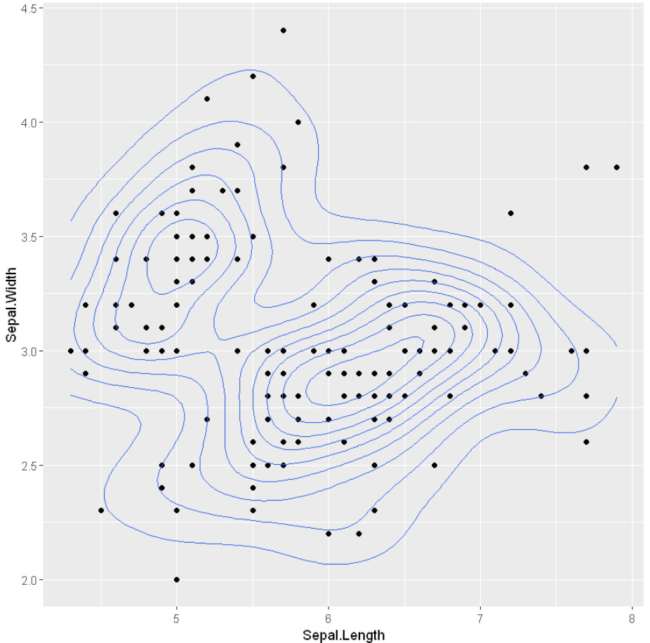
具有二维密度估计的散点图
为了在散点图中创建密度估计,我们将使用ggplot2 中的 geom_density_2d() 方法和 geom_density_2d_filled() 。
Syntax: ggplot( aes(x)) + geom_density_2d( fill, color, alpha)
Parameters:
- fill: background color below the plot
- color: the color of the plotline
- alpha: transparency of graph
示例:具有二维密度估计的散点图
R
# Scatter plots with the 2d density estimation

ggplot(iris, aes(x = Sepal.Length, y = Sepal.Width)) +
    geom_point()+
    geom_density_2d()
输出:
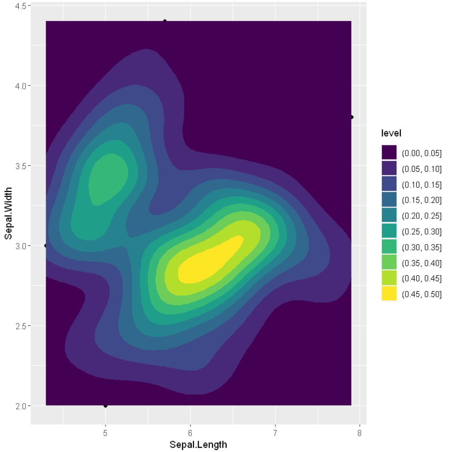
使用 geom_density_2d_filled() 可视化数据点内部的颜色情况
示例:添加美学
R
ggplot(iris, aes(x = Sepal.Length, y = Sepal.Width)) +
    geom_point()+
    geom_density_2d(alpha = 0.5)+
    geom_density_2d_filled()
输出:
stat_density_2d() 也可用于部署二维密度估计。
示例:部署密度估计
R
# Scatter plots with the 2d density estimation

ggplot(iris, aes(x = Sepal.Length, y = Sepal.Width)) +
    geom_point()+
    stat_density_2d()
输出:

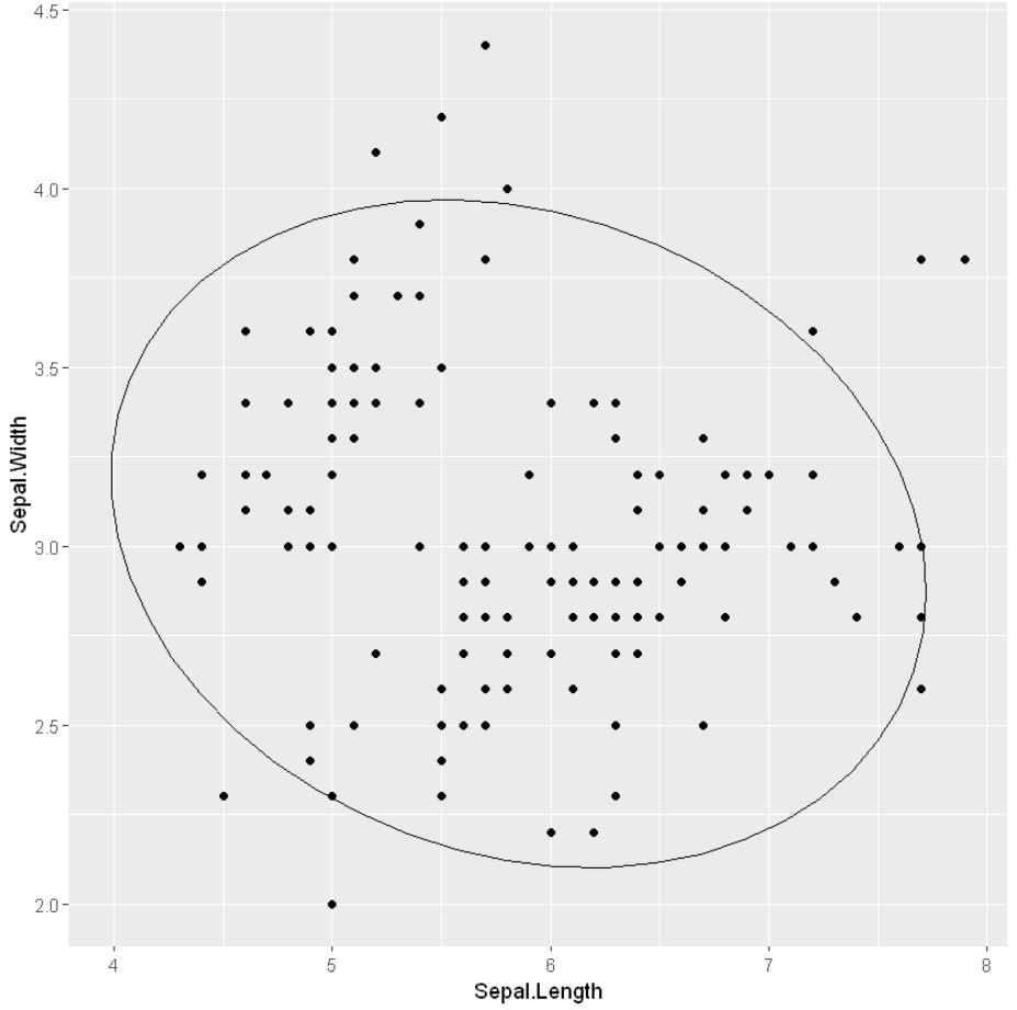
带椭圆的散点图
要在一组数据点周围添加一个圆或椭圆,我们使用 stat_ellipse()函数。此函数自动计算圆/椭圆半径以通过分类数据围绕点簇绘制。
示例:带有椭圆的散点图
R
# Scatter plots with ellipses

ggplot(iris, aes(x = Sepal.Length, y = Sepal.Width)) +
    geom_point()+
    stat_ellipse()
输出: