Plotly-Python 入门
Plotly Python库是一个交互式开源库。这对于数据可视化和简单轻松地理解数据来说是一个非常有用的工具。 plotly 图形对象是 plotly 的高级接口,易于使用。它可以绘制各种类型的图形和图表,如散点图、折线图、条形图、箱线图、直方图、饼图等。
所以你们一定想知道为什么要对其他可视化工具或库进行绘图?这是答案——
- 情节 具有悬停工具功能,使我们能够检测大量数据点中的任何异常值或异常。
- 它 具有视觉吸引力,可以被广泛的观众接受。
- 它允许我们对图表进行无休止的定制,使我们的情节对其他人来说更有意义和更容易理解。
好的,足够的理论让我们开始吧。
安装:
要安装此模块,请在终端中键入以下命令。
pip install plotly入门
让我们使用这个模块创建各种图
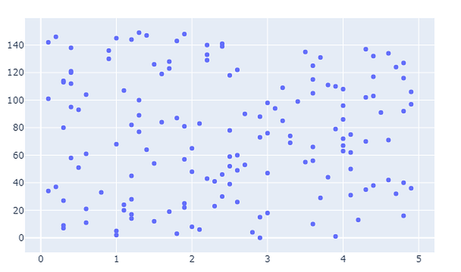
- 散点图:散点图表示两个不同数值变量的值。它们主要用于表示两个变量之间的关系。
Python3
# import all required libraries
import numpy as np
import plotly
import plotly.graph_objects as go
import plotly.offline as pyo
from plotly.offline import init_notebook_mode

init_notebook_mode(connected=True)

# generating 150 random integers
# from 1 to 50
x = np.random.randint(low=1, high=50, size=150)*0.1

# generating 150 random integers
# from 1 to 50
y = np.random.randint(low=1, high=50, size=150)*0.1

# plotting scatter plot
fig = go.Figure(data=go.Scatter(x=x, y=y, mode='markers'))

fig.show()
Python3
# import all required libraries
import numpy as np
import plotly
import plotly.graph_objects as go
import plotly.offline as pyo
from plotly.offline import init_notebook_mode

init_notebook_mode(connected = True)

# countries on x-axis
countries=['India', 'canada',
           'Australia','Brazil',
           'Mexico','Russia',
           'Germany','Switzerland',
           'Texas']

# plotting corresponding y for each
# country in x
fig = go.Figure([go.Bar(x=countries,
                        y=[80,70,60,50,
                           40,50,60,70,80])])

fig.show()
Python3
# import all required libraries
import numpy as np
import plotly
import plotly.graph_objects as go
import plotly.offline as pyo
from plotly.offline import init_notebook_mode

init_notebook_mode(connected = True)

# different individual parts in
# total chart
countries=['India', 'canada',
           'Australia','Brazil',
           'Mexico','Russia',
           'Germany','Switzerland',
           'Texas']

# values corresponding to each
# individual country present in
# countries
values = [4500, 2500, 1053, 500,
          3200, 1500, 1253, 600, 3500]

# plotting pie chart
fig = go.Figure(data=[go.Pie(labels=countries,
                      values=values)])

fig.show()
Python3
# import all required libraries
import numpy as np
import plotly
import plotly.graph_objects as go
import plotly.offline as pyo
from plotly.offline import init_notebook_mode

init_notebook_mode(connected = True)

# save the state of random
np.random.seed(42)

# generating 250 random numbers
x = np.random.randn(250)

# plotting histogram for x
fig = go.Figure(data=[go.Histogram(x=x)])

fig.show()
Python3
# import all required libraries
import numpy as np
import plotly
import plotly.graph_objects as go
import plotly.offline as pyo
from plotly.offline import init_notebook_mode

init_notebook_mode(connected = True)

np.random.seed(42)

# generating 50 random numbers
y = np.random.randn(50)

# generating 50 random numbers
y1 = np.random.randn(50)
fig = go.Figure()

# updating the figure with y
fig.add_trace(go.Box(y=y))

# updating the figure with y1
fig.add_trace(go.Box(y=y1))

fig.show()
输出:
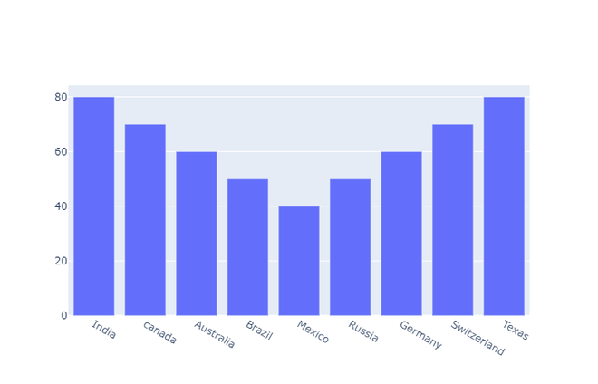
- 条形图:当我们想要比较不同的数据组并推断哪些组最高以及哪些组常见并比较一组与其他组相比的表现时,使用条形图。
Python3
# import all required libraries
import numpy as np
import plotly
import plotly.graph_objects as go
import plotly.offline as pyo
from plotly.offline import init_notebook_mode

init_notebook_mode(connected = True)

# countries on x-axis
countries=['India', 'canada',
           'Australia','Brazil',
           'Mexico','Russia',
           'Germany','Switzerland',
           'Texas']

# plotting corresponding y for each
# country in x
fig = go.Figure([go.Bar(x=countries,
                        y=[80,70,60,50,
                           40,50,60,70,80])])

fig.show()
输出:
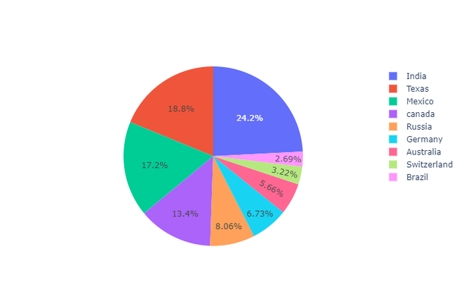
- 饼图:饼图表示不同变量在总数中的分布。在饼图中,每个切片显示其对总量的贡献。
Python3
# import all required libraries
import numpy as np
import plotly
import plotly.graph_objects as go
import plotly.offline as pyo
from plotly.offline import init_notebook_mode

init_notebook_mode(connected = True)

# different individual parts in
# total chart
countries=['India', 'canada',
           'Australia','Brazil',
           'Mexico','Russia',
           'Germany','Switzerland',
           'Texas']

# values corresponding to each
# individual country present in
# countries
values = [4500, 2500, 1053, 500,
          3200, 1500, 1253, 600, 3500]

# plotting pie chart
fig = go.Figure(data=[go.Pie(labels=countries,
                      values=values)])

fig.show()
输出:
- 直方图:直方图将变量的连续分布绘制为一系列条形图,每个条形图表示变量中出现值的频率。为了使用直方图,我们只需要一个采用连续数值的变量
Python3
# import all required libraries
import numpy as np
import plotly
import plotly.graph_objects as go
import plotly.offline as pyo
from plotly.offline import init_notebook_mode

init_notebook_mode(connected = True)

# save the state of random
np.random.seed(42)

# generating 250 random numbers
x = np.random.randn(250)

# plotting histogram for x
fig = go.Figure(data=[go.Histogram(x=x)])

fig.show()
输出:

- 箱线图:箱线图是统计摘要的表示。最小值、第一四分位数、中位数、第三四分位数、最大值。
Python3
# import all required libraries
import numpy as np
import plotly
import plotly.graph_objects as go
import plotly.offline as pyo
from plotly.offline import init_notebook_mode

init_notebook_mode(connected = True)

np.random.seed(42)

# generating 50 random numbers
y = np.random.randn(50)

# generating 50 random numbers
y1 = np.random.randn(50)
fig = go.Figure()

# updating the figure with y
fig.add_trace(go.Box(y=y))

# updating the figure with y1
fig.add_trace(go.Box(y=y1))

fig.show()
输出:
