响应式网页设计基础——媒体查询
媒体查询是一种用于产生响应式设计的 CSS 技术。本质上,它包括条件,响应式设计只有在满足这些条件时才会显示。为什么这很有用?假设您想让所有移动设备上的图像更小,但在所有其他设备(如 iPad、笔记本电脑和台式机)上更大,那么实现这一目标的最佳方法是使用媒体查询。
使用媒体查询的一般方法包括:
CSS
@media only screen and (/*condition goes here */) {
    body {
        /* Conditions goes here */
    }
  }
CSS
@media only screen and (max-width: 500px) {
  body {
    background-color: black;
  }
}
CSS
@media only screen and (min-width: 300px) and (max-width: 500px) {
  body {
    background-color: black;
  }
}
HTML
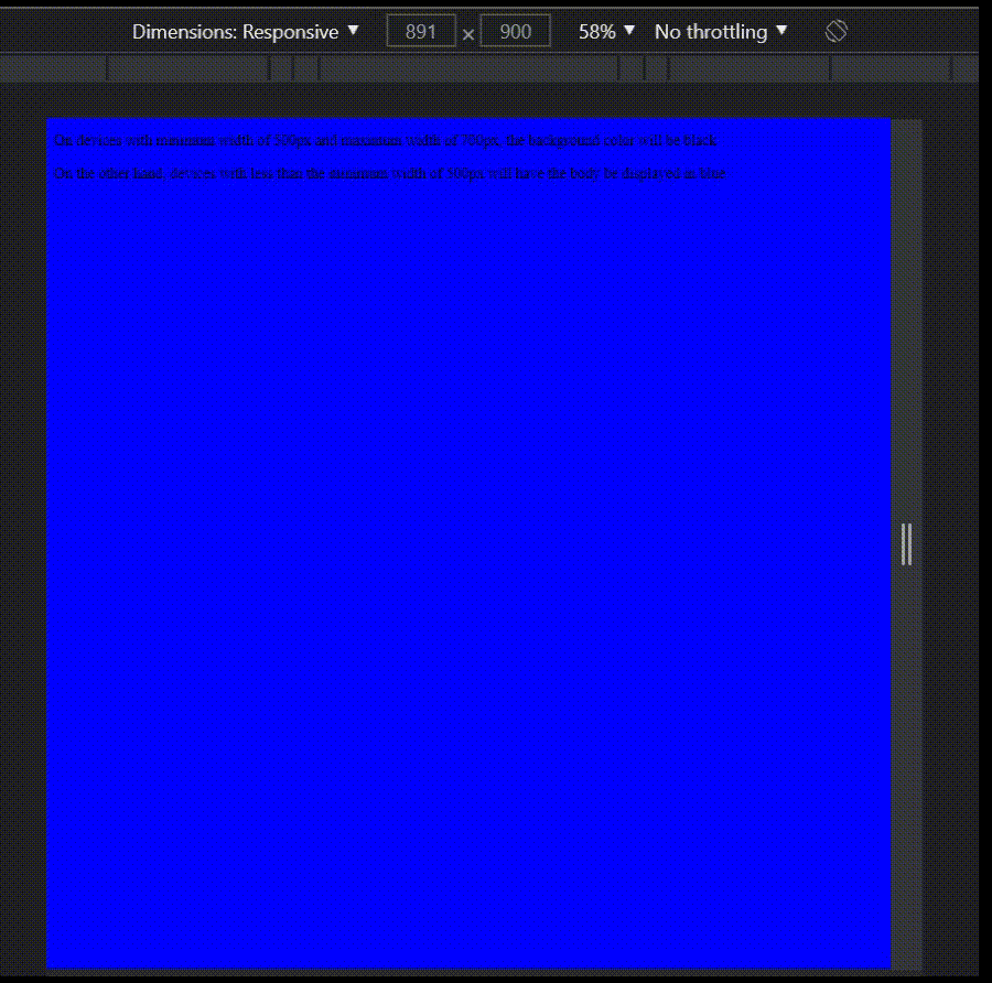
On devices with minimum width of 500px
and maximum width of 700px, the background
color will be black
On the other hand, devices with less than the
minimum width of 500px will have the
body be displayed in blue
说明:以上是调用媒体查询的一般方式。在括号中,我们添加了浏览器窗口的条件,例如您希望浏览器窗口的最小/最大尺寸是多少,以使“正文”中的条件出现。
示例:考虑以下代码:
CSS
@media only screen and (max-width: 500px) {
  body {
    background-color: black;
  }
}
在这种情况下,我们基本上是说使这个条件成立:
body {
    background-color: black;
}当且仅当设备的宽度小于或等于 500px。当然,您可以更改条件并根据自己的意愿进行制作。但是,这是媒体查询如何工作的一般概念。
我们还可以为浏览器的宽度添加另一个条件,考虑以下代码:
CSS
@media only screen and (min-width: 300px) and (max-width: 500px) {
  body {
    background-color: black;
  }
}
在这种情况下,请注意括号中如何给出两个条件?我们基本上是说当且仅当浏览器的最小尺寸为 300 像素且最大为 500 像素时才执行以下代码。因此,如果浏览器窗口小于 300 像素或大于 500 像素,代码将不会执行。它应该在 300 像素和 500 像素(含)之间。这是使用媒体查询来满足您可能拥有的条件的另一种方式。
例子:
HTML
On devices with minimum width of 500px
and maximum width of 700px, the background
color will be black
On the other hand, devices with less than the
minimum width of 500px will have the
body be displayed in blue
输出:当您希望仅在满足有关窗口大小的条件时才执行特定代码时,媒体查询非常有用。例如,如果您希望页面的背景颜色在较大设备上为黑色,而在较小设备上为蓝色,则媒体查询是处理此类情况的最佳方式。