Flutter – 上滑面板
flutter是 Flutter 中底部小部件的向上滑动面板。在许多应用程序中,我们需要使用底部面板显示附加数据。这就是为什么在许多应用程序中使用上滑面板的原因。一个可拖动的Flutter小部件,使实现 SlidingUpPanel 变得更加容易!基于 Material Design 底部表单组件,此小部件适用于 Android 和 iOS。下面给出了一个示例视频,以了解我们将在本文中做什么。
安装
将依赖项添加到pubspec.yaml文件中。

Note: Don’t forget to get the packages.
代码或语法
Dart
SlidingUpPanel(
  body :      // Widget(Column,Row,Center..)
  collapsed : // Widget(Column,Row,Center..)
  panel :     // Widget(Column,Row,Center..)
  )
Dart
@override
Widget build(BuildContext context) {
  return Scaffold(    // returning Scaffold
    appBar: AppBar(   // appbar with title
      title: Text("SlidingUpPanelExample"),
    ),
    // in body we have SlidingUpPanel,
    // panel has center text
    body: SlidingUpPanel(
      panel: Center(
        child: Text("This is the sliding Widget"),
      ),
      // this is main body now,
      // replace by the scaffold body.
      body: Center(
        child: Text("This is the Widget behind the sliding panel"),
      ),
    ),
  );
}
Dart
@override
Widget build(BuildContext context) {
  return Scaffold(   // returning scaffold
    appBar: AppBar(  // appbar with title text.
      title: Text("SlidingUpPanelExample"),
    ),
    // In body we have a SlidingUpPanel,
    body: SlidingUpPanel(
      // panel with centered text
      panel: Center(
        child: Text("This is the sliding Widget"),
      ),
      // collapsed with container
      collapsed: Container(
        color: Colors.blueGrey,
        child: Center(
          child: Text(
            "This is the collapsed Widget",
            style: TextStyle(color: Colors.white),
          ),
        ),
      ),
      // main body
      body: Center(
        child: Text("This is the Widget behind the sliding panel"),
      ),
    ),
  );
}
Dart
@override
Widget build(BuildContext context){
  return Scaffold (  // returning Scaffold.
    appBar: AppBar(  // appbar with title
     title: Text("SlidingUpPanelExample"),
      body: SlidingUpPanel(
      // this is true so that background
      // will be dark when panel open
      backdropEnabled: true,
      // panel with centered text
      panel: Center(
        child: Text("This is the sliding Widget"),
      ),
        // this is the body
        body:  Center(
          child: Text("This is the Widget behind the sliding panel"),
        ),
      ),
    ),
  );
}
Dart
@override
Widget build(BuildContext context) {
  // making radius circular so that panel
  // and collapsed should be circular in border.
  BorderRadiusGeometry radius = BorderRadius.only(
    topLeft: Radius.circular(24.0),
    topRight: Radius.circular(24.0),
  );

  // scaffold with appbar
  return Scaffold(
    appBar: AppBar(
      title: Text("SlidingUpPanelExample"),
    ),
    // SlidingUpPanel with panel and collapsed
    body: SlidingUpPanel(
      panel: Center(
        child: Text("This is the sliding Widget"),
      ),
      collapsed: Container(
        decoration: BoxDecoration(
          color: Colors.blueGrey,
          // changing radius that we define above
          borderRadius:  radius
        ),
        // collapsed text
        child: Center(
          child: Text(
            "This is the collapsed Widget",
            style: TextStyle(color: Colors.white),
          ),
        ),
      ),
      // main body or content behind the panel
      body: Center(
        child: Text("This is the Widget behind the sliding panel"),
      ),
      borderRadius: radius,
    ),
  );
}
Dart
import 'package:flutter/material.dart';
import 'package:sliding_up_panel/sliding_up_panel.dart';
// main app
void main() {
  runApp(SlideUp());
}

class SlideUp extends StatelessWidget {
  SlideUp({Key? key}) : super(key: key);
  // defining border radius
  BorderRadius radius = const BorderRadius.only(
    topLeft: Radius.circular(24),
    topRight: Radius.circular(24),
  );
  @override
  Widget build(BuildContext context) {
    return MaterialApp(   // MaterialApp
      theme: ThemeData(
        primarySwatch: Colors.teal,
      ),
      debugShowCheckedModeBanner: false,
      home: Scaffold(       // scaffold
        appBar: AppBar(  // appbar with title text
          title: const Text("Sliding Up Panel"),
        ),
        body: SlidingUpPanel(
          // making false it does
          // not render outside
          renderPanelSheet: false,
          // panel
          panel:  Container(
    decoration: const BoxDecoration(
        color: Color.fromARGB(255, 253, 253, 253),
        borderRadius: BorderRadius.all(Radius.circular(24.0)),
        boxShadow: [
          BoxShadow(
            blurRadius: 20.0,
            color: Colors.grey,
          ),
        ]),
    margin: const EdgeInsets.all(24.0),
    child: const Center(
      child: Text("This is the SlidingUpPanel when open"),
    ),
  ),
          // collapsed
          collapsed:Container(
    decoration: const BoxDecoration(
      color: Colors.blueGrey,
      borderRadius: BorderRadius.only(
          topLeft: Radius.circular(24.0), topRight: Radius.circular(24.0)),
    ),
    margin: const EdgeInsets.fromLTRB(24.0, 24.0, 24.0, 0.0),
    child: const Center(
      child: Text(
        "This is the collapsed Widget",
        style: TextStyle(color: Colors.white),
      ),
    ),
  ) ,
          body: const Center(
            child: Text(
                "This the widget behind the Sliding panel"),
          ),
        ),
      ),
    );
  }
}
SlidingUpPanel 的一些属性
Properties | Description |
|---|---|
| panel | The Widget that slides into view. |
| collapsed | The Widget displayed overtop the panel when collapsed. |
| body | The Widget that lies underneath the sliding panel. Widget automatically sizes itself to fill the screen. |
| color | The color to fill the background of the sliding panel sheet. |
| backdropEnabled | If non-null, shows a darkening shadow over the body as the panel slides open. |
| maxHeight | The height of the sliding panel when fully collapsed. |
| maxHeight | The height of the sliding panel when fully open. |
| backdropColor | Shows a darkening shadow of this Color over the body as the panel slides open. |
| controller | If non-null, this can be used to control the state of the panel. |
| border | A border to draw around the sliding panel sheet. |
没有折叠的 SlidingUpPanel
添加具有居中文本小部件的面板属性。
Dart
@override
Widget build(BuildContext context) {
  return Scaffold(    // returning Scaffold
    appBar: AppBar(   // appbar with title
      title: Text("SlidingUpPanelExample"),
    ),
    // in body we have SlidingUpPanel,
    // panel has center text
    body: SlidingUpPanel(
      panel: Center(
        child: Text("This is the sliding Widget"),
      ),
      // this is main body now,
      // replace by the scaffold body.
      body: Center(
        child: Text("This is the Widget behind the sliding panel"),
      ),
    ),
  );
}
输出
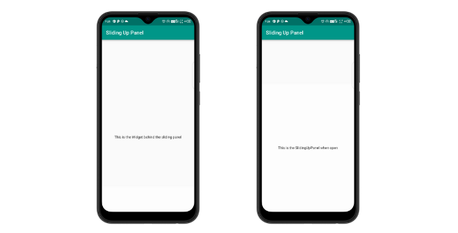
没有折叠的面板
带有面板和折叠的 SlidingUpPanel
添加折叠属性作为容器,并添加一个文本小部件。
Dart
@override
Widget build(BuildContext context) {
  return Scaffold(   // returning scaffold
    appBar: AppBar(  // appbar with title text.
      title: Text("SlidingUpPanelExample"),
    ),
    // In body we have a SlidingUpPanel,
    body: SlidingUpPanel(
      // panel with centered text
      panel: Center(
        child: Text("This is the sliding Widget"),
      ),
      // collapsed with container
      collapsed: Container(
        color: Colors.blueGrey,
        child: Center(
          child: Text(
            "This is the collapsed Widget",
            style: TextStyle(color: Colors.white),
          ),
        ),
      ),
      // main body
      body: Center(
        child: Text("This is the Widget behind the sliding panel"),
      ),
    ),
  );
}
输出
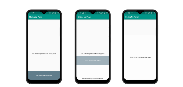
折叠的面板
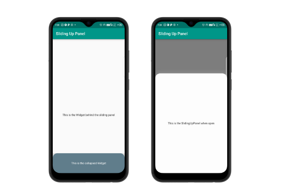
面板打开时使身体变暗
通过将 backgroundEnabled 设为 true,我们可以在面板打开时使 body 变暗。
Dart
@override
Widget build(BuildContext context){
  return Scaffold (  // returning Scaffold.
    appBar: AppBar(  // appbar with title
     title: Text("SlidingUpPanelExample"),
      body: SlidingUpPanel(
      // this is true so that background
      // will be dark when panel open
      backdropEnabled: true,
      // panel with centered text
      panel: Center(
        child: Text("This is the sliding Widget"),
      ),
        // this is the body
        body:  Center(
          child: Text("This is the Widget behind the sliding panel"),
        ),
      ),
    ),
  );
}
输出
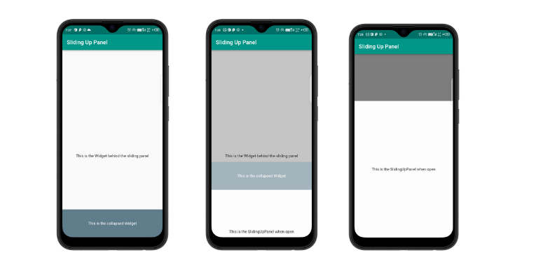
面板向上滑动时背景变暗
环绕边界
这可以通过将半径属性设置为圆形来实现。
Dart
@override
Widget build(BuildContext context) {
  // making radius circular so that panel
  // and collapsed should be circular in border.
  BorderRadiusGeometry radius = BorderRadius.only(
    topLeft: Radius.circular(24.0),
    topRight: Radius.circular(24.0),
  );

  // scaffold with appbar
  return Scaffold(
    appBar: AppBar(
      title: Text("SlidingUpPanelExample"),
    ),
    // SlidingUpPanel with panel and collapsed
    body: SlidingUpPanel(
      panel: Center(
        child: Text("This is the sliding Widget"),
      ),
      collapsed: Container(
        decoration: BoxDecoration(
          color: Colors.blueGrey,
          // changing radius that we define above
          borderRadius:  radius
        ),
        // collapsed text
        child: Center(
          child: Text(
            "This is the collapsed Widget",
            style: TextStyle(color: Colors.white),
          ),
        ),
      ),
      // main body or content behind the panel
      body: Center(
        child: Text("This is the Widget behind the sliding panel"),
      ),
      borderRadius: radius,
    ),
  );
}
输出
浮动面板的示例
Dart
import 'package:flutter/material.dart';
import 'package:sliding_up_panel/sliding_up_panel.dart';
// main app
void main() {
  runApp(SlideUp());
}

class SlideUp extends StatelessWidget {
  SlideUp({Key? key}) : super(key: key);
  // defining border radius
  BorderRadius radius = const BorderRadius.only(
    topLeft: Radius.circular(24),
    topRight: Radius.circular(24),
  );
  @override
  Widget build(BuildContext context) {
    return MaterialApp(   // MaterialApp
      theme: ThemeData(
        primarySwatch: Colors.teal,
      ),
      debugShowCheckedModeBanner: false,
      home: Scaffold(       // scaffold
        appBar: AppBar(  // appbar with title text
          title: const Text("Sliding Up Panel"),
        ),
        body: SlidingUpPanel(
          // making false it does
          // not render outside
          renderPanelSheet: false,
          // panel
          panel:  Container(
    decoration: const BoxDecoration(
        color: Color.fromARGB(255, 253, 253, 253),
        borderRadius: BorderRadius.all(Radius.circular(24.0)),
        boxShadow: [
          BoxShadow(
            blurRadius: 20.0,
            color: Colors.grey,
          ),
        ]),
    margin: const EdgeInsets.all(24.0),
    child: const Center(
      child: Text("This is the SlidingUpPanel when open"),
    ),
  ),
          // collapsed
          collapsed:Container(
    decoration: const BoxDecoration(
      color: Colors.blueGrey,
      borderRadius: BorderRadius.only(
          topLeft: Radius.circular(24.0), topRight: Radius.circular(24.0)),
    ),
    margin: const EdgeInsets.fromLTRB(24.0, 24.0, 24.0, 0.0),
    child: const Center(
      child: Text(
        "This is the collapsed Widget",
        style: TextStyle(color: Colors.white),
      ),
    ),
  ) ,
          body: const Center(
            child: Text(
                "This the widget behind the Sliding panel"),
          ),
        ),
      ),
    );
  }
}