R – 折线图
折线图是一种图表,用于以一系列数据点的形式显示信息。它利用点和线来表示随时间的变化。折线图是通过在它们的 X 坐标和 Y 坐标上绘制不同的点,然后通过一条线从头到尾将它们连接在一起来绘制的。该图表示不同的值,因为它可以根据合适的变量上下移动。
R – 折线图
R 中的 plot()函数用于创建折线图。
Syntax: plot(v, type, col, xlab, ylab)
Parameters:
- v: This parameter is a contains only the numeric values
- type: This parameter has the following value:
- “p” : This value is used to draw only the points.
- “l” : This value is used to draw only the lines.
- “o”: This value is used to draw both points and lines
- xlab: This parameter is the label for x axis in the chart.
- ylab: This parameter is the label for y axis in the chart.
- main: This parameter main is the title of the chart.
- col: This parameter is used to give colors to both the points and lines.
创建一个简单的折线图
方法:为了创建折线图:
- 它是使用类型参数“o”和输入向量创建的。
- 下面的代码来描述折线图。
例子:
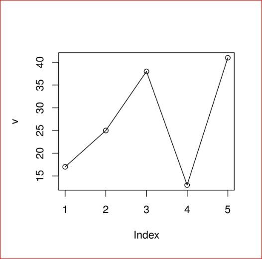
R
# Create the data for the chart.
v <- c(17, 25, 38, 13, 41)

# Plot the bar chart.
plot(v, type = "o")
R
# Create the data for the chart.
v <- c(17, 25, 38, 13, 41)

# Plot the bar chart.
plot(v, type = "o", col = "green",
    xlab = "Month", ylab = "Article Written",
    main = "Article Written chart")
R
# Create the data for the chart.
v <- c(17, 25, 38, 13, 41)
t <- c(22, 19, 36, 19, 23)
m <- c(25, 14, 16, 34, 29)

# Plot the bar chart.
plot(v, type = "o", col = "red",
    xlab = "Month", ylab = "Article Written ",
    main = "Article Written chart")

lines(t, type = "o", col = "blue")
lines(m, type = "o", col = "green")
输出:
在 R 中的折线图中添加标题、颜色和标签
方法:创建一个彩色和标记的折线图。
- 通过为图表提供标题并为轴添加标签来获取制作折线图所需的所有参数。
- 我们可以通过向点和线添加更多具有更多颜色的参数来添加更多特征。
例子:
R
# Create the data for the chart.
v <- c(17, 25, 38, 13, 41)

# Plot the bar chart.
plot(v, type = "o", col = "green",
    xlab = "Month", ylab = "Article Written",
    main = "Article Written chart")
输出:

R 编程语言中折线图中的多条线
方法:创建多个折线图。
- 在上面的例子中,我们在每个图中只用一条线创建了折线图。
- 现在创建多行以更清楚地描述它。
例子:
R
# Create the data for the chart.
v <- c(17, 25, 38, 13, 41)
t <- c(22, 19, 36, 19, 23)
m <- c(25, 14, 16, 34, 29)

# Plot the bar chart.
plot(v, type = "o", col = "red",
    xlab = "Month", ylab = "Article Written ",
    main = "Article Written chart")

lines(t, type = "o", col = "blue")
lines(m, type = "o", col = "green")
输出:当我们执行上面的代码时,它显示了以下结果——
