在Python中使用 Plotly 的折线图
Plotly是一个Python库,用于设计图形,尤其是交互式图形。它可以绘制各种图形和图表,如直方图、条形图、箱线图、散布图等等。它主要用于数据分析和财务分析。 plotly 是一个交互式可视化库。
Plotly 中的折线图
Plotly 中的线图非常易于访问,并且是对 plotly 的出色补充,它管理各种类型的数据并组装易于样式的统计数据。使用 px.line,每个数据位置都表示为 2D 空间中折线标记的顶点变换(位置由 x 和 y 列给出)。折线图 将一系列数值数据显示为由线连接的点。它可视化显示两个数据趋势。主要的生产功能是无需滚动即可显示数千个数据点。它可以使用 plotly.express 类的 line() 方法创建。
Syntax: plotly.express.line(data_frame=None, x=None, y=None, line_group=None, color=None, line_dash=None, hover_name=None, hover_data=None, custom_data=None, text=None, facet_row=None, facet_col=None, facet_col_wrap=0, error_x=None, error_x_minus=None, error_y=None, error_y_minus=None, animation_frame=None, animation_group=None, category_orders={}, labels={}, orientation=None, color_discrete_sequence=None, color_discrete_map={}, line_dash_sequence=None, line_dash_map={}, log_x=False, log_y=False, range_x=None, range_y=None, line_shape=None, render_mode=’auto’, title=None, template=None, width=None, height=None)
参数:Name Description data_frame Array-like and dict are transformed internally to a pandas DataFrame. Optional: if missing, a DataFrame gets constructed under the hood using the other arguments. x Either a name of a column in data_frame, or a pandas Series or array_like object. Values from this column or array_like are used to position marks along the x axis in cartesian coordinates. Either x or y can optionally be a list of column references or array_likes, in which case the data will be treated as if it were ‘wide’ rather than ‘long’. y Either a name of a column in data_frame, or a pandas Series or array_like object. Values from this column or array_like are used to position marks along the y axis in cartesian coordinates. Either x or y can optionally be a list of column references or array_likes, in which case the data will be treated as if it were ‘wide’ rather than ‘long’. line_group Either a name of a column in data_frame, or a pandas Series or array_like object. Values from this column or array_like are used to group rows of data_frame into lines. line_dash Either a name of a column in data_frame, or a pandas Series or array_like object. Values from this column or array_like are used to assign dash-patterns to lines.
创建一个简单的折线图
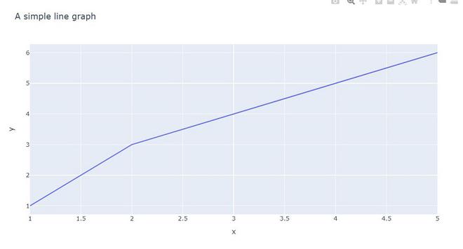
示例 1:在此示例中,我们将看到一个包含两个不同数据集的简单线图。
Python3
import plotly.express as px

x = [1,2,3,4,5]
y = [1,3,4,5,6]
fig = px.line( x = x ,
              y = y,
              title = 'A simple line graph')
fig.show()
Python3
import numpy as np
import plotly.graph_objects as go

x = [0, 1, 2, 3, 4, 5, 6, 7, 8, 9]
y = [1, 3, 4, 5, 6]
fig = go.Figure(data=go.Scatter(x = x, y = y))
fig.show()
Python3
import plotly.express as px

# Loading the iris dataset
df = px.data.iris()

fig = px.line(df, x="sepal_width", y="sepal_length")
fig.show()
Python3
import plotly.express as px

df = px.data.iris().head(20)

fig = px.line(df, x = "sepal_width",
              y = "sepal_length" ,
              color = "sepal_length")
fig.show()
Python3
import plotly.express as px

# Loading the iris dataset
df = px.data.iris()

fig = px.line(df, x = "sepal_width", y = "sepal_length",
              color = "species")
fig.show()
输出:
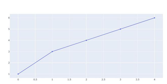
示例 2:在此示例中,我们将使用 go.Scatter 进行绘图。 plotly.express有两个函数scatter和line , go.Scatter可用于绘制点(制造商)或线条,具体取决于 mode 的值。
Python3
import numpy as np
import plotly.graph_objects as go

x = [0, 1, 2, 3, 4, 5, 6, 7, 8, 9]
y = [1, 3, 4, 5, 6]
fig = go.Figure(data=go.Scatter(x = x, y = y))
fig.show()
输出:
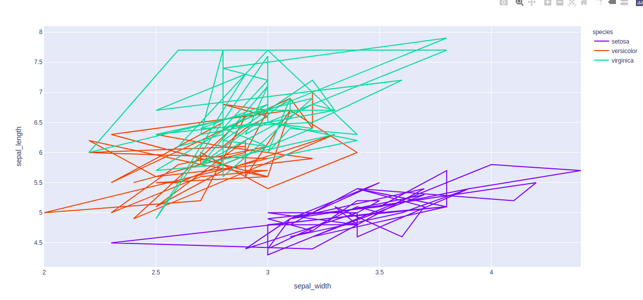
示例 3:使用 Iris 数据集,我们将绘制折线图。
Python3
import plotly.express as px

# Loading the iris dataset
df = px.data.iris()

fig = px.line(df, x="sepal_width", y="sepal_length")
fig.show()
输出:
映射编码颜色
列编码颜色也称为颜色映射,它是一种以颜色内联形式表示文本或数字数据的方法。
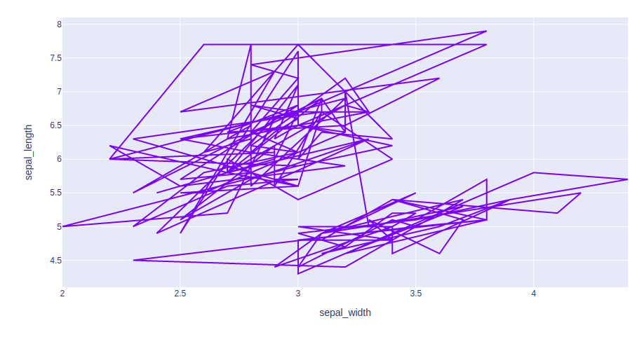
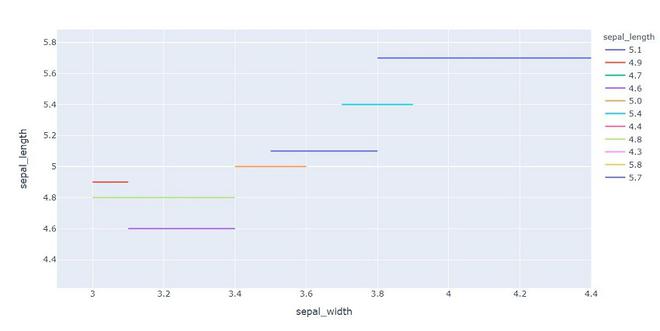
示例 1:在此示例中,我们将使用颜色属性来绘制具有不同颜色的线。
Python3
import plotly.express as px

df = px.data.iris().head(20)

fig = px.line(df, x = "sepal_width",
              y = "sepal_length" ,
              color = "sepal_length")
fig.show()
输出:
示例 2:在此示例中,我们将使用不同的颜色方面。
Python3
import plotly.express as px

# Loading the iris dataset
df = px.data.iris()

fig = px.line(df, x = "sepal_width", y = "sepal_length",
              color = "species")
fig.show()
输出: