Python-Plotly 中的悬停文本和格式设置
先决条件: Python剧情
在本文中,我们将探讨如何在Python中悬停文本和格式化。
这是悬停文本和格式设置的有用方法,因为它允许显示有关复杂信息的大量数据。数据可视化最具欺骗性的功能之一是当将光标指向出现的点标签时,查看者能够快速分析足够数量的数据信息。
示例 1:默认值
默认设置为layout.hovermode='closest' ,其中为光标正下方的点显示一个悬停标签。
Python3
import plotly.express as px

df = px.data.gapminder().query("continent=='Oceania'")

fig = px.line(df, x="year", y="lifeExp", color="country")
fig.update_traces(mode="markers+lines")

fig.show()
Python3
import plotly.express as px

df = px.data.gapminder().query("continent=='Oceania'")

fig = px.line(df, x="year", y="lifeExp", color="country")
fig.update_traces(mode="markers+lines", hovertemplate=None)
fig.update_layout(hovermode="x unified")

fig.show()
Python3
import plotly.express as px

df = px.data.gapminder().query("continent=='Oceania'")

fig = px.line(df, x="year", y="lifeExp", color="country")
fig.update_traces(mode="markers+lines", hovertemplate=None)
fig.update_layout(hovermode="y unified")

fig.show()
Python3
import plotly.express as px

df_2007 = px.data.gapminder().query("year==2007")

fig = px.scatter(df_2007, x="gdpPercap", y="lifeExp",
                 log_x=True, color='continent')

fig.update_traces(hovertemplate='GDP: %{x}
Life Expectancy: %{y}')

fig.show()
Python3
import plotly.graph_objects as go

fig = go.Figure(go.Pie(
    name = "",
    values = [2, 5, 3, 2.5],
    labels = ["R", "Python", "Java Script", "Matlab"],
    text = ["R", "Python", "JS", "Matlab"],
    hovertemplate = "%{label}:
Popularity: %{percent}  %{text}"
))

fig.show()
输出:

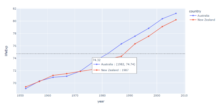
示例 2:x 统一
如果layout.hovermode='x' ,每个轨迹都会出现一个悬停标签,用于与光标具有相同 x 值的点。
Python3
import plotly.express as px

df = px.data.gapminder().query("continent=='Oceania'")

fig = px.line(df, x="year", y="lifeExp", color="country")
fig.update_traces(mode="markers+lines", hovertemplate=None)
fig.update_layout(hovermode="x unified")

fig.show()
输出:

示例 3:y 统一
如果layout.hovermode='y' ,每个跟踪显示一个悬停标签,用于与光标具有相同 y 值的点。
Python3
import plotly.express as px

df = px.data.gapminder().query("continent=='Oceania'")

fig = px.line(df, x="year", y="lifeExp", color="country")
fig.update_traces(mode="markers+lines", hovertemplate=None)
fig.update_layout(hovermode="y unified")

fig.show()
输出:
文本格式
示例 1:用户定义的悬停模板
GDP: %{x}
Life Expectancy: %{y}
在这里,GDP 和期望值被用作数据的命名约定,而%{
Python3
import plotly.express as px

df_2007 = px.data.gapminder().query("year==2007")

fig = px.scatter(df_2007, x="gdpPercap", y="lifeExp",
                 log_x=True, color='continent')

fig.update_traces(hovertemplate='GDP: %{x}
Life Expectancy: %{y}')

fig.show()
输出:

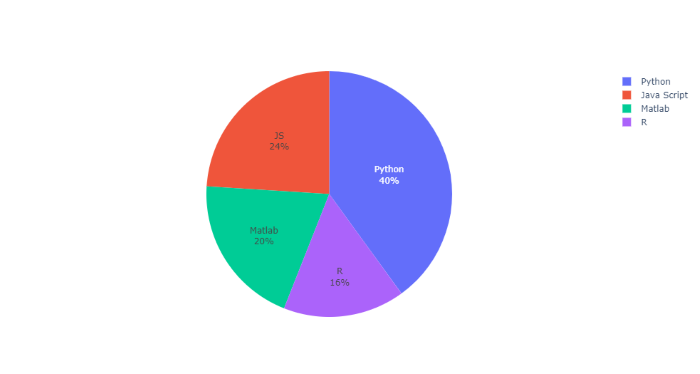
示例 2:用户定义的悬停模板
%{label}:
Popularity: %{percent} %{text}
在这里,Label、Percent 和 Text 被用作数据的命名约定,而%{
Python3
import plotly.graph_objects as go

fig = go.Figure(go.Pie(
    name = "",
    values = [2, 5, 3, 2.5],
    labels = ["R", "Python", "Java Script", "Matlab"],
    text = ["R", "Python", "JS", "Matlab"],
    hovertemplate = "%{label}:
Popularity: %{percent}  %{text}"
))

fig.show()
输出: