Flutter中的脚手架类和示例
Scaffold是 Flutter 中的一个类,它提供了许多小部件,或者我们可以说是 Drawer、SnackBar、 flutter 、FloatingActionButton、AppBar 等API。Scaffold将扩展或占据整个设备屏幕。它将占用可用空间。 Scaffold 将提供一个框架来实现应用程序的基本材料设计布局。
类层次结构:
Object
 ↳ Diagnosticable
   ↳ Diagnosticable Tree
     ↳ Widget
       ↳ StateFul Widget
         ↳ Scaffold
Scaffold 类的构造函数:
const Scaffold({
    Key key,
    this.appBar,
    this.body,
    this.floatingActionButton,
    this.floatingActionButtonLocation,
    this.floatingActionButtonAnimator,
    this.persistentFooterButtons,
    this.drawer,
    this.endDrawer,
    this.bottomNavigationBar,
    this.bottomSheet,
    this.backgroundColor,
    this.resizeToAvoidBottomPadding,
    this.resizeToAvoidBottomInset,
    this.primary = true,
    this.drawerDragStartBehavior
          = DragStartBehavior.start,
    this.extendBody = false,
    this.drawerScrimColor,
})
脚手架类的属性:
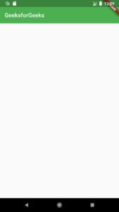
- appBar:显示一个水平条,主要放置在Scaffold的顶部。 appBar使用小部件AppBar ,它有自己的属性,如高度、标题、亮度等。
Dart
Widget build(BuildContext context)
{
  return Scaffold(
    appBar: AppBar(
      title: Text('GeeksforGeeks'),
    ),
Dart
Widget build(BuildContext context)
{
  return Scaffold(
    appBar: AppBar(
      title: Text('GeeksforGeeks'),
    ),
    body: Center(
      child: Text("Welcome to GeeksforGeeks!!!",
        style: TextStyle(
          color: Colors.black,
          fontSize: 40.0,
        ),
      ),
    ),
Dart
Widget build(BuildContext context)
{
  return Scaffold(
      appBar: AppBar(title: Text('GeeksforGeeks')),
      body:  Center(
        child: Text("Welcome to GeeksforGeeks!!!",
          style: TextStyle(
            color: Colors.black,
            fontSize: 40.0,
          ),
        ),
      ),
      floatingActionButton: FloatingActionButton(
          elevation: 10.0,
          child: Icon(Icons.add),
          onPressed: (){
        // action on button press
          }
      );
}
Dart
drawer: Drawer(
          child: ListView(
        children: const [
          DrawerHeader(
            decoration: BoxDecoration(
              color: Colors.green,
            ),
            child: Text(
              'GeeksforGeeks',
              style: TextStyle(
                color: Colors.green,
                fontSize: 24,
              ),
            ),
          ),
          ListTile(
            title: Text('Item 1'),
          ),
          ListTile(
            title: Text('Item 2'),
          ),
        ],
      ),
    ),
Dart
ListTile(
    title
    : Text('Item 1'),
      leading
    : Icon(Icons.people), ),
    ListTile(
        title
        : Text('Item 2'),
          leading
        : Icon(Icons.mail), ),
Dart
bottomNavigationBar
    : BottomNavigationBar(
          currentIndex : 0,
          fixedColor
          : Colors.green,
            items
          : [
              BottomNavigationBarItem(
                  title
                  : Text("Home"),
                    icon
                  : Icon(Icons.home), ),
              BottomNavigationBarItem(
                  title
                  : Text("Search"),
                    icon
                  : Icon(Icons.search), ),
              BottomNavigationBarItem(
                  title
                  : Text("Profile"),
                    icon
                  : Icon(Icons.account_circle), ),
          ],
            onTap
          : (int indexOfItem){

          }),
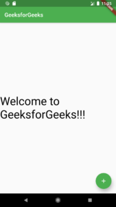
- body:它将显示脚手架中的主要或主要内容。它位于appBar下方和floatingActionButton下方。默认情况下,body 内的小部件位于左下角。
Dart
Widget build(BuildContext context)
{
  return Scaffold(
    appBar: AppBar(
      title: Text('GeeksforGeeks'),
    ),
    body: Center(
      child: Text("Welcome to GeeksforGeeks!!!",
        style: TextStyle(
          color: Colors.black,
          fontSize: 40.0,
        ),
      ),
    ),
在此示例中,我们显示了文本Welcome to GeeksforGeeks!!!在身体里。我们使用Center小部件在页面中心显示了文本。对于文本样式,我们使用了TextStyle小部件。

- floatingActionButton: FloatingActionButton是默认放置在右下角的按钮。 FloatingActionButton是一个图标按钮,它浮动在屏幕内容的固定位置。如果我们滚动页面,它的位置不会改变,它会被固定。
Dart
Widget build(BuildContext context)
{
  return Scaffold(
      appBar: AppBar(title: Text('GeeksforGeeks')),
      body:  Center(
        child: Text("Welcome to GeeksforGeeks!!!",
          style: TextStyle(
            color: Colors.black,
            fontSize: 40.0,
          ),
        ),
      ),
      floatingActionButton: FloatingActionButton(
          elevation: 10.0,
          child: Icon(Icons.add),
          onPressed: (){
        // action on button press
          }
      );
}
此处的海拔属性用于为按钮提供阴影效果。 Icon用于使用flutter SDK 中一些预加载的图标放置按钮的图标。 onPressed()是一个函数,当按下按钮时将调用该函数,函数内部的语句将被执行。
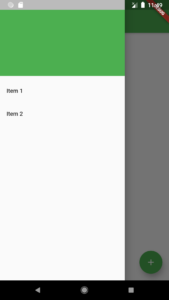
- 抽屉:抽屉是显示在 Scaffold 侧面的滑块菜单或面板。用户必须根据定义的操作从左向右或从右向左滑动才能访问抽屉菜单。在 Appbar 中,抽屉的适当图标会自动设置在特定位置。打开抽屉的手势也是自动设置的。它由脚手架处理。
Dart
drawer: Drawer(
          child: ListView(
        children: const [
          DrawerHeader(
            decoration: BoxDecoration(
              color: Colors.green,
            ),
            child: Text(
              'GeeksforGeeks',
              style: TextStyle(
                color: Colors.green,
                fontSize: 24,
              ),
            ),
          ),
          ListTile(
            title: Text('Item 1'),
          ),
          ListTile(
            title: Text('Item 2'),
          ),
        ],
      ),
    ),
作为父小部件,我们采用ListView并在其中将面板分为两部分,标题和菜单。 DrawerHeader用于修改面板的表头。在标题中,我们可以根据应用程序显示用户的图标或详细信息。我们使用ListTile将项目添加到菜单中。
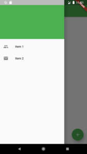
我们还可以使用ListTile的属性前导在项目之前添加图标,在其中我们必须使用Icon小部件。
例子:
Dart
ListTile(
    title
    : Text('Item 1'),
      leading
    : Icon(Icons.people), ),
    ListTile(
        title
        : Text('Item 2'),
          leading
        : Icon(Icons.mail), ),
输出:
- bottomNavigationBar: bottomNavigationBar就像 Scaffold 底部的菜单。我们在大多数应用程序中都看到了这个导航栏。我们可以在栏中添加多个图标或文本或两者作为项目。
Dart
bottomNavigationBar
    : BottomNavigationBar(
          currentIndex : 0,
          fixedColor
          : Colors.green,
            items
          : [
              BottomNavigationBarItem(
                  title
                  : Text("Home"),
                    icon
                  : Icon(Icons.home), ),
              BottomNavigationBarItem(
                  title
                  : Text("Search"),
                    icon
                  : Icon(Icons.search), ),
              BottomNavigationBarItem(
                  title
                  : Text("Profile"),
                    icon
                  : Icon(Icons.account_circle), ),
          ],
            onTap
          : (int indexOfItem){

          }),
我们使用BottomNavigationBar小部件来显示栏。对于活动图标的颜色,我们使用fixedColor属性。要在栏中添加项目,我们使用BottomNavigationBarItems小部件,我们在其中提供文本和图标。对于点击项目执行的操作,我们有onTap(int indexOfItem)函数,它根据项目的索引位置工作。

- backgroundColor:用于设置整个Scaffold小部件的颜色。
- floatingActionButtonAnimator:用于提供动画来移动floatingActionButton 。
- primary:判断Scaffold是否显示。
- drawerScrimColor:用于定义抽屉打开时主要内容的颜色。
- bottomSheet :此属性接受一个小部件(最终)作为对象,以将其显示在屏幕底部。
- drawerDragStartBehaviour :该属性将DragStartBehavior 枚举作为对象来确定抽屉的拖动行为。
- drawerEdgeDragWidth :这决定了滑动或拖动将导致抽屉打开的区域。它接受一个double作为对象。
- drawerEnableOpenGesture :此属性保存在一个布尔值中,作为确定拖动手势是否打开抽屉的对象,默认情况下设置为 true。
- endDrawer : endDrawer属性接受一个小部件作为参数。它类似于抽屉,只是它以相反的方向打开。
- endDrawerEnableOpenGesture :此属性再次接受一个布尔值作为对象,以确定拖动手势是否会打开endDrawer 。
- extendBody :extendBody 属性接受一个布尔值作为对象。默认情况下,此属性始终为 false,但不能为 null。如果在存在bottomNavigationBar或persistentFooterButtons的情况下将其设置为 true,则它们的高度将添加到 body 中,并且它们会在 body 下方移动。
- extendBodyBehindAppBar :此属性还接受一个布尔值作为对象。默认情况下,此属性始终为 false,但不能为 null。如果它设置为 true,则appBar不会在 body 上,而是在其上方延伸,并将其高度添加到 body。当appBar的颜色不是完全不透明时使用此属性。
- floatingActionButtonLocation :该属性负责floatingActionBotton的位置。
- persistentFooterButton :此属性接受一个小部件列表。通常是显示在脚手架下方的按钮。
- resizeToAvoidBottomInsets :此属性接受一个布尔值作为对象。如果设置为 true,则脚手架上的浮动小部件会自行调整大小以避免妨碍屏幕键盘。