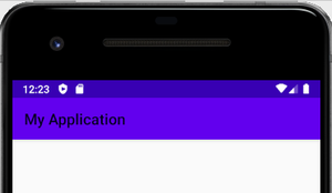
应用栏
AppBar是应用程序活动中的重要设计元素。它的外观为应用程序提供了唯一的标识。此外,它还显示当前活动的标题,以方便用户了解其在应用程序中的位置。为了使应用程序具有一致的外观,开发人员使用AppBar。在Android 3.0(Honeycomb)之前,用户交互元素(如任何选项或操作)放置在AppBar中的“菜单”按钮内。 AppBar中包含的组件是:
- 标题
- 菜单按钮
应用程序中的AppBar:

动作栏
动作栏 是活动屏幕顶部的元素。这是android应用程序的一项显着功能,它在所有活动中都具有一致的状态。它为应用程序提供了视觉结构,并包含一些用户常用的元素。 Google于2013年发布了Android 3.0(API 11) ,从而推出了Android ActionBar。在此之前,最重要的视觉元素的名称是AppBar 。使用Android(Theme.AppCompat.Light.DarkActionBar)提供的默认主题的所有应用程序默认都包含一个ActionBar。但是,开发人员可以根据需要以几种方式对其进行自定义。可以包含在ActionBar中的组件是:
- 导航控制按钮/抽屉
- 应用程式图示
- 标题和副标题
- 动作按钮
- 动作溢出菜单
应用程序中的ActionBar:

工具列
工具栏是一种ViewGroup ,可以放置在活动的XML布局中。它是由Google Android团队在发布Android Lollipop(API 21)时引入的。工具栏基本上是ActionBar的高级后继者。就外观和功能而言,它更加灵活和可定制。与ActionBar不同,它的位置不是硬编码的,即不在活动的顶部。开发人员可以根据需要将其放置在活动中的任何位置,就像android中的任何其他View一样。工具栏使用Android的材质设计主题功能,因此它提供了向后兼容API 7(Android 2.1)的功能。与ActionBar相比,Toolbar支持的功能更加集中和可自定义。以下是可以添加到工具栏的组件:
- 导航按钮/抽屉或向上按钮
- 品牌徽标/应用图标
- 标题和副标题
- ActionMenu项目
- 多个自定义视图,例如TextView,ImageView等。
应用程序中的ActionBar(位于顶部)和Toolbar:

差异表
|
AppBar |
ActionBar |
Toolbar |
|---|---|---|
| It is a dedicated space located at top of an activity that indicates the app title or location of a user in the app. | It is a dedicated navigation or control element present at top of each screen of the application. | It is a ViewGroup that can be placed anywhere in the activity layout. |
| It was used in Android devices running on OS version older than 3.0(Honeycomb). | It was released along with Android 3.0 (API -11) as the successor of AppBar. | Introduced in material design with the release of Android 5.0 i.e., lollipop(API – 21). |
| Its position is fixed i.e., at the top of an application screen. | It is a part of the activity’s opaque window decor, thus its position is hardcoded. | It is the generalized form of ActionBar that can be placed at any arbitrary level within the Component Tree hierarchy of an activity. |
| Android system allows the presence of only one AppBar in an activity. | There can be only one ActionBar in an activity. Developers have the choice to show or hide the ActionBar. | Multiple Toolbar elements having a completely different appearance and the behavior can be defined within a single activity. A Toolbar can also be used as an ActionBar. |
| Its prime purpose is to provide identity to the application. Further, it includes a Menu button that is used by developers to display relevant options/actions to the user. | Behaves as a regular AppBar but provides scope for customization. Developers can add application logo/icon, action menu items, overflow menu, etc. | Fewer lines of code are needed to make the same customization in Toolbar that is possible in ActionBar. Moreover, Toolbar provides more flexibility and control to the developers by which they can animate the elements or can apply reaction to scroll events. |
| With the increase in demand for devices powered with the latest Android versions, developers migrated their design from the Menu button to ActionBar. | Features were added gradually, at the different API levels(15, 17, and 19). Thus it does not provide backward compatibility. | Uses material theme design and provides backward compatibility up to API 7(Android 2.1). |