在 Seaborn 和 Matplotlib 中旋转轴刻度标签
Seaborn 和 Matplotlib 都是Python用于数据可视化的常用库。我们可以使用 Matplotlib 绘制各种类型的图,例如散点图、折线图、条形图、直方图等等。另一方面,Seaborn 提供了多种可视化模式。它使用简单的语法并具有很有趣的默认主题。它专门从事统计可视化。
在 Matplotlib 中创建基本图
Python3
import numpy as np
import matplotlib.pyplot as plt

data = {'Cristopher': 20, 'Agara': 15, 'Jayson': 30,
        'Peter': 35}
names = list(data.keys())
age = list(data.values())

fig = plt.figure(figsize=(10, 5))

# creating the bar plot
plt.bar(names, age, color='blue', width=0.4)

plt.xlabel("Names")
plt.ylabel("Age of the person")
plt.show()
Python3
import seaborn as sns
import matplotlib.pyplot as plt

sns.barplot(x=["Asia", "Africa", "Antartica", "Europe"],
            y=[90, 60, 30, 10])

plt.show()
Python3
import numpy as np
import matplotlib.pyplot as plt

data = {'Cristopher': 20, 'Agara': 15, 'Jayson': 30,
        'Peter': 35}
names = list(data.keys())
age = list(data.values())

fig = plt.figure(figsize=(10, 5))

# creating the bar plot
plt.bar(names, age, color='blue', width=0.4)

plt.xlabel("Names")
plt.xticks(rotation=45)
plt.ylabel("Age of the person")
plt.show()
Python3
import seaborn as sns
import matplotlib.pyplot as plt

g = sns.barplot(x=["Asia", "Africa", "Antartica", "Europe"],
                y=[90, 30, 60, 10])
g.set_xticklabels(
    labels=["Asia", "Africa", "Antartica", "Europe"], rotation=30)
# Show the plot
plt.show()
Python3
import numpy as np
import matplotlib.pyplot as plt

data = {'Cristopher': 20, 'Agara': 15, 'Jayson': 30,
        'Peter': 35}
courses = list(data.keys())
values = list(data.values())

fig = plt.figure(figsize=(8, 5))

# creating the bar plot
plt.bar(courses, values, color='blue', width=0.4)
plt.yticks(rotation=45)
plt.xlabel("Names")
plt.ylabel("Age of the person")
plt.show()
Python3
import seaborn as sns
import matplotlib.pyplot as plt

g = sns.barplot(x=["Asia", "Africa", "Antartica", "Europe"],
                y=[90, 30, 60, 10])

g.set_yticklabels(labels=[0, 20, 40, 60, 80], rotation=30)

# Show the plot
plt.show()
输出:

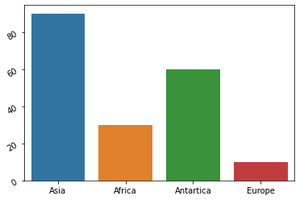
在 Seaborn 中创建基本图
蟒蛇3
import seaborn as sns
import matplotlib.pyplot as plt

sns.barplot(x=["Asia", "Africa", "Antartica", "Europe"],
            y=[90, 60, 30, 10])

plt.show()
输出:

在绘制这些图时会出现一个问题 - x 标签或 y 标签的重叠导致难以阅读 x 标签上的内容和 y 标签上的内容。所以我们通过旋转 x 轴标签或 y 轴标签来解决这个问题。
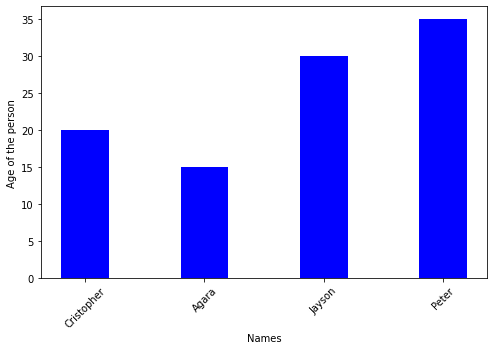
在 Matplotlib 中旋转 X 轴标签
我们使用 plt.xticks(rotation=#) 其中 # 可以是我们想要旋转 x 标签的任何角度
蟒蛇3
import numpy as np
import matplotlib.pyplot as plt

data = {'Cristopher': 20, 'Agara': 15, 'Jayson': 30,
        'Peter': 35}
names = list(data.keys())
age = list(data.values())

fig = plt.figure(figsize=(10, 5))

# creating the bar plot
plt.bar(names, age, color='blue', width=0.4)

plt.xlabel("Names")
plt.xticks(rotation=45)
plt.ylabel("Age of the person")
plt.show()
输出:
在 Seaborn 中旋转 X 轴标签
通过使用 FacetGrid,我们将 barplot 分配给变量 'g',然后我们调用函数set_xticklabels(labels=#list of labels on x-axis, rotation=*) 其中 * 可以是我们想要旋转 x 标签的任何角度
蟒蛇3
import seaborn as sns
import matplotlib.pyplot as plt

g = sns.barplot(x=["Asia", "Africa", "Antartica", "Europe"],
                y=[90, 30, 60, 10])
g.set_xticklabels(
    labels=["Asia", "Africa", "Antartica", "Europe"], rotation=30)
# Show the plot
plt.show()
输出:

在 Matplotlib 中旋转 Y 轴标签
我们使用 plt.xticks(rotation=#) 其中 # 可以是我们想要旋转 y 标签的任何角度
蟒蛇3
import numpy as np
import matplotlib.pyplot as plt

data = {'Cristopher': 20, 'Agara': 15, 'Jayson': 30,
        'Peter': 35}
courses = list(data.keys())
values = list(data.values())

fig = plt.figure(figsize=(8, 5))

# creating the bar plot
plt.bar(courses, values, color='blue', width=0.4)
plt.yticks(rotation=45)
plt.xlabel("Names")
plt.ylabel("Age of the person")
plt.show()
输出:

在 Seaborn 中旋转 Y 轴标签
通过使用 FacetGrid,我们将 barplot 分配给变量 'g',然后我们调用函数set_yticklabels(labels=#the scale we want for y label, rotation=*) 其中 * 可以是我们想要旋转 y 标签的任何角度
蟒蛇3
import seaborn as sns
import matplotlib.pyplot as plt

g = sns.barplot(x=["Asia", "Africa", "Antartica", "Europe"],
                y=[90, 30, 60, 10])

g.set_yticklabels(labels=[0, 20, 40, 60, 80], rotation=30)

# Show the plot
plt.show()
输出: