在 R 中的 ggplot2 中组合条形图和折线图
有时在处理分层数据时,我们需要将两种或多种不同的图表类型组合成一个图表,以便更好地进行可视化和分析。这些被称为“组合图”。在本文中,我们将看到如何使用 ggplot2 在 R 编程语言中组合条形图和折线图。
使用中的数据集:销售的课程与注册的学生Year Courses Sold Percentage Of Students Enrolled 2014 35 30% 2015 30 25% 2016 40 30% 2017 25 50% 2018 30 40% 2019 35 20% 2020 65 60%
为了在 R 中绘制条形图,我们使用函数geom_bar()。
Syntax:
geom_bar(stat, fill, color, width)
Parameters :
- stat : Set the stat parameter to identify the mode.
- fill : Represents color inside the bars.
- color : Represents color of outlines of the bars.
- width : Represents width of the bars.
此外,线图是使用函数geom_line( )绘制的。
句法:
geom_line(mapping=NULL, data=NULL, stat=”identity”, position=”identity”,…)
例子:
R
# Entering data
year <- c(2014, 2015, 2016, 2017, 2018, 2019,2020)
course <- c(35, 30, 40, 25, 30, 35, 65)
penroll <- c(0.3, 0.25, 0.3, 0.5, 0.4, 0.2, 0.6)

# Creating Data Frame
perf <- data.frame(year, course, penroll)
head(perf)

# Plotting Multiple Charts
library(ggplot2)

ggplot(perf)  +
  geom_bar(aes(x=year, y=course),stat="identity", fill="cyan",colour="#006000")+
  geom_line(aes(x=year, y=penroll),stat="identity",color="red")+
  labs(title= "Courses vs Students Enrolled in GeeksforGeeks",
       x="Year",y="Number of Courses Sold")
R
# Entering data
year <- c(2014, 2015, 2016, 2017, 2018, 2019,2020)
course <- c(35, 30, 40, 25, 30, 35, 65)
penroll <- c(0.3, 0.25, 0.3, 0.5, 0.4, 0.2, 0.6)

# Creating Data Frame
perf <- data.frame(year, course, penroll)

# Plotting Charts and adding a secondary axis
library(ggplot2)
ggp <- ggplot(perf)  +
  geom_bar(aes(x=year, y=course),stat="identity", fill="cyan",colour="#006000")+
  geom_line(aes(x=year, y=100*penroll),stat="identity",color="red",size=2)+
  labs(title= "Courses vs Students Enrolled in GeeksforGeeks",
       x="Year",y="Number of Courses Sold")+
  scale_y_continuous(sec.axis=sec_axis(~.*0.01,name="Percentage"))
ggp
R
# Entering data
year <- c(2014, 2015, 2016, 2017, 2018, 2019,2020)
course <- c(35, 30, 40, 25, 30, 35, 65)
penroll <- c(0.3, 0.25, 0.3, 0.5, 0.4, 0.2, 0.6)
# Creating Data Frame
perf <- data.frame(year, course, penroll)
# Plotting Multiple Charts and changing
# secondary axis to percentage
library(ggplot2)
ggp <- ggplot(perf) +
geom_bar(aes(x=year, y=course),stat="identity", fill="cyan",colour="#006000")+
geom_line(aes(x=year, y=100*penroll),stat="identity",color="red",size=2)+
labs(title= "Courses vs Students Enrolled in GeeksforGeeks",
x="Year",y="Number of Courses Sold")+
scale_y_continuous(sec.axis=sec_axis(
~.*0.01,name="Percentage of Students Enrolled", labels=scales::percent))
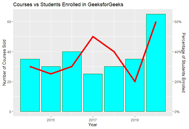
ggp输出:
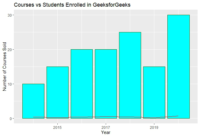
在上面的图中,我们可以观察到条形图的形状符合预期,但线图仅可见。这是由于比例因子而发生的,因为线图是针对十进制的学生百分比并且当前垂直轴具有非常大的值。因此,我们需要一个辅助轴,以便在同一图表区域中正确地拟合线条。
随着缩放的出现,我们必须使用 ggplot2 包中的 R函数scale_y_continuous()。此外,另一个函数sec_axis()用于添加辅助轴并为其分配规格。
Syntax:
sec_axis(trans,name,breaks,labels,guide)
Parameters :
- trans : A formula or function needed to transform.
- name : The name of the secondary axis.
由于我们处理的是辅助 Y 轴,因此我们需要在scale_y_continuous() 中编写命令。
句法:
scale_y_continuous(name,labels,position,sec.axis,limits,breaks)
在处理辅助轴时,缩放因子是最难处理的部分。由于辅助轴需要以百分比表示,因此我们必须使用0.01的比例因子并在sec_axis()的 trans 参数中写入转换公式。并且您在公式中使用 0.01 进行缩放,您还必须在geom_line()中将同一轴乘以 100,以便在缩放中取得平衡。
例子:
电阻
# Entering data
year <- c(2014, 2015, 2016, 2017, 2018, 2019,2020)
course <- c(35, 30, 40, 25, 30, 35, 65)
penroll <- c(0.3, 0.25, 0.3, 0.5, 0.4, 0.2, 0.6)

# Creating Data Frame
perf <- data.frame(year, course, penroll)

# Plotting Charts and adding a secondary axis
library(ggplot2)
ggp <- ggplot(perf)  +
  geom_bar(aes(x=year, y=course),stat="identity", fill="cyan",colour="#006000")+
  geom_line(aes(x=year, y=100*penroll),stat="identity",color="red",size=2)+
  labs(title= "Courses vs Students Enrolled in GeeksforGeeks",
       x="Year",y="Number of Courses Sold")+
  scale_y_continuous(sec.axis=sec_axis(~.*0.01,name="Percentage"))
ggp
输出:

添加的辅助轴将采用分数值的形式,如上所示。但是我们需要以百分比表示的辅助轴。为了转换为百分比,我们必须使用sec_axis() 中的参数标签。
使用的一些重要关键字是:
- scale:用于缩放数据。缩放因子乘以原始数据值。
- 标签:用于分配标签。
使用的函数是scale_y_continuous() ,它是库 ggplot2 中“y-aesthetics”中的默认比例。由于我们需要在 Y 轴的标签中添加“百分比”,因此使用关键字“标签” 。
现在使用下面的命令将 y 轴标签转换为百分比。
scales : : percent
这将简单地将 y 轴数据从十进制缩放到百分比。它将当前值乘以 100。比例因子为 100。
例子:
电阻
# Entering data
year <- c(2014, 2015, 2016, 2017, 2018, 2019,2020)
course <- c(35, 30, 40, 25, 30, 35, 65)
penroll <- c(0.3, 0.25, 0.3, 0.5, 0.4, 0.2, 0.6)

# Creating Data Frame
perf <- data.frame(year, course, penroll)

# Plotting Multiple Charts and changing
# secondary axis to percentage
library(ggplot2)
ggp <- ggplot(perf)  +
  geom_bar(aes(x=year, y=course),stat="identity", fill="cyan",colour="#006000")+
  geom_line(aes(x=year, y=100*penroll),stat="identity",color="red",size=2)+
  labs(title= "Courses vs Students Enrolled in GeeksforGeeks",
       x="Year",y="Number of Courses Sold")+
  scale_y_continuous(sec.axis=sec_axis(
    ~.*0.01,name="Percentage of Students Enrolled", labels=scales::percent))
ggp
输出: