在Python中使用 Plotly 的条形图
Plotly是一个Python库,用于设计图形,尤其是交互式图形。它可以绘制各种图形和图表,如直方图、条形图、箱线图、散布图等等。它主要用于数据分析和财务分析。 Plotly 是一个交互式可视化库。
条形图
在条形图中,数据类别显示在垂直轴上,数据值显示在水平轴上。标签更容易显示,并且使用大数据集,它们促使它们在狭窄的布局(如移动视图)中更好地工作。
Syntax: plotly.express.bar(data_frame=None, x=None, y=None, color=None, facet_row=None, facet_col=None, facet_col_wrap=0, hover_name=None, hover_data=None, custom_data=None, text=None, error_x=None, error_x_minus=None, error_y=None, error_y_minus=None, animation_frame=None, animation_group=None, category_orders={}, labels={}, color_discrete_sequence=None, color_discrete_map={}, color_continuous_scale=None, range_color=None, color_continuous_midpoint=None, opacity=None, orientation=None, barmode=’relative’, log_x=False, log_y=False, range_x=None, range_y=None, title=None, template=None, width=None, height=None)
参数:Name Description data_frame This argument needs to be passed for column names (and not keyword names) to be used. Array-like and dict are transformed internally to a pandas DataFrame. Optional: if missing, a DataFrame gets constructed under the hood using the other arguments. x Either a name of a column in data_frame, or a pandas Series or array_like object. Values from this column or array_like are used to position marks along the x axis in cartesian coordinates. Either x or y can optionally be a list of column references or array_likes, in which case the data will be treated as if it were ‘wide’ rather than ‘long’. y Either a name of a column in data_frame, or a pandas Series or array_like object. Values from this column or array_like are used to position marks along the y axis in cartesian coordinates. Either x or y can optionally be a list of column references or array_likes, in which case the data will be treated as if it were ‘wide’ rather than ‘long’. color Either a name of a column in data_frame, or a pandas Series or array_like object. Values from this column or array_like are used to assign color to marks.
带有 Plotly Express 的条形图
在此示例中,我们将使用 Plotly express 绘制条形图。
Python3
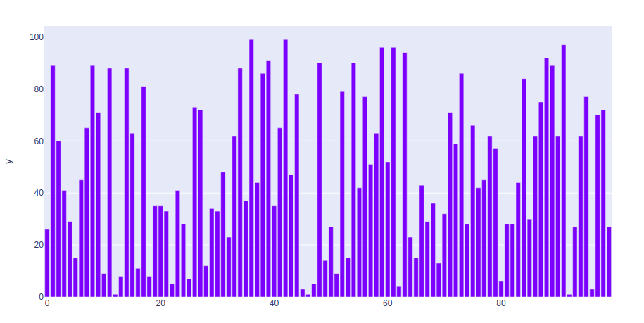
import plotly.express as px
import numpy

# creating random data through randomint
# function of numpy.random
np.random.seed(42)

random_x= np.random.randint(1, 101, 100)
random_y= np.random.randint(1, 101, 100)

fig = px.bar(random_x, y = random_y)
fig.show()
Python3
import plotly.express as px

df = px.data.iris()

fig = px.bar(df, x = "sepal_width", y = "sepal_length")
fig.show()
Python3
import plotly.express as px
long_df = px.data.medals_long()

fig = px.bar(long_df, x = "nation", y = "count",
             color = "medal", title = "Long-Form Input")
fig.show()
Python3
import plotly.express as px
df = px.data.medals_wide()

fig = px.bar(df, x="nation",
             y=["gold", "silver", "bronze"],
             title="Wide Form Data")
fig.show()
Python3
import plotly.express as px

df = px.data.iris()

fig = px.bar(df, x="sepal_width", y="sepal_length",
             color="species", barmode="group",
             facet_row="species", facet_col="species_id")

fig.show()
Python3
import plotly.express as px

df = px.data.iris()

fig = px.bar(df, x="sepal_width", y="sepal_length", color="species")
fig.show()
Python3
import plotly.express as px

df = px.data.iris()

fig = px.bar(df, x="sepal_width", y="sepal_length",
             color="species", barmode = 'group')
fig.show()
Python3
import plotly.express as px

df = px.data.iris()

fig = px.bar(df, x="sepal_width", y="sepal_length",
             color="species", barmode='overlay')
fig.show()
输出:
长宽格式数据的条形图
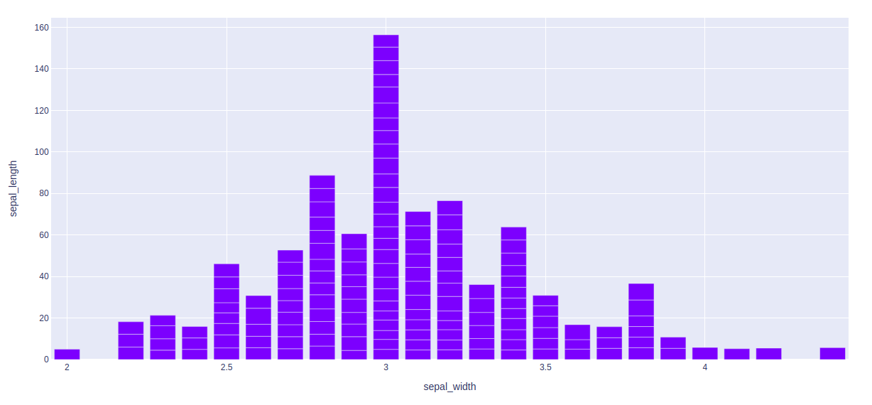
示例 1:在本示例中,我们将使用 iris 数据集并将其转换为数据框来绘制条形图。
Python3
import plotly.express as px

df = px.data.iris()

fig = px.bar(df, x = "sepal_width", y = "sepal_length")
fig.show()
输出:
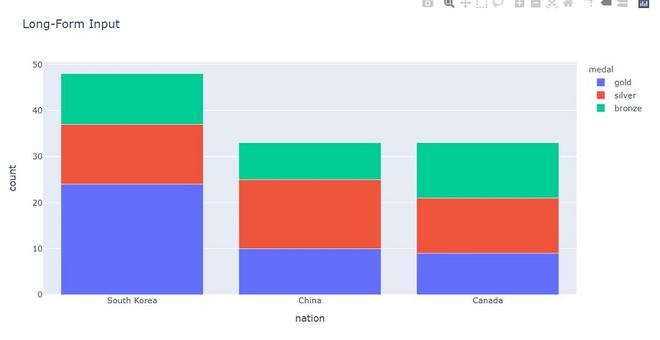
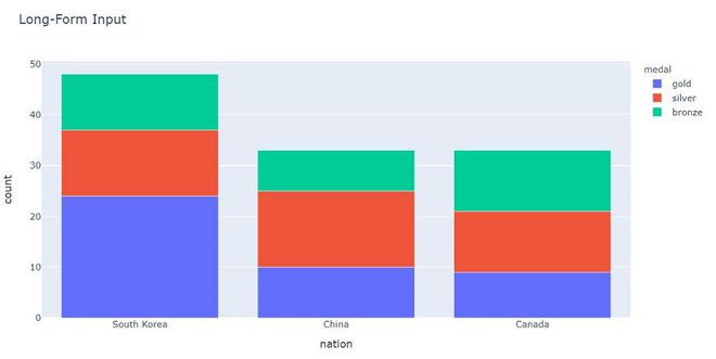
示例 2:在此示例中,我们将看到长格式数据。长格式数据每个观察值一行,每个变量一列。这适用于存储和显示多变量数据,即维度大于 2。这种格式有时被称为“整洁”。
Python3
import plotly.express as px
long_df = px.data.medals_long()

fig = px.bar(long_df, x = "nation", y = "count",
             color = "medal", title = "Long-Form Input")
fig.show()
输出:
示例 3:在此示例中,我们将看到 Wide-from 数据。宽格式数据每个第一个变量的值有一行,第二个变量的每个值有一个列。这适用于存储和显示二维数据。
Python3
import plotly.express as px
df = px.data.medals_wide()

fig = px.bar(df, x="nation",
             y=["gold", "silver", "bronze"],
             title="Wide Form Data")
fig.show()
输出:
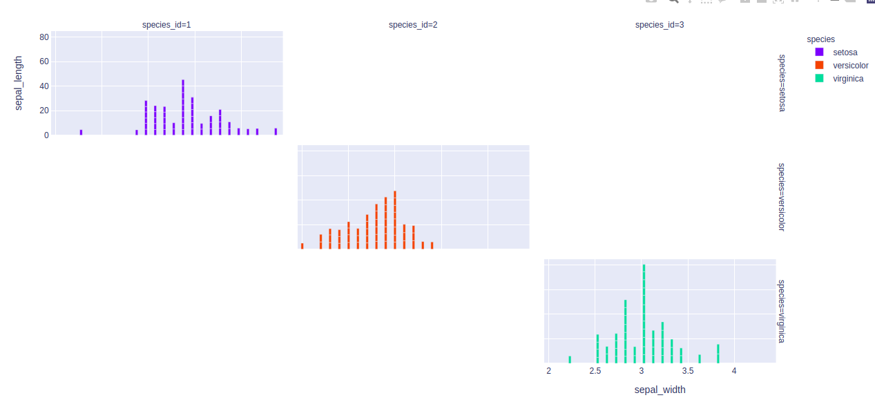
显示分面子图
在 plotly 中,使用 facet_row 参数创建分面子图,其中不同的值对应于数据框列的不同行。
例子:
Python3
import plotly.express as px

df = px.data.iris()

fig = px.bar(df, x="sepal_width", y="sepal_length",
             color="species", barmode="group",
             facet_row="species", facet_col="species_id")

fig.show()
输出:
自定义条形图
通过使用关键字参数,可以自定义条形模式。让我们看看下面给出的例子:
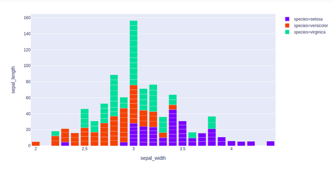
示例 1:在此示例中,条形图根据颜色属性进行自定义。
Python3
import plotly.express as px

df = px.data.iris()

fig = px.bar(df, x="sepal_width", y="sepal_length", color="species")
fig.show()
输出:
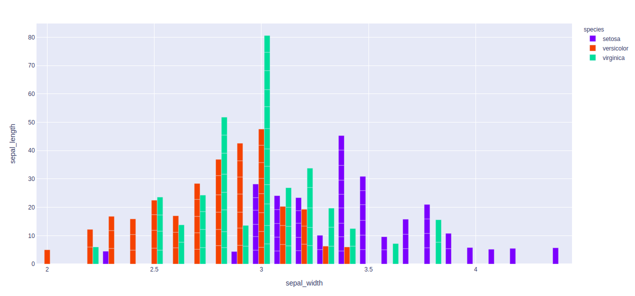
示例 2:在此示例中,我们将使用 barmode = “group”。使用“组”,条形图彼此分组
Python3
import plotly.express as px

df = px.data.iris()

fig = px.bar(df, x="sepal_width", y="sepal_length",
             color="species", barmode = 'group')
fig.show()
输出:
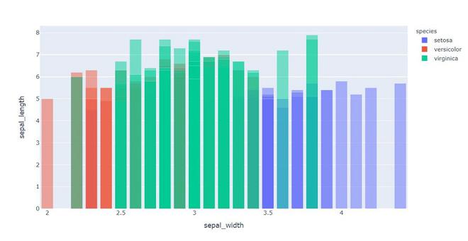
示例 3:在这里,我们将使用“overlay” 和“overlay”,条形图与另一个条形图重叠。在这里,我们很容易看到“不透明度”以看到多个条形。
Python3
import plotly.express as px

df = px.data.iris()

fig = px.bar(df, x="sepal_width", y="sepal_length",
             color="species", barmode='overlay')
fig.show()
输出: