📌 相关文章
- Flutter – 复选框小部件(1)
- Flutter – 复选框小部件
- Flutter – 复选框小部件(1)
- Flutter – 复选框小部件
- c#中的复选框(1)
- C#中的复选框
- C#中的复选框(1)
- c#代码示例中的复选框
- flutter 卡(1)
- Flutter
- Flutter(1)
- flutter 表(1)
- flutter 卡
- Flutter
- flutter 表
- 复选框值 - Html (1)
- 复选框值 - Html 代码示例
- jquery 复选框 - Javascript (1)
- 复选框 jquery - Javascript (1)
- 当我单击一个复选框时,检查所有复选框 - Html (1)
- 复选框 onclick 传递复选框 - 任何代码示例
- 如何使用 css 创建复选框 ui,如禁用复选框(1)
- 当我单击一个复选框时,检查所有复选框 - Html 代码示例
- 如何使用 css 代码示例创建复选框 ui,如禁用复选框
- 当我单击一个复选框时,选中所有复选框 - Javascript (1)
- Kotlin 中的复选框(1)
- Kotlin 中的复选框
- 自定义复选框 (1)
- 复选框 jquery - Javascript 代码示例
📜 Flutter复选框
📅 最后修改于: 2021-01-02 05:11:54 🧑 作者: Mango
颤动复选框
复选框是一种包含布尔值的输入组件。它是一个GUI元素,允许用户从多个选项中选择多个选项。在这里,用户只能回答是或否。标记/选中的复选框表示是,未标记/未选中的复选框表示无值。通常情况下,我们可以看到屏幕上的复选框与空格或勾号的方盒子。与每个复选框相对应的标签或标题描述了复选框的含义。
在本文中,我们将学习如何在Flutter中使用复选框。在Flutter中,我们可以有两种类型的复选框:名为“ checkbox”的Checkbox的简化版本和带有标题和副标题的“ CheckboxListTile”复选框。这些复选框的详细说明如下:
复选框:
| Attributes | Descriptions |
|---|---|
| value | It is used whether the checkbox is checked or not. |
| onChanged | It will be called when the value is changed. |
| Tristate | It is false, by default. Its value can also be true, false, or null. |
| activeColor | It specified the color of the selected checkbox. |
| checkColor | It specified the color of the check icon when they are selected. |
| materialTapTargetSize | It is used to configure the size of the tap target. |
例:
以下是复选框的演示示例:
Checkbox(
  value: this.showvalue,
  onChanged: (bool value) {
    setState(() {
      this.showvalue = value;
    });
  },
),
让我们编写完整的代码,以查看复选框在Flutter中的显示方式。首先,在android studio中创建一个项目,打开main.dart文件,并替换下面给出的代码:
import 'package:flutter/material.dart';

void main() {
  runApp(MaterialApp( home: MyHomePage(),));
}

class MyHomePage extends StatefulWidget {
  @override
  _HomePageState createState() => _HomePageState();
}

class _HomePageState extends State {
  bool valuefirst = false;
  bool valuesecond = false;

  @override
  Widget build(BuildContext context) {
    return MaterialApp(
      home: Scaffold(
        appBar: AppBar(title: Text('Flutter Checkbox Example'),),
        body: Container(

            child: Column(
              children: [
                Row(
                  children: [
                    SizedBox(width: 10,),
                    Text('Checkbox without Header and Subtitle: ',style: TextStyle(fontSize: 17.0), ),
                    Checkbox(
                      checkColor: Colors.greenAccent,
                      activeColor: Colors.red,
                      value: this.valuefirst,
                      onChanged: (bool value) {
                        setState(() {
                          this.valuefirst = value;
                        });
                      },
                    ),
                    Checkbox(
                      value: this.valuesecond,
                      onChanged: (bool value) {
                        setState(() {
                          this.valuesecond = value;
                        });
                      },
                    ),
                  ],
                ),
              ],
            )
        ),
      ),
    );
  }
}
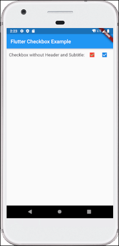
输出量
现在,在模拟器或设备中执行该应用程序,我们将看到以下屏幕:
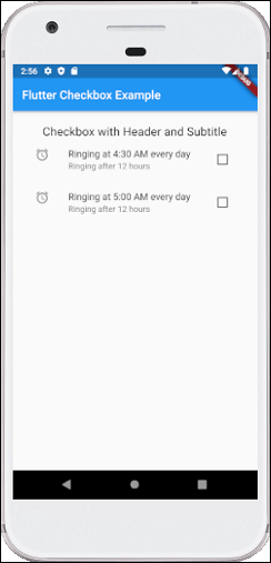
CheckboxListTitle:
| Attributes | Descriptions |
|---|---|
| value | It is used whether the checkbox is checked or not. |
| onChanged | It will be called when the value is changed. |
| titile | It specified the main title of the list. |
| subtitle | It specified the subtitle of the list. Usually, it is used to add the description. |
| activeColor | It specified the color of the selected checkbox. |
| activeColor | It specified the color of the selected checkbox. |
| selected | By default, it is false. It highlights the text after selection. |
| secondary | It is the widget, which is displayed in front of the checkbox. |
例:
以下是CheckboxListTitle的演示示例:
CheckboxListTile(
  secondary: const Icon(Icons.abc),
  title: const Text('demo mode'),
     subtitle: Text('sub demo mode'),
  value: this.subvalue,
  onChanged: (bool value) {
    setState(() {
      this.subvalue = value;
    });
  },
),
让我们编写完整的代码,以查看CheckboxListTitle如何在Flutter中显示。首先,在android studio中创建一个项目,打开main.dart文件,并替换下面给出的代码:
import 'package:flutter/material.dart';

void main() {
  runApp(MaterialApp( home: MyHomePage(),));
}

class MyHomePage extends StatefulWidget {
  @override
  _HomePageState createState() => _HomePageState();
}

class _HomePageState extends State {
  bool valuefirst = false;
  bool valuesecond = false;

  @override
  Widget build(BuildContext context) {
    return MaterialApp(
      home: Scaffold(
        appBar: AppBar(title: Text('Flutter Checkbox Example'),),
        body: Container(
            padding: new EdgeInsets.all(22.0),
            child: Column(
              children: [
                SizedBox(width: 10,),
                Text('Checkbox with Header and Subtitle',style: TextStyle(fontSize: 20.0), ),
                CheckboxListTile(
                  secondary: const Icon(Icons.alarm),
                  title: const Text('Ringing at 4:30 AM every day'),
                  subtitle: Text('Ringing after 12 hours'),
                  value: this.valuefirst,
                  onChanged: (bool value) {
                    setState(() {
                      this.valuefirst = value;
                    });
                  },
                ),
                CheckboxListTile(
                  controlAffinity: ListTileControlAffinity.trailing,
                  secondary: const Icon(Icons.alarm),
                  title: const Text('Ringing at 5:00 AM every day'),
                  subtitle: Text('Ringing after 12 hours'),
                  value: this.valuesecond,
                  onChanged: (bool value) {
                    setState(() {
                      this.valuesecond = value;
                    });
                  },
                ),
              ],
            )
        ),
      ),
    );
  }
}
输出量
现在在模拟器或设备中执行该应用程序,我们将获得以下屏幕: