使用 Matplotlib 在Python中绘制 3D 散点图
3D 散点图是一种数学图,是 3D 绘图的最基本版本,用于使用笛卡尔坐标将数据的属性显示为数据集的三个变量。要创建 3D 散点图,Matplotlib 的mplot3d 工具包用于启用三维绘图。通常使用 ax.scatter3D() 创建 3D 散点图,matplotlib 库的函数接受 X、Y 和 Z 的数据集来创建绘图,而函数的其余属性相同就像二维散点图一样。
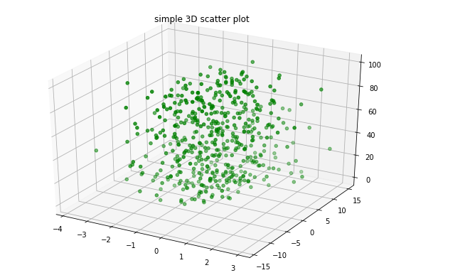
示例 1:让我们使用 ax.scatter3D()函数创建一个基本的 3D 散点图。
Python3
# Import libraries
from mpl_toolkits import mplot3d
import numpy as np
import matplotlib.pyplot as plt


# Creating dataset
z = np.random.randint(100, size =(50))
x = np.random.randint(80, size =(50))
y = np.random.randint(60, size =(50))

# Creating figure
fig = plt.figure(figsize = (10, 7))
ax = plt.axes(projection ="3d")

# Creating plot
ax.scatter3D(x, y, z, color = "green")
plt.title("simple 3D scatter plot")

# show plot
plt.show()
Python3
# Import libraries
from mpl_toolkits import mplot3d
import numpy as np
import matplotlib.pyplot as plt


# Creating dataset
z = 4 * np.tan(np.random.randint(10, size =(500))) + np.random.randint(100, size =(500))
x = 4 * np.cos(z) + np.random.normal(size = 500)
y = 4 * np.sin(z) + 4 * np.random.normal(size = 500)

# Creating figure
fig = plt.figure(figsize = (16, 9))
ax = plt.axes(projection ="3d")

# Add x, y gridlines
ax.grid(b = True, color ='grey',
        linestyle ='-.', linewidth = 0.3,
        alpha = 0.2)


# Creating color map
my_cmap = plt.get_cmap('hsv')

# Creating plot
sctt = ax.scatter3D(x, y, z,
                    alpha = 0.8,
                    c = (x + y + z),
                    cmap = my_cmap,
                    marker ='^')

plt.title("simple 3D scatter plot")
ax.set_xlabel('X-axis', fontweight ='bold')
ax.set_ylabel('Y-axis', fontweight ='bold')
ax.set_zlabel('Z-axis', fontweight ='bold')
fig.colorbar(sctt, ax = ax, shrink = 0.5, aspect = 5)

# show plot
plt.show()
输出 :
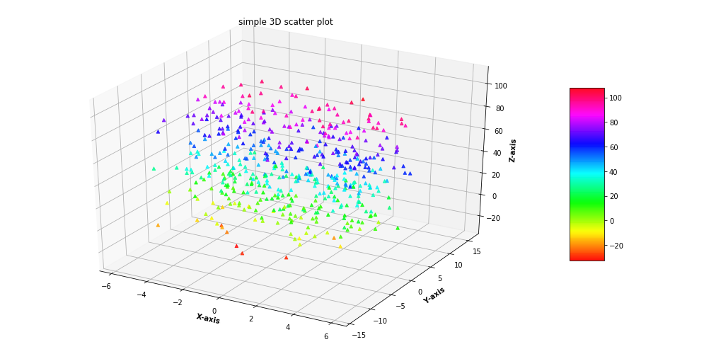
示例 2:为了更好地理解让我们再举一个例子。
Python3
# Import libraries
from mpl_toolkits import mplot3d
import numpy as np
import matplotlib.pyplot as plt


# Creating dataset
z = 4 * np.tan(np.random.randint(10, size =(500))) + np.random.randint(100, size =(500))
x = 4 * np.cos(z) + np.random.normal(size = 500)
y = 4 * np.sin(z) + 4 * np.random.normal(size = 500)

# Creating figure
fig = plt.figure(figsize = (16, 9))
ax = plt.axes(projection ="3d")

# Add x, y gridlines
ax.grid(b = True, color ='grey',
        linestyle ='-.', linewidth = 0.3,
        alpha = 0.2)


# Creating color map
my_cmap = plt.get_cmap('hsv')

# Creating plot
sctt = ax.scatter3D(x, y, z,
                    alpha = 0.8,
                    c = (x + y + z),
                    cmap = my_cmap,
                    marker ='^')

plt.title("simple 3D scatter plot")
ax.set_xlabel('X-axis', fontweight ='bold')
ax.set_ylabel('Y-axis', fontweight ='bold')
ax.set_zlabel('Z-axis', fontweight ='bold')
fig.colorbar(sctt, ax = ax, shrink = 0.5, aspect = 5)

# show plot
plt.show()
输出 :