在 R 中使用 ggplot2 绘制线图
在折线图中,我们有横轴值,通过它可以使用纵轴值对线进行排序和连接。我们将使用包含多个层的 R 包ggplot2 。
首先,如果之前未在 R Studio 中安装 ggplot2 包,则需要安装它。
函数:
- geom_line按照变量在水平 (x) 轴上的顺序将它们连接起来。
句法:
geom_line(mapping=NULL, data=NULL, stat=”identity”, position=”identity”,…)
- geom_path以与数据相同的顺序连接观察
句法:
geom_path(mapping=NULL, data=NULL, stat=”identity”, position=”identity”,…)
单线图
在本节中,我们将处理单个折线图,还将讨论有助于其外观的各种属性。
使用中的数据集:
R
# Create data for chart
val <-data.frame(course=c('DSA','C++','R','Python'),
                num=c(77,55,80,60))
head(val)
R
library(ggplot2)

# Create data for chart
val <-data.frame(course=c('DSA','C++','R','Python'),
                num=c(77,55,80,60))

# Basic Line
ggplot(data=val, aes(x=course, y=num, group=1)) +
  geom_line()+
  geom_point()
R
library(ggplot2)

# Create data for chart
val <-data.frame(course=c('DSA','C++','R','Python'),
                num=c(77,55,80,60))

# Format the line type
ggplot(data=val, aes(x=course, y=num, group=1)) +
  geom_line(linetype = "dotted")+
  geom_point()
R
library(ggplot2)

# Create data for chart
val <-data.frame(course=c('DSA','C++','R','Python'),
                num=c(77,55,80,60))

# Format the line color
ggplot(data=val, aes(x=course, y=num, group=1)) +
  geom_line(color="green")+
  geom_point()
R
library(ggplot2)

# Create data for chart
val <-data.frame(course=c('DSA','C++','R','Python'),
                num=c(77,55,80,60))

# Format the line size
ggplot(data=val, aes(x=course, y=num, group=1)) +
  geom_line(color="green",size=1.5)+
  geom_point()
R
library(ggplot2)

# Create data for chart
val <-data.frame(course=c('DSA','C++','R','Python'),
                num=c(77,55,80,60))

# Adding titles
line<-ggplot(data=val, aes(x=course, y=num, group=1)) +
  geom_line(color="green",size=1.5)+
  geom_point()

line+ggtitle("Courses vs Students Enrolled in GeeksforGeeks")+
  labs(x="Courses",y="Number of Students")
R
library(ggplot2)

# Create data for chart
val <-data.frame(course=c('DSA','C++','R','Python'),
                num=c(77,55,80,60))

# Adding titles
line<-ggplot(data=val, aes(x=course, y=num, group=1)) +
  geom_line(color="green",size=1.5)+
  geom_point()

line+ggtitle("Courses vs Students Enrolled in GeeksforGeeks")+
  labs(x="Courses",y="Number of Students")+
  theme_dark()
R
library(ggplot2)
library(grid)

# Create data for chart
val <-data.frame(course=c('DSA','C++','R','Python'),
                num=c(77,55,80,60))

# Adding an arrow
ggplot(data=val, aes(x=course, y=num, group=1)) +
  geom_line(arrow=arrow())+
  geom_point()

# Adding  closed arrow on both ends of the line
arr=arrow(angle = 20, ends = "both", type = "closed")
ggplot(data=val, aes(x=course, y=num, group=1)) +
  geom_line(arrow=arr)+
  geom_point()
R
library(ggplot2)

# Create data for chart
val <-data.frame(course=c('DSA','C++','R','Python'),
                num=c(77,55,80,60))

# Adding data label
ggplot(data=val, aes(x=course, y=num, group=1, label=num)) +
  geom_line()+
  geom_point()+
  geom_text(nudge_y = 2)
R
library(ggplot2)

# Create data for chart
val <-data.frame(course=c('DSA','C++','R','Python'),
                num=c(77,55,80,60))

# Storing the line plot
ln <-ggplot(data=val, aes(x=course, y=num, group=1)) +
  geom_line(color="green",size=2)+
  geom_point()

# y-axis limits
ln+ylim(0,100)+
theme_dark()
R
library(ggplot2)

# Inserting data
vacc <- data.frame(type=rep(c("Covishield", "Covaxin"), each=2),
                  dose=rep(c("D1", "D2"),2),
                  slots=c(33, 45, 66, 50))

# Plotting line with multiple groups
ggplot(data=vacc, aes(x=dose, y=slots, group=type)) +
  geom_line(linetype="longdash", color="green", size=1.5)+
  geom_point(color="red", size=5)+
  theme_dark()
R
library(ggplot)

# Inserting data
vacc <- data.frame(type=rep(c("Covishield", "Covaxin"), each=2),
                  dose=rep(c("D1", "D2"),2),
                  slots=c(33, 45, 66, 50))

# Changing the line type on the basis of groups
ggplot(vacc, aes(x=dose, y=slots, group=type)) +
  geom_line(aes(linetype=type))+
  geom_point()+
  theme_classic()

# Changing the line type on the basis of groups and also the shape of points
ggplot(vacc, aes(x=dose, y=slots, group=type)) +
  geom_line(aes(linetype=type))+
  geom_point(aes(shape=type))+
  theme_classic()
R
library(ggplot2)

# Inserting data
vacc <- data.frame(type=rep(c("Covishield", "Covaxin"), each=2),
                  dose=rep(c("D1", "D2"),2),
                  slots=c(33, 45, 66, 50))

# Change line color by group type of vaccine
ln <-ggplot(vacc, aes(x=dose, y=slots, group=type)) +
  geom_line(aes(color=type))+
  geom_point(aes(color=type))+
  theme_classic()
ln
R
library(ggplot2)

# Inserting data
vacc <- data.frame(type=rep(c("Covishield", "Covaxin"), each=2),
                  dose=rep(c("D1", "D2"),2),
                  slots=c(33, 45, 66, 50))

# Change line color by group type of vaccine
ln <-ggplot(vacc, aes(x=dose, y=slots, group=type)) +
  geom_line(aes(color=type))+
  geom_point(aes(color=type))+
  theme_classic()

# Adding line colors using brewer color palette
ln+scale_color_brewer(palette="Set2")

# Adding line colors using color manual
ln+scale_color_manual(values=c("green", "blue"))
R
library(ggplot2)

# Inserting data
vacc <- data.frame(type=rep(c("Covishield", "Covaxin"), each=2),
                  dose=rep(c("D1", "D2"),2),
                  slots=c(33, 45, 66, 50))

# Change line color by group type of vaccine
ln <-ggplot(vacc, aes(x=dose, y=slots, group=type)) +
  geom_line(aes(color=type))+
  geom_point(aes(color=type))+
  theme_classic()

ln <- ln + scale_color_brewer(palette="Dark2")+
  theme_classic()

# Legend at top
ln + theme(legend.position="top")

# Legend at left
ln + theme(legend.position="left")

# Remove legend
ln + theme(legend.position="none")
输出:
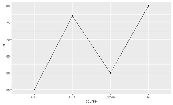
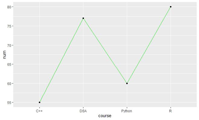
基本线图
对于简单的折线图,数据大致传递给具有一些必需属性的函数。
例子:
电阻
library(ggplot2)

# Create data for chart
val <-data.frame(course=c('DSA','C++','R','Python'),
                num=c(77,55,80,60))

# Basic Line
ggplot(data=val, aes(x=course, y=num, group=1)) +
  geom_line()+
  geom_point()
输出:
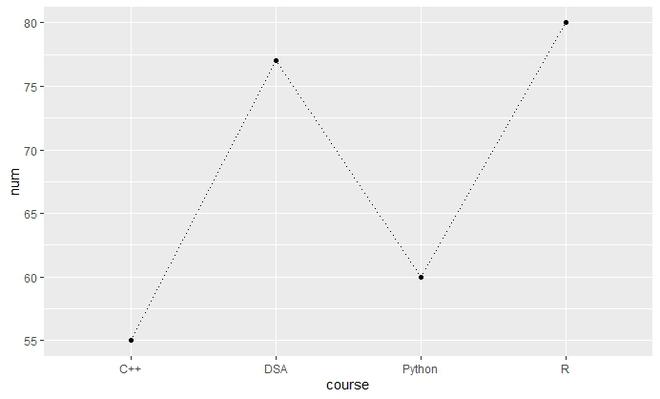
成型线
- 线型
对于这一点,使用了命令线型。 ggplot2 提供各种线型。例如:dotted、两个破折号、破折号等。这个属性是通过一个必需的值传递的。
例子:
电阻
library(ggplot2)

# Create data for chart
val <-data.frame(course=c('DSA','C++','R','Python'),
                num=c(77,55,80,60))

# Format the line type
ggplot(data=val, aes(x=course, y=num, group=1)) +
  geom_line(linetype = "dotted")+
  geom_point()
输出:
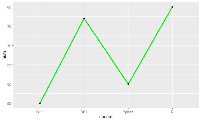
- 线条颜色
使用命令颜色并在 geom_line( ) 内用双引号 [" "] 写出所需的颜色。
例子:
电阻
library(ggplot2)

# Create data for chart
val <-data.frame(course=c('DSA','C++','R','Python'),
                num=c(77,55,80,60))

# Format the line color
ggplot(data=val, aes(x=course, y=num, group=1)) +
  geom_line(color="green")+
  geom_point()
输出:
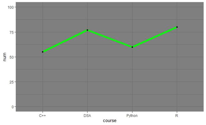
- 线路尺寸
可以使用命令size并在 geom_line( ) 中提供大小的值来更改行大小。
例子:
电阻
library(ggplot2)

# Create data for chart
val <-data.frame(course=c('DSA','C++','R','Python'),
                num=c(77,55,80,60))

# Format the line size
ggplot(data=val, aes(x=course, y=num, group=1)) +
  geom_line(color="green",size=1.5)+
  geom_point()
输出:
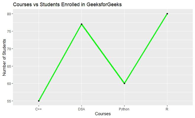
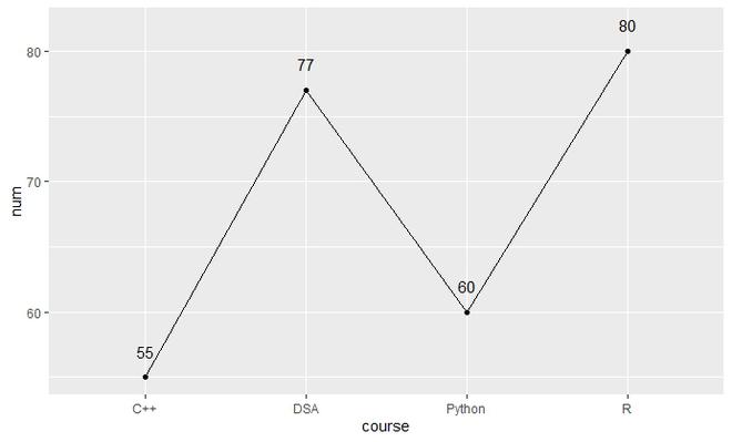
添加图表标题、轴标题
可以使用具有适当标题的ggtitle() 使用适当的输入再次添加图表标题和实验室可用于添加轴标题。
例子:
电阻
library(ggplot2)

# Create data for chart
val <-data.frame(course=c('DSA','C++','R','Python'),
                num=c(77,55,80,60))

# Adding titles
line<-ggplot(data=val, aes(x=course, y=num, group=1)) +
  geom_line(color="green",size=1.5)+
  geom_point()

line+ggtitle("Courses vs Students Enrolled in GeeksforGeeks")+
  labs(x="Courses",y="Number of Students")
输出:
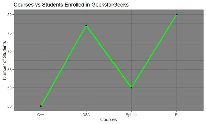
改变主题
使用 theme_theme_name() 添加主题。 R 库中有很多可用的主题。例如:dark、classic 等。可以根据需要提供值。
例子:
电阻
library(ggplot2)

# Create data for chart
val <-data.frame(course=c('DSA','C++','R','Python'),
                num=c(77,55,80,60))

# Adding titles
line<-ggplot(data=val, aes(x=course, y=num, group=1)) +
  geom_line(color="green",size=1.5)+
  geom_point()

line+ggtitle("Courses vs Students Enrolled in GeeksforGeeks")+
  labs(x="Courses",y="Number of Students")+
  theme_dark()
输出:
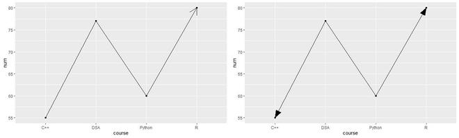
添加箭头
要在线添加箭头,请使用网格库。然后添加箭头使用箭头( ) 添加箭头。还可以更改箭头中的参数,如角度、类型、末端。
例子:
电阻
library(ggplot2)
library(grid)

# Create data for chart
val <-data.frame(course=c('DSA','C++','R','Python'),
                num=c(77,55,80,60))

# Adding an arrow
ggplot(data=val, aes(x=course, y=num, group=1)) +
  geom_line(arrow=arrow())+
  geom_point()

# Adding  closed arrow on both ends of the line
arr=arrow(angle = 20, ends = "both", type = "closed")
ggplot(data=val, aes(x=course, y=num, group=1)) +
  geom_line(arrow=arr)+
  geom_point()
输出:
添加数据标签
使用 label 获取 y 轴上的值,使用 nudge_y 放置数据标签。
例子:
电阻
library(ggplot2)

# Create data for chart
val <-data.frame(course=c('DSA','C++','R','Python'),
                num=c(77,55,80,60))

# Adding data label
ggplot(data=val, aes(x=course, y=num, group=1, label=num)) +
  geom_line()+
  geom_point()+
  geom_text(nudge_y = 2)
输出:
缩放轴:
使用xlim( )更改 x 轴比例,使用ylim( )更改 y 轴比例并将适当的值传递给这些。
句法:
xlim(min,max)
ylim(min,max)
例子:
电阻
library(ggplot2)

# Create data for chart
val <-data.frame(course=c('DSA','C++','R','Python'),
                num=c(77,55,80,60))

# Storing the line plot
ln <-ggplot(data=val, aes(x=course, y=num, group=1)) +
  geom_line(color="green",size=2)+
  geom_point()

# y-axis limits
ln+ylim(0,100)+
theme_dark()
输出:
绘制多条线
为了将多个图绘制成一个图,除了 group 属性必须设置为列的名称之外,没有任何变化,根据不同的线将被绘制。
例子:
电阻
library(ggplot2)

# Inserting data
vacc <- data.frame(type=rep(c("Covishield", "Covaxin"), each=2),
                  dose=rep(c("D1", "D2"),2),
                  slots=c(33, 45, 66, 50))

# Plotting line with multiple groups
ggplot(data=vacc, aes(x=dose, y=slots, group=type)) +
  geom_line(linetype="longdash", color="green", size=1.5)+
  geom_point(color="red", size=5)+
  theme_dark()
输出:
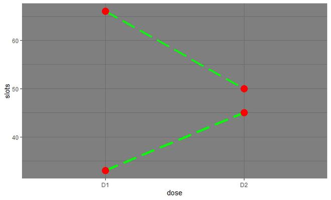
您还可以在上面的线图中添加标题、轴标题、数据标签,如上一节所述。
格式化绘图:
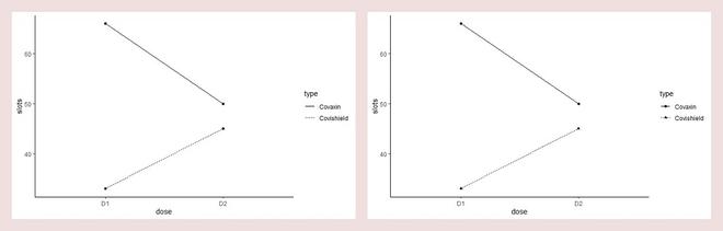
- 基于组使用单独的线型
要通过更改线条类型来区分线条,请在 geom_line() 中提供线条类型,并在 geom_point() 中提供图例的形状。
例子:
电阻
library(ggplot)

# Inserting data
vacc <- data.frame(type=rep(c("Covishield", "Covaxin"), each=2),
                  dose=rep(c("D1", "D2"),2),
                  slots=c(33, 45, 66, 50))

# Changing the line type on the basis of groups
ggplot(vacc, aes(x=dose, y=slots, group=type)) +
  geom_line(aes(linetype=type))+
  geom_point()+
  theme_classic()

# Changing the line type on the basis of groups and also the shape of points
ggplot(vacc, aes(x=dose, y=slots, group=type)) +
  geom_line(aes(linetype=type))+
  geom_point(aes(shape=type))+
  theme_classic()
输出:
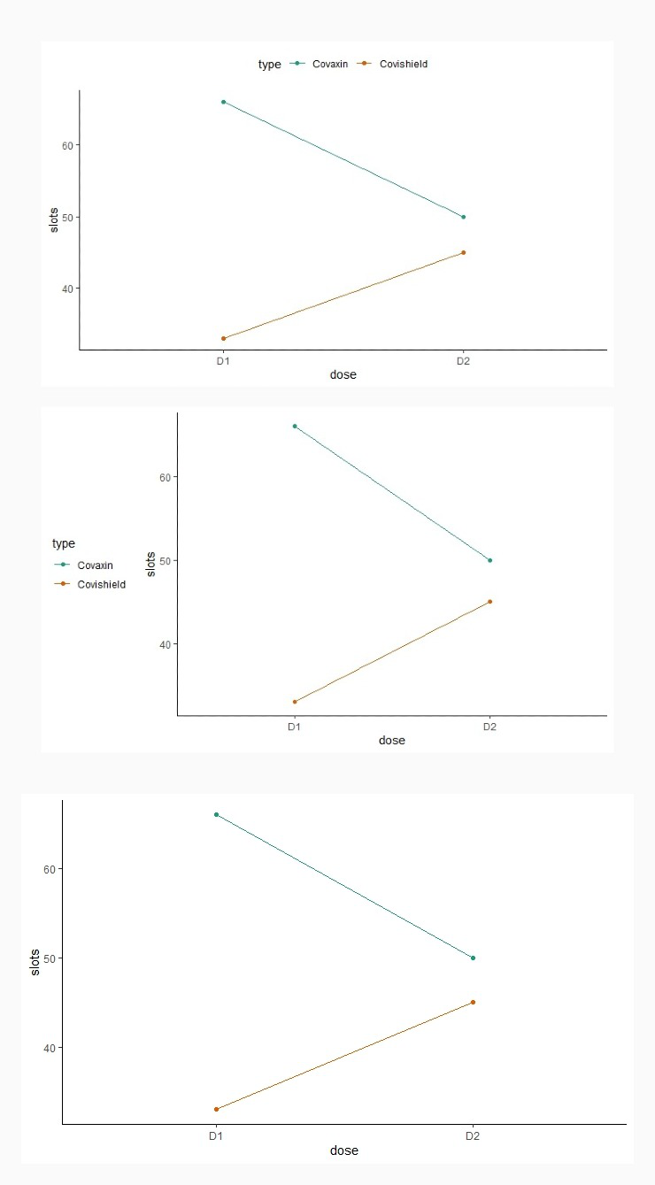
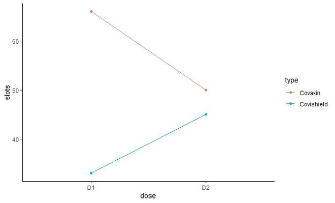
- 根据组分配不同的线条颜色
以下代码使用变量“类型”的级别自动控制颜色。它将为每条线分配单独的颜色。
例子:
电阻
library(ggplot2)

# Inserting data
vacc <- data.frame(type=rep(c("Covishield", "Covaxin"), each=2),
                  dose=rep(c("D1", "D2"),2),
                  slots=c(33, 45, 66, 50))

# Change line color by group type of vaccine
ln <-ggplot(vacc, aes(x=dose, y=slots, group=type)) +
  geom_line(aes(color=type))+
  geom_point(aes(color=type))+
  theme_classic()
ln
输出:
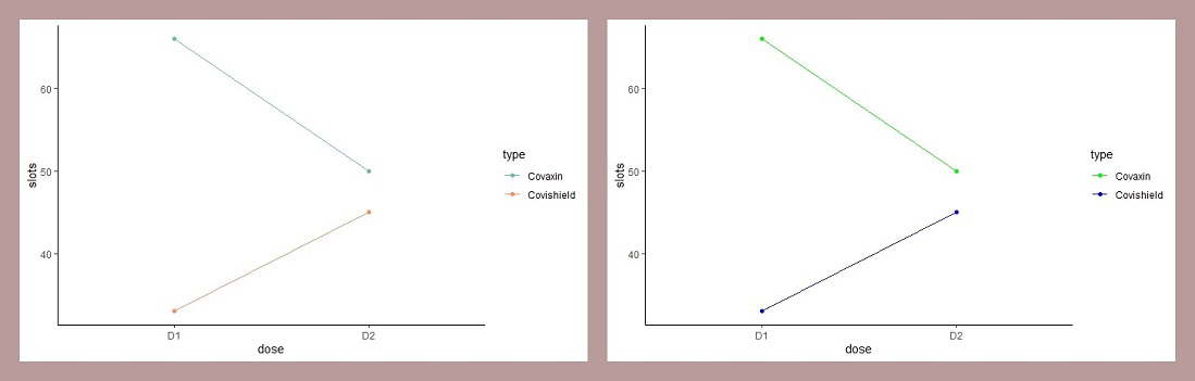
要手动输入颜色,您可以使用:
- scale_color_brewer() :它使用来自 RColorBrewer 包的不同调色板。它有各种调色板。
- scale_color_manual( ) :用于手动添加离散颜色。
例子:
电阻
library(ggplot2)

# Inserting data
vacc <- data.frame(type=rep(c("Covishield", "Covaxin"), each=2),
                  dose=rep(c("D1", "D2"),2),
                  slots=c(33, 45, 66, 50))

# Change line color by group type of vaccine
ln <-ggplot(vacc, aes(x=dose, y=slots, group=type)) +
  geom_line(aes(color=type))+
  geom_point(aes(color=type))+
  theme_classic()

# Adding line colors using brewer color palette
ln+scale_color_brewer(palette="Set2")

# Adding line colors using color manual
ln+scale_color_manual(values=c("green", "blue"))
输出:
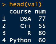
- 改变图例的位置
为了更改图例位置,主题函数的legen.position 属性传递了所需的值。
句法:
theme(legend.position=”pos”)
pos可以是顶部、右侧、底部、左侧或无
例子:
电阻
library(ggplot2)

# Inserting data
vacc <- data.frame(type=rep(c("Covishield", "Covaxin"), each=2),
                  dose=rep(c("D1", "D2"),2),
                  slots=c(33, 45, 66, 50))

# Change line color by group type of vaccine
ln <-ggplot(vacc, aes(x=dose, y=slots, group=type)) +
  geom_line(aes(color=type))+
  geom_point(aes(color=type))+
  theme_classic()

ln <- ln + scale_color_brewer(palette="Dark2")+
  theme_classic()

# Legend at top
ln + theme(legend.position="top")

# Legend at left
ln + theme(legend.position="left")

# Remove legend
ln + theme(legend.position="none")
输出: