R语言中的散点图
散点图是一组虚线,表示水平轴和垂直轴上的各个数据。两个变量的值沿 X 轴和 Y 轴绘制的图表,结果点的模式揭示了它们之间的相关性。
R – 散点图
我们可以创造 R 编程语言中使用plot()函数的散点图。
Syntax: plot(x, y, main, xlab, ylab, xlim, ylim, axes)
Parameters:
- x: This parameter sets the horizontal coordinates.
- y: This parameter sets the vertical coordinates.
- xlab: This parameter is the label for horizontal axis.
- ylab: This parameter is the label for vertical axis.
- main: This parameter main is the title of the chart.
- xlim: This parameter is used for plotting values of x.
- ylim: This parameter is used for plotting values of y.
- axes: This parameter indicates whether both axes should be drawn on the plot.
简单的散点图
为了创建散点图:
- 我们使用数据集“mtcars”。
- 使用 mtcars 中的“wt”和“mpg”列。
例子:
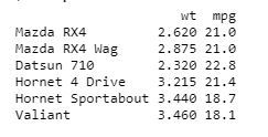
R
input <- mtcars[, c('wt', 'mpg')]
print(head(input))
R
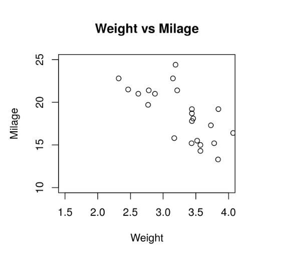
# Get the input values.
input <- mtcars[, c('wt', 'mpg')]

# Plot the chart for cars with
# weight between 1.5 to 4 and
# mileage between 10 and 25.
plot(x = input$wt, y = input$mpg,
    xlab = "Weight",
    ylab = "Milage",
    xlim = c(1.5, 4),
    ylim = c(10, 25),
    main = "Weight vs Milage"
)
R
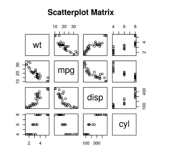
# Plot the matrices between
# 4 variables giving 12 plots.

# One variable with 3 others
# and total 4 variables.
pairs(~wt + mpg + disp + cyl, data = mtcars,
    main = "Scatterplot Matrix")
R
# Loading ggplot2 package
library(ggplot2)

# Creating scatterplot with fitted values.
# An additional function stst_smooth
# is used for linear regression.
ggplot(mtcars, aes(x = log(mpg), y = log(drat))) +
        geom_point(aes(color = factor(gear))) +
        stat_smooth(method = "lm",
        col = "#C42126", se = FALSE, size = 1
)
Python3
# Loading ggplot2 package
library(ggplot2)

# Creating scatterplot with fitted values.
# An additional function stst_smooth
# is used for linear regression.
new_graph<-ggplot(mtcars, aes(x = log(mpg),
                              y = log(drat))) +
                    geom_point(aes(color = factor(gear))) +
                    stat_smooth(method = "lm",
                                col = "#C42126",
                    se = FALSE, size = 1)

# in above example lm is used for linear regression
# and se stands for standard error.
# Adding title with dynamic name
new_graph + labs(
        title = "Relation between Mile per hours and drat",
        subtitle = "Relationship break down by gear class",
        caption = "Authors own computation"
)
R
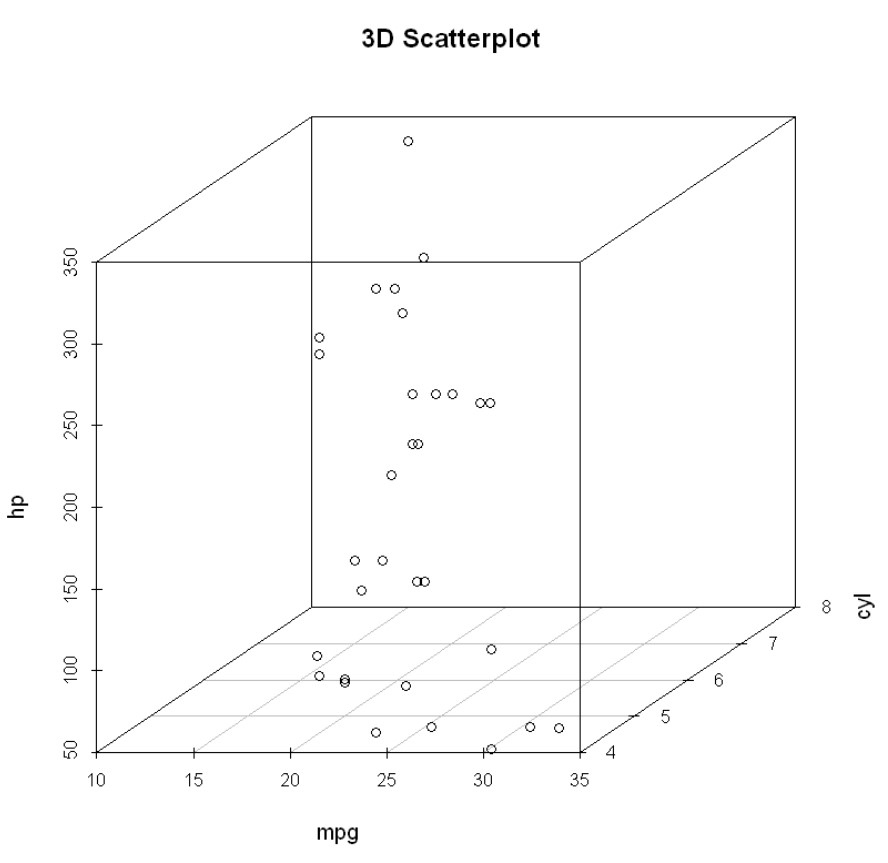
# 3D Scatterplot
library(scatterplot3d)
attach(mtcars)

scatterplot3d(mpg, cyl, hp,
              main = "3D Scatterplot")
输出:
创建散点图
为了创建散点图:
- 我们正在使用所需的参数来绘制图表。
- 在此“xlab”描述 X 轴,“ylab”描述 Y 轴。
例子:
R
# Get the input values.
input <- mtcars[, c('wt', 'mpg')]

# Plot the chart for cars with
# weight between 1.5 to 4 and
# mileage between 10 and 25.
plot(x = input$wt, y = input$mpg,
    xlab = "Weight",
    ylab = "Milage",
    xlim = c(1.5, 4),
    ylim = c(10, 25),
    main = "Weight vs Milage"
)
输出:
散点图矩阵
当我们有两个或多个变量并且我们想在一个变量和其他变量之间进行相关时,我们使用散点图矩阵。
pair()函数用于创建散点图矩阵。
Syntax: pairs(formula, data)
Parameters:
- formula: This parameter represents the series of variables used in pairs.
- data: This parameter represents the data set from which the variables will be taken.
例子:
R
# Plot the matrices between
# 4 variables giving 12 plots.

# One variable with 3 others
# and total 4 variables.
pairs(~wt + mpg + disp + cyl, data = mtcars,
    main = "Scatterplot Matrix")
输出:
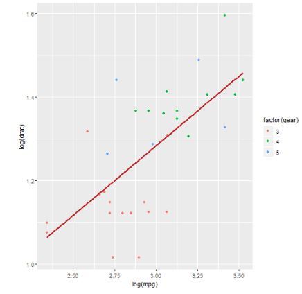
带有拟合值的散点图
为了创建散点图:
- 我们正在使用 ggplot2 包提供 ggplot() 和 geom_point()函数来创建散点图。
- 我们还在 mtcars 中使用“wt”和“mpg”列。
例子:
R
# Loading ggplot2 package
library(ggplot2)

# Creating scatterplot with fitted values.
# An additional function stst_smooth
# is used for linear regression.
ggplot(mtcars, aes(x = log(mpg), y = log(drat))) +
        geom_point(aes(color = factor(gear))) +
        stat_smooth(method = "lm",
        col = "#C42126", se = FALSE, size = 1
)
输出:
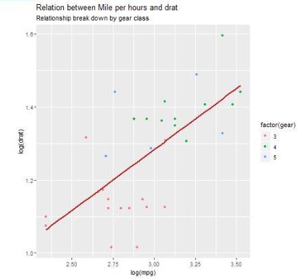
添加具有动态名称的标题
要创建散点图,请添加子标题:
- 我们使用附加函数,在 ggplot 中我们添加数据集“mtcars”,并添加“aes”、“geom_point”。
- 使用标题、标题、副标题。
例子:
Python3
# Loading ggplot2 package
library(ggplot2)

# Creating scatterplot with fitted values.
# An additional function stst_smooth
# is used for linear regression.
new_graph<-ggplot(mtcars, aes(x = log(mpg),
                              y = log(drat))) +
                    geom_point(aes(color = factor(gear))) +
                    stat_smooth(method = "lm",
                                col = "#C42126",
                    se = FALSE, size = 1)

# in above example lm is used for linear regression
# and se stands for standard error.
# Adding title with dynamic name
new_graph + labs(
        title = "Relation between Mile per hours and drat",
        subtitle = "Relationship break down by gear class",
        caption = "Authors own computation"
)
输出:
3D 散点图
在这里,我们将使用 scatterplot3D 包创建 3D 散点图,该包可以使用 scatterplot3d() 方法绘制 3D 散点图。
R
# 3D Scatterplot
library(scatterplot3d)
attach(mtcars)

scatterplot3d(mpg, cyl, hp,
              main = "3D Scatterplot")
输出: