R 中带有 ggplot2 的气泡图
气泡图是一种数据可视化,有助于在二维图中显示与散点图中相同的多个圆圈(气泡)。气泡图主要用于描绘和显示数值变量之间的关系。
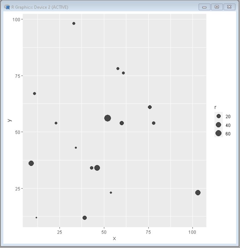
使用 ggplot2,可以使用geom_point()函数构建气泡图。必须至少向aes()提供三个变量,即 x、y 和 size。图例将由 ggplot2 自动显示。
句法:
ggplot(data, aes(x, y, size)) + geom_point()
上述语法中的大小将根据气泡大小不同的值采用其中一个属性的名称。
示例:创建气泡图
R
# importing the ggplot2 library
library(ggplot2)

# creating data set columns
x <- c(12,23,43,61,78,54,34,76,58,103,39,46,52,33,11,9,60)
y <- c(12,54,34,76,54,23,43,61,78,23,12,34,56,98,67,36,54)
r <- c(1,5,13,8,12,3,2,16,7,40,23,45,76,8,7,41,23)

# creating the dataframe from the above columns
data <- data.frame(x, y, r)

ggplot(data, aes(x = x, y = y,size = r))+ geom_point(alpha = 0.7)
R
# importing the ggplot2 library
library(ggplot2)

# creating data set columns
x <- c(12,23,43,61,78,54,34,76,58,103,39,46,52,33,11)
y <- c(12,54,34,76,54,23,43,61,78,23,12,34,56,98,67)
r <- c(1,5,13,8,12,3,2,16,7,40,23,45,76,8,7)

color <- c(rep("color1", 1), rep("color2", 2),
           rep("Color3", 3), rep("color4", 4),
           rep("color5", 5))
# creating the dataframe from the above columns
data <- data.frame(x, y, r, color)

ggplot(data, aes(x = x, y = y,size = r, color=color))+
geom_point(alpha = 0.7)
R
# creating data set columns
x <- c(12,23,43,61,78,54,34,76,58,103,39,46,52,33,11)
y <- c(12,54,34,76,54,23,43,61,78,23,12,34,56,98,67)
r <- c(1,5,13,8,12,3,2,16,7,40,23,45,76,8,7)

colors <- c(1,2,3,1,2,3,1,1,2,3,1,2,2,3,3)

# creating the dataframe from the
# above columns
data <- data.frame(x, y, r, colors)

# importing the ggplot2 library and
# RColorBrewer
library(RColorBrewer)
library(ggplot2)

# Draw plot
ggplot(data, aes(x = x, y = y,size = r, color=as.factor(colors))) +
geom_point(alpha = 0.7)+ scale_color_brewer(palette="Spectral")
R
# creating data set columns
x <- c(12,23,43,61,78,54,34,76,58,103,39,46,52,33,11)
y <- c(12,54,34,76,54,23,43,61,78,23,12,34,56,98,67)
r <- c(1,5,13,8,12,3,2,16,7,40,23,45,76,8,7)

color <- c(rep("color1", 1), rep("color2", 2),
           rep("Color3", 3), rep("color4", 4),
           rep("color5", 5))
sizeRange <- c(2,18)

# creating the dataframe from the above
# columns
data <- data.frame(x, y, r, color)

# importing the ggplot2 library
library(ggplot2)

ggplot(data, aes(x = x, y = y,size = r, color=color))
                + geom_point(alpha = 0.7)
                + scale_size(range = sizeRange, name="index")
R
# creating data set columns
x <- c(12,23,43,61,78,54,34,76,58,103,39,46,52,33,11)
y <- c(12,54,34,76,54,23,43,61,78,23,12,34,56,98,67)
r <- c(1,5,13,8,12,3,2,16,7,40,23,45,76,8,7)
library("RColorBrewer")
color <- brewer.pal(n = 5, name = "RdBu")
# creating the dataframe from the above columns
data <- data.frame(x, y, r, color)
# importing the ggplot2 library
library(ggplot2)
ggplot(data, aes(x = x, y = y,size = r, color=color)) +
geom_point(alpha = 0.7) +
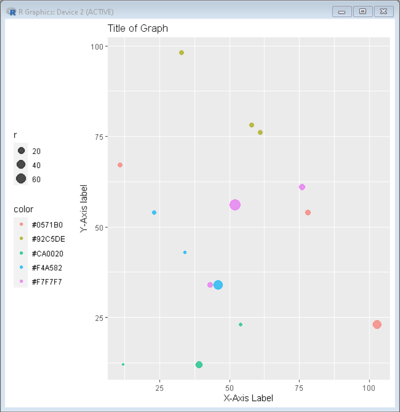
labs(title= "Title of Graph", y="Y-Axis label", x = "X-Axis Label")R
# creating data set columns
x <- c(12,23,43,61,78,54,34,76,58,103,39,46,52,33,11)
y <- c(12,54,34,76,54,23,43,61,78,23,12,34,56,98,67)
r <- c(1,5,13,8,12,3,2,16,7,40,23,45,76,8,7)

library("RColorBrewer")
color <- brewer.pal(n = 5, name = "RdBu")

# creating the dataframe from the above columns
data <- data.frame(x, y, r, color)

# importing the ggplot2 library
library(ggplot2)

ggplot(data, aes(x = x, y = y,size = r, color=color)) +
geom_point(alpha = 0.7) +
labs(title= "Title of Graph",y="Y-Axis label", x = "X-Axis Label") +
theme(legend.position="left")
输出:
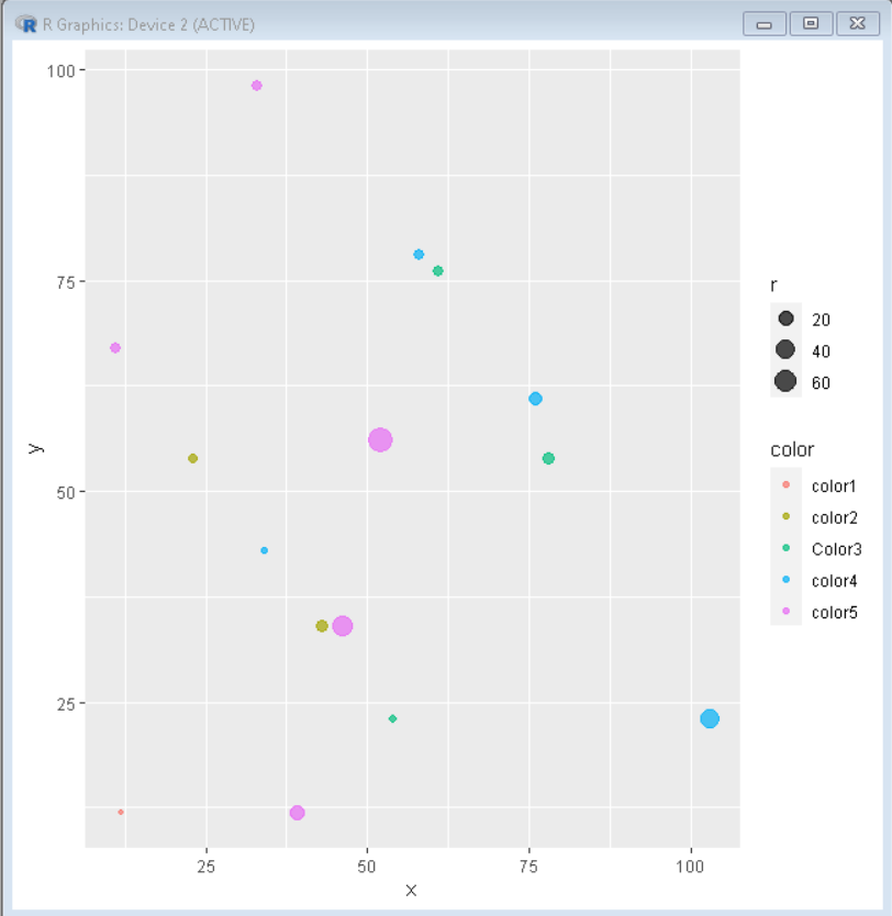
在上面的例子中,所有气泡都以相同的颜色出现,因此使图形难以解释。可以将颜色添加到绘图中以使气泡彼此不同。
示例:为气泡图添加颜色
电阻
# importing the ggplot2 library
library(ggplot2)

# creating data set columns
x <- c(12,23,43,61,78,54,34,76,58,103,39,46,52,33,11)
y <- c(12,54,34,76,54,23,43,61,78,23,12,34,56,98,67)
r <- c(1,5,13,8,12,3,2,16,7,40,23,45,76,8,7)

color <- c(rep("color1", 1), rep("color2", 2),
           rep("Color3", 3), rep("color4", 4),
           rep("color5", 5))
# creating the dataframe from the above columns
data <- data.frame(x, y, r, color)

ggplot(data, aes(x = x, y = y,size = r, color=color))+
geom_point(alpha = 0.7)
输出:
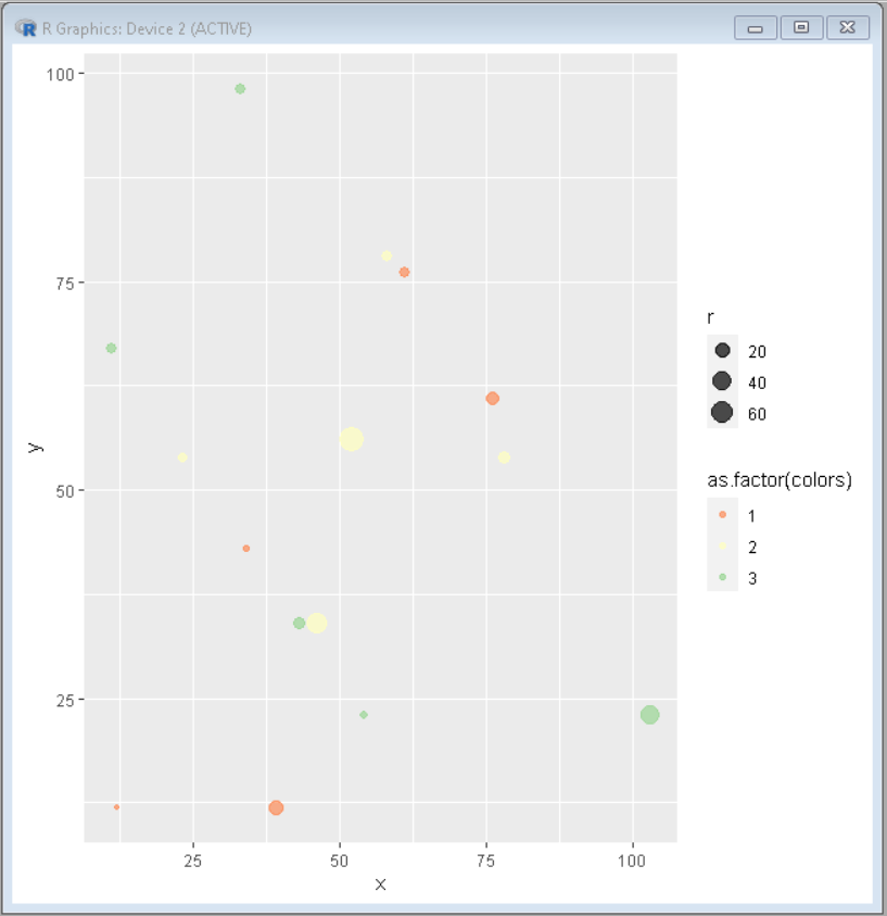
可以使用调色板自定义颜色。要使用 RColorBrewer 调色板更改颜色,请将scale_color_brewer()添加到 ggplot2 的绘图代码中
句法:
scale_color_brewer(palette=
示例:在 R 中自定义气泡图的颜色
电阻
# creating data set columns
x <- c(12,23,43,61,78,54,34,76,58,103,39,46,52,33,11)
y <- c(12,54,34,76,54,23,43,61,78,23,12,34,56,98,67)
r <- c(1,5,13,8,12,3,2,16,7,40,23,45,76,8,7)

colors <- c(1,2,3,1,2,3,1,1,2,3,1,2,2,3,3)

# creating the dataframe from the
# above columns
data <- data.frame(x, y, r, colors)

# importing the ggplot2 library and
# RColorBrewer
library(RColorBrewer)
library(ggplot2)

# Draw plot
ggplot(data, aes(x = x, y = y,size = r, color=as.factor(colors))) +
geom_point(alpha = 0.7)+ scale_color_brewer(palette="Spectral")
输出:
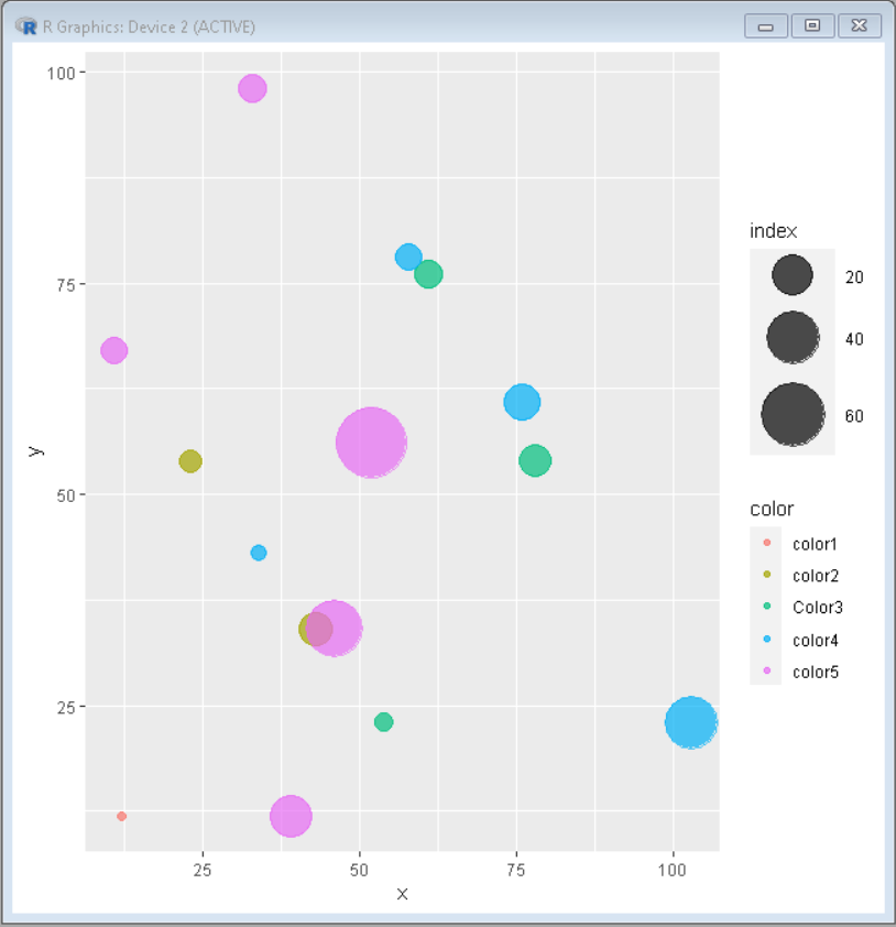
为了改变图中气泡的大小,即给出从最小气泡到最大气泡的大小范围,我们使用scale_size() 。这允许使用 range 参数设置最小和最大圆圈的大小。
句法:
scale_size(range =< range-vector>)
示例:更改气泡图的大小
电阻
# creating data set columns
x <- c(12,23,43,61,78,54,34,76,58,103,39,46,52,33,11)
y <- c(12,54,34,76,54,23,43,61,78,23,12,34,56,98,67)
r <- c(1,5,13,8,12,3,2,16,7,40,23,45,76,8,7)

color <- c(rep("color1", 1), rep("color2", 2),
           rep("Color3", 3), rep("color4", 4),
           rep("color5", 5))
sizeRange <- c(2,18)

# creating the dataframe from the above
# columns
data <- data.frame(x, y, r, color)

# importing the ggplot2 library
library(ggplot2)

ggplot(data, aes(x = x, y = y,size = r, color=color))
                + geom_point(alpha = 0.7)
                + scale_size(range = sizeRange, name="index")
输出:
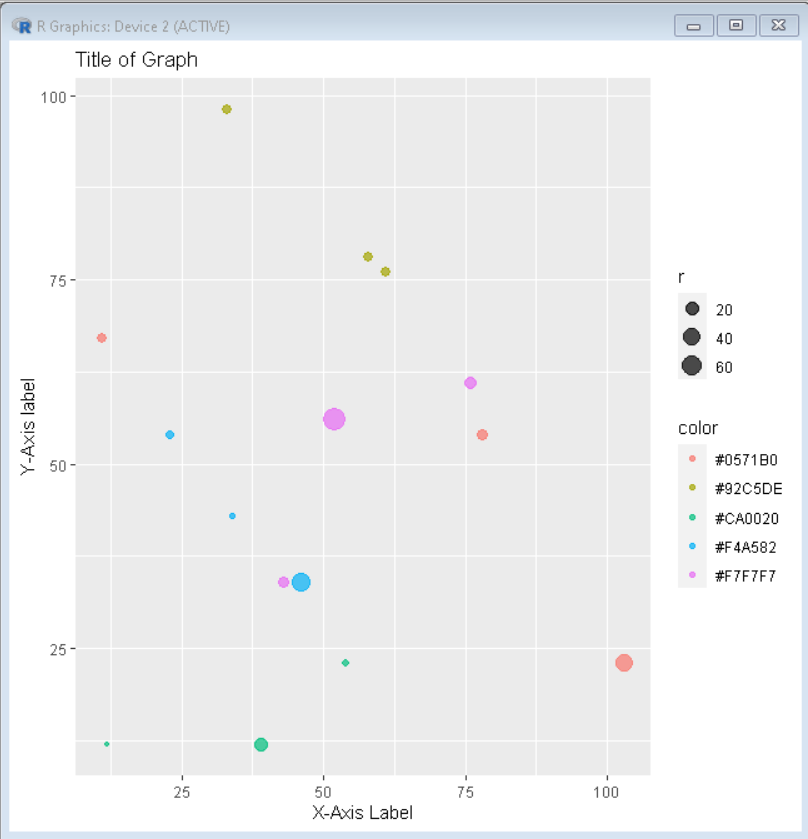
要更改轴上的标签,请将代码+labs(y= “y 轴名称”, x = “x 轴名称”)添加到您的基本 ggplot 代码行中。
示例:更改 R 中气泡图的标签
电阻
# creating data set columns
x <- c(12,23,43,61,78,54,34,76,58,103,39,46,52,33,11)
y <- c(12,54,34,76,54,23,43,61,78,23,12,34,56,98,67)
r <- c(1,5,13,8,12,3,2,16,7,40,23,45,76,8,7)

library("RColorBrewer")
color <- brewer.pal(n = 5, name = "RdBu")

# creating the dataframe from the above columns
data <- data.frame(x, y, r, color)

# importing the ggplot2 library
library(ggplot2)
ggplot(data, aes(x = x, y = y,size = r, color=color)) +
geom_point(alpha = 0.7) +
labs(title= "Title of Graph", y="Y-Axis label", x = "X-Axis Label")
输出:
要更改 ggplot2 中的图例位置,请将theme()添加到基本的 ggplot2 代码中。
句法:
theme(legend.position=
示例:更改气泡图的图例位置
电阻
# creating data set columns
x <- c(12,23,43,61,78,54,34,76,58,103,39,46,52,33,11)
y <- c(12,54,34,76,54,23,43,61,78,23,12,34,56,98,67)
r <- c(1,5,13,8,12,3,2,16,7,40,23,45,76,8,7)

library("RColorBrewer")
color <- brewer.pal(n = 5, name = "RdBu")

# creating the dataframe from the above columns
data <- data.frame(x, y, r, color)

# importing the ggplot2 library
library(ggplot2)

ggplot(data, aes(x = x, y = y,size = r, color=color)) +
geom_point(alpha = 0.7) +
labs(title= "Title of Graph",y="Y-Axis label", x = "X-Axis Label") +
theme(legend.position="left")
输出: