Seaborn – 气泡图
Seaborn是一个了不起的可视化库,用于在Python中绘制统计图形。它提供了漂亮的默认样式和调色板,使统计图更具吸引力。它建立在matplotlib库的顶部,并且还与 pandas 的数据结构紧密集成。
散点图用于观察变量之间的关系,并用点来表示它们之间的关系。气泡图是带有气泡(彩色实心圆圈)而不是信息焦点的散点图。气泡具有各种大小,具体取决于数据中的另一个变量。同样,气泡可以具有各种颜色,具体取决于数据集中的另一个变量。
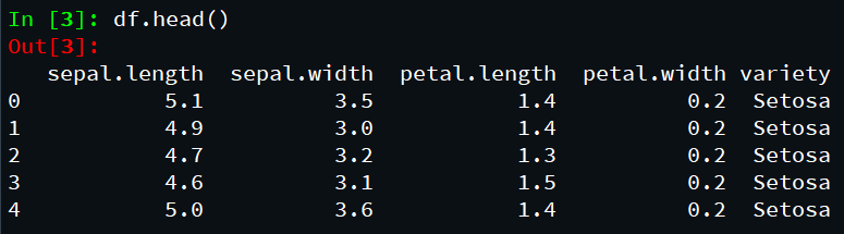
让我们加载所需的模块和简化的 Iris 数据作为 Pandas 数据框:
Python3
# import all important libraries
import matplotlib.pyplot as plt
import pandas as pd
import seaborn as sns

# load dataset
data= "https://gist.githubusercontent.com/netj/8836201/raw/6f9306ad21398ea43cba4f7d537619d0e07d5ae3/iris.csv"

# convert to dataframe
df = pd.read_csv(data)

# display top most rows
df.head()
Python3
# import all important libraries
import matplotlib.pyplot as plt
import pandas as pd
import seaborn as sns

# load dataset
data = "https://gist.githubusercontent.com/netj/8836201/raw/6f9306ad21398ea43cba4f7d537619d0e07d5ae3/iris.csv"

# convert to dataframe
df = pd.read_csv(data)

# display top most rows
df.head()

# depict scatterplot illustration
sns.set_context("talk", font_scale=1.1)
plt.figure(figsize=(8, 6))
sns.scatterplot(x="sepal.length",
                y="sepal.width",
                data=df)

# assign labels
plt.xlabel("Sepal.Length")
plt.ylabel("sepal.width")
Python3
# import all important libraries
import matplotlib.pyplot as plt
import pandas as pd
import seaborn as sns

# load dataset
data = "https://gist.githubusercontent.com/netj/8836201/raw/6f9306ad21398ea43cba4f7d537619d0e07d5ae3/iris.csv"

# convert to dataframe
df = pd.read_csv(data)

# display top most rows
df.head()

# depict scatter plot illustration
sns.set_context("talk", font_scale=1.1)
plt.figure(figsize=(10, 6))
sns.scatterplot(x="petal.length",
                y="petal.width",
                data=df)
# Put the legend out of the figure
plt.legend(bbox_to_anchor=(1.01, 1), borderaxespad=0)
plt.xlabel("petal.length")
plt.ylabel("petal.width")
plt.tight_layout()
plt.savefig("Bubble_plot_Seaborn_scatterplot.png",
            format='png', dpi=150)
Python3
# import all important libraries
import matplotlib.pyplot as plt
import pandas as pd
import seaborn as sns

# load dataset
data= "https://gist.githubusercontent.com/netj/8836201/raw/6f9306ad21398ea43cba4f7d537619d0e07d5ae3/iris.csv"

# convert to dataframe
df = pd.read_csv(data)

# display top most rows
df.head()

# depict bubble plot illustration
sns.set_context("talk", font_scale=1.2)
plt.figure(figsize=(10,6))
sns.scatterplot(x='petal.length',
               y='petal.width',
               sizes=(20,500),
               alpha=0.5,
               data= df)
# Put the legend out of the figure
plt.legend(bbox_to_anchor=(1.01, 1),borderaxespad=0)

# assign labels
plt.xlabel("Sepal.length")
plt.ylabel("Sepal.width")

# assign title
plt.title("Bubble plot in Seaborn")

# adjust layout
plt.tight_layout()
Python3
# import all important libraries
import matplotlib.pyplot as plt
import pandas as pd
import seaborn as sns

# load dataset
data = "https://gist.githubusercontent.com/netj/8836201/raw/6f9306ad21398ea43cba4f7d537619d0e07d5ae3/iris.csv"

# convert to dataframe
df = pd.read_csv(data)

# display top most rows
df.head()

# depict bubble plot illustration
sns.set_context("talk", font_scale=1.2)
plt.figure(figsize=(10, 6))
sns.scatterplot(x='sepal.length',
                y='sepal.width',
                # size="body_mass_g",
                sizes=(20, 500),
                alpha=0.5,
                hue='variety',
                data=df)

# Put the legend out of the figure
plt.legend(bbox_to_anchor=(1.01, 1), borderaxespad=0)

# Put the legend out of the figure
plt.xlabel("sepal.length")
plt.ylabel("sepal.width")
plt.title("Bubble plot with Colors in Seaborn")
plt.tight_layout()
输出:
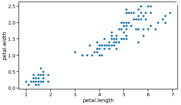
Seaborn 的散点图:
如前所述,气泡是散点图的一种独特形式,与散点图中的简单事实点相反。让我们首先使用Seaborn的scatterplot()函数制作一个简单的散点图。
蟒蛇3
# import all important libraries
import matplotlib.pyplot as plt
import pandas as pd
import seaborn as sns

# load dataset
data = "https://gist.githubusercontent.com/netj/8836201/raw/6f9306ad21398ea43cba4f7d537619d0e07d5ae3/iris.csv"

# convert to dataframe
df = pd.read_csv(data)

# display top most rows
df.head()

# depict scatterplot illustration
sns.set_context("talk", font_scale=1.1)
plt.figure(figsize=(8, 6))
sns.scatterplot(x="sepal.length",
                y="sepal.width",
                data=df)

# assign labels
plt.xlabel("Sepal.Length")
plt.ylabel("sepal.width")
输出:

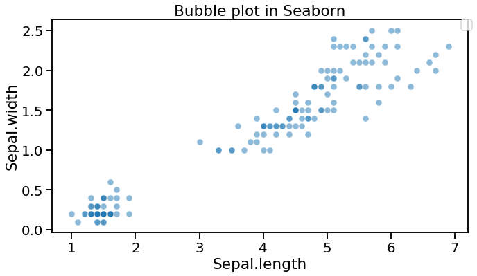
带有 Seaborn scatterplot() 的气泡图:
为了在 Seaborn 中制作气泡图,除了散点图的 x 和 y 轴变量之外,我们还可以在Seaborn中使用scatterplot ()函数和一个指定大小参数的变量。
在这个气泡图实例中,我们有length= ”body_mass_g” 。这将创建一个气泡图,该气泡图具有基于体长变量的独特气泡大小。
蟒蛇3
# import all important libraries
import matplotlib.pyplot as plt
import pandas as pd
import seaborn as sns

# load dataset
data = "https://gist.githubusercontent.com/netj/8836201/raw/6f9306ad21398ea43cba4f7d537619d0e07d5ae3/iris.csv"

# convert to dataframe
df = pd.read_csv(data)

# display top most rows
df.head()

# depict scatter plot illustration
sns.set_context("talk", font_scale=1.1)
plt.figure(figsize=(10, 6))
sns.scatterplot(x="petal.length",
                y="petal.width",
                data=df)
# Put the legend out of the figure
plt.legend(bbox_to_anchor=(1.01, 1), borderaxespad=0)
plt.xlabel("petal.length")
plt.ylabel("petal.width")
plt.tight_layout()
plt.savefig("Bubble_plot_Seaborn_scatterplot.png",
            format='png', dpi=150)
输出:
下面的例子描述了一个带有彩色气泡的气泡图:
蟒蛇3
# import all important libraries
import matplotlib.pyplot as plt
import pandas as pd
import seaborn as sns

# load dataset
data= "https://gist.githubusercontent.com/netj/8836201/raw/6f9306ad21398ea43cba4f7d537619d0e07d5ae3/iris.csv"

# convert to dataframe
df = pd.read_csv(data)

# display top most rows
df.head()

# depict bubble plot illustration
sns.set_context("talk", font_scale=1.2)
plt.figure(figsize=(10,6))
sns.scatterplot(x='petal.length',
               y='petal.width',
               sizes=(20,500),
               alpha=0.5,
               data= df)
# Put the legend out of the figure
plt.legend(bbox_to_anchor=(1.01, 1),borderaxespad=0)

# assign labels
plt.xlabel("Sepal.length")
plt.ylabel("Sepal.width")

# assign title
plt.title("Bubble plot in Seaborn")

# adjust layout
plt.tight_layout()
输出:
具有明确大小范围的气泡图 Seaborn scatterplot()
我们可以毫无问题地改变用Seaborn制作的气泡图。我们从上面的气泡图中注意到的一点是,气泡大小范围几乎很小。如果我们可以区分最小和最大的气泡尺寸,那将是非凡的。
通过Seaborn的scatterplot()工作中的争用大小,我们可以指示气泡大小的范围。在下面的这个气穴图模型中,我们使用了size=(20,500)。
蟒蛇3
# import all important libraries
import matplotlib.pyplot as plt
import pandas as pd
import seaborn as sns

# load dataset
data = "https://gist.githubusercontent.com/netj/8836201/raw/6f9306ad21398ea43cba4f7d537619d0e07d5ae3/iris.csv"

# convert to dataframe
df = pd.read_csv(data)

# display top most rows
df.head()

# depict bubble plot illustration
sns.set_context("talk", font_scale=1.2)
plt.figure(figsize=(10, 6))
sns.scatterplot(x='sepal.length',
                y='sepal.width',
                # size="body_mass_g",
                sizes=(20, 500),
                alpha=0.5,
                hue='variety',
                data=df)

# Put the legend out of the figure
plt.legend(bbox_to_anchor=(1.01, 1), borderaxespad=0)

# Put the legend out of the figure
plt.xlabel("sepal.length")
plt.ylabel("sepal.width")
plt.title("Bubble plot with Colors in Seaborn")
plt.tight_layout()
输出:
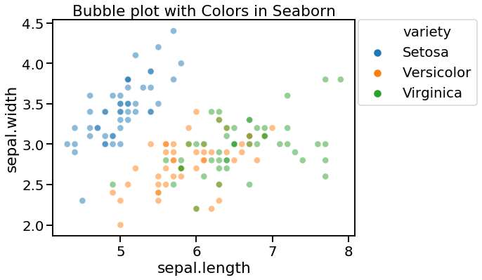
目前我们的气泡图看起来要好得多,最低的气泡与最低的权重相比,最大的气泡与最大的权重有关。当信息中有更多因素时,我们可以用第四个因素来遮蔽气泡。为了通过变量为气泡图着色,我们确定色调争用。