在 Matplotlib 中的绘图内添加文本
在本文中,我们将看到如何在 Matplotlib 中的绘图中添加文本。 matplotlib.pyplot.text()函数用于在图中添加文本。该语法在轴的任意位置添加文本。它还支持数学表达式。
Syntax: matplotlib.pyplot.text(x, y, s, fontdict=None, **kwargs)
Parameters:
- where x, y – coordinates
- s – text to be added inside the plot(string)
- fontdict – optional parameter. It overrides the default text properties
- **kwargs – text properties
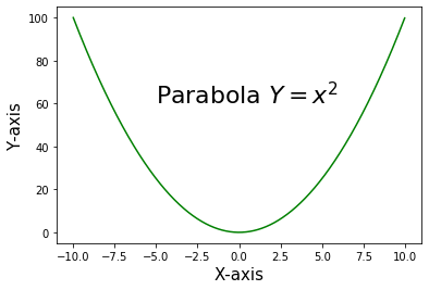
示例 1:在图中添加数学方程。
Python3
import matplotlib.pyplot as plt
import numpy as np

x = np.arange(-10, 10, 0.01)
y = x**2

#adding text inside the plot
plt.text(-5, 60, 'Parabola $Y = x^2$', fontsize = 22)

plt.plot(x, y, c='g')

plt.xlabel("X-axis", fontsize = 15)
plt.ylabel("Y-axis",fontsize = 15)

plt.show()
Python3
import matplotlib.pyplot as plt
import numpy as np

x = np.arange(-10, 10, 0.01)
y = x**2

plt.xlabel("X-axis", fontsize = 15)
plt.ylabel("Y-axis",fontsize = 15)

#Adding text inside a rectangular box by using the keyword 'bbox'
plt.text(-5, 60, 'Parabola $Y = x^2$', fontsize = 22,
         bbox = dict(facecolor = 'red', alpha = 0.5))

plt.plot(x, y, c = 'g')

plt.show()
Python3
import matplotlib.pyplot as plt
import numpy as np

x = np.arange(0, 10, 0.1)
y = np.sin(x)

plt.plot(x,y)

plt.text(3.5, 0.9, 'Sine wave', fontsize = 23)

plt.xlabel('X-axis', fontsize = 15)
plt.ylabel('Y-axis', fontsize = 15)

#plt.grid(True, which='both')
plt.show()
Python3
import matplotlib.pyplot as plt
import numpy as np

x = ['Rani', 'Meena', 'Raju', 'Jhansi', 'Ram']
y = [5, 7, 9, 2, 6]

plt.bar(x,y)

plt.text(3, 7, 'Student Marks',
         fontsize = 18, color = 'g')

plt.xlabel('Students', fontsize = 15)
plt.ylabel('Marks', fontsize = 15)

plt.annotate('Highest scored', xy = (2.4, 8),
             fontsize = 16, xytext = (3, 9),
             arrowprops = dict(facecolor = 'red'),
             color = 'g')

plt.show()
输出:
示例 2:使用关键字 'bbox' 在文本周围添加矩形框。 bbox 是 Rectangle 属性的字典。
蟒蛇3
import matplotlib.pyplot as plt
import numpy as np

x = np.arange(-10, 10, 0.01)
y = x**2

plt.xlabel("X-axis", fontsize = 15)
plt.ylabel("Y-axis",fontsize = 15)

#Adding text inside a rectangular box by using the keyword 'bbox'
plt.text(-5, 60, 'Parabola $Y = x^2$', fontsize = 22,
         bbox = dict(facecolor = 'red', alpha = 0.5))

plt.plot(x, y, c = 'g')

plt.show()
输出:

示例 3:在图中添加文本“Sine wave”。
蟒蛇3
import matplotlib.pyplot as plt
import numpy as np

x = np.arange(0, 10, 0.1)
y = np.sin(x)

plt.plot(x,y)

plt.text(3.5, 0.9, 'Sine wave', fontsize = 23)

plt.xlabel('X-axis', fontsize = 15)
plt.ylabel('Y-axis', fontsize = 15)

#plt.grid(True, which='both')
plt.show()
输出:

示例 4:在绘图中使用注释和文本
蟒蛇3
import matplotlib.pyplot as plt
import numpy as np

x = ['Rani', 'Meena', 'Raju', 'Jhansi', 'Ram']
y = [5, 7, 9, 2, 6]

plt.bar(x,y)

plt.text(3, 7, 'Student Marks',
         fontsize = 18, color = 'g')

plt.xlabel('Students', fontsize = 15)
plt.ylabel('Marks', fontsize = 15)

plt.annotate('Highest scored', xy = (2.4, 8),
             fontsize = 16, xytext = (3, 9),
             arrowprops = dict(facecolor = 'red'),
             color = 'g')

plt.show()
输出:
