使用 Seaborn 更改轴标签、将标题和图形大小设置为绘图
Seaborn 是 Python 的可视化库,作为 Matplotlib 的扩展而构建。 Seaborn 具有Axes 级函数(散点图、regplot、boxplot、kdeplot 等)以及图形级函数(lmplot、factorplot、jointplot、relplot 等)。轴级函数返回带有绘制在其上的图的 Matplotlib 轴对象,而图形级函数包括始终以有意义的方式组织的轴。图形需要使其易于理解的基本自定义是设置标题、设置轴标签和调整图形大小。所做的任何自定义都针对轴级函数的轴对象和图形级函数的图形对象。
注:以上说明中的轴是指图形的一部分或图形的顶层,不是一个以上轴的数学术语。考虑一个图上的图。此图轴。现在,考虑一个图上的多个子图。这些子图中的每一个都是一个轴。
让我们看一些例子,以更好地理解 Seaborn 的定制。
Python
# Import required libraries
import matplotlib.pyplot as plt
import seaborn as sns
# Load data set
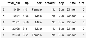
tips = sns.load_dataset( "tips" )
tips.head()Python
# Set figure size (width, height) in inches
fig, ax = plt.subplots(figsize = ( 5 , 3 ))

# Plot the scatterplot
sns.scatterplot( ax = ax , x = "total_bill" , y = "tip" , data = tips )

# Set label for x-axis
ax.set_xlabel( "Total Bill (USD)" , size = 12 )

# Set label for y-axis
ax.set_ylabel( "Tips (USD)" , size = 12 )

# Set title for plot
ax.set_title( "Bill vs Tips" , size = 24 )

# Display figure
plt.show()
Python
# Set figure size (width, height) in inches
plt.figure(figsize = ( 5 , 3 ))

# Plot scatterplot
sns.scatterplot( x = "total_bill" , y = "tip" , data = tips )

# Set label for x-axis
plt.xlabel( "Total Bill (USD)" , size = 12 )

# Set label for y-axis
plt.ylabel( "Tips (USD)" , size = 12 )

# Set title for figure
plt.title( "Bill vs Tips" , size = 24 )

# Display figure
plt.show()
Python
# Set figure size
sns.set( rc = {'figure.figsize' : ( 20, 20 ),
               'axes.labelsize' : 12 })

# Plot scatter plot
g = sns.relplot(data = tips , x = "total_bill" ,
                y = "tip" , col = "time" ,
                hue = "day" , style = "day" ,
                kind = "scatter" )

# Title for the complete figure
g.fig.suptitle("Tips by time of day" ,
               fontsize = 'x-large' ,
               fontweight = 'bold' )

# Adjust subplots so that titles don't overlap
g.fig.subplots_adjust( top = 0.85 )

# Set x-axis and y-axis labels
g.set_axis_labels( "Tip" , "Total Bill (USD)" )

# Display the figure
plt.show()
输出:
示例 1:使用轴对象自定义绘图
对于轴级函数,将 figsize 参数传递给 plt.subplots()函数以设置图形大小。函数plt.subplots() 返回 Figure 和 Axes 对象。这些对象是提前创建的,然后在其上绘制图。我们使用 set_title(), set_xlabel(), 和 set_ylabel() 函数更改轴标签并设置绘图的标题。我们可以使用 size 属性设置文本的大小。确保在创建绘图时分配轴级对象。该对象然后用于设置标题和标签,如下所示。
Python
# Set figure size (width, height) in inches
fig, ax = plt.subplots(figsize = ( 5 , 3 ))

# Plot the scatterplot
sns.scatterplot( ax = ax , x = "total_bill" , y = "tip" , data = tips )

# Set label for x-axis
ax.set_xlabel( "Total Bill (USD)" , size = 12 )

# Set label for y-axis
ax.set_ylabel( "Tips (USD)" , size = 12 )

# Set title for plot
ax.set_title( "Bill vs Tips" , size = 24 )

# Display figure
plt.show()
输出:
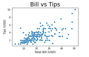
示例 2:使用 pyplot 对象自定义散点图
我们还可以更改轴标签并使用 matplotlib.pyplot 设置绘图标题 对象使用 xlabel()、ylabel() 和 title() 函数。与上面的例子类似,我们可以通过 size 属性设置文本的大小。函数plt.figure() 创建一个 Figure 实例, figsize 参数允许设置图形大小。
Python
# Set figure size (width, height) in inches
plt.figure(figsize = ( 5 , 3 ))

# Plot scatterplot
sns.scatterplot( x = "total_bill" , y = "tip" , data = tips )

# Set label for x-axis
plt.xlabel( "Total Bill (USD)" , size = 12 )

# Set label for y-axis
plt.ylabel( "Tips (USD)" , size = 12 )

# Set title for figure
plt.title( "Bill vs Tips" , size = 24 )

# Display figure
plt.show()
输出:

示例 3:在同一图中自定义多个绘图
Seaborn 的 relplot函数返回一个 FacetGrid 对象,它是一个图形级别的对象。该对象允许方便地管理子图。为了给包含多个子图的完整图形命名,我们使用 suptitle() 方法。 subplots_adjust() 方法用于通过指定子图的顶部、底部、左侧和右侧边缘位置来避免子图标题和图标题重叠。要设置图形大小,请在 set() 方法中传递带有键“figure.figsize”的字典。 set() 方法允许在一个步骤中设置多个主题参数。
Python
# Set figure size
sns.set( rc = {'figure.figsize' : ( 20, 20 ),
               'axes.labelsize' : 12 })

# Plot scatter plot
g = sns.relplot(data = tips , x = "total_bill" ,
                y = "tip" , col = "time" ,
                hue = "day" , style = "day" ,
                kind = "scatter" )

# Title for the complete figure
g.fig.suptitle("Tips by time of day" ,
               fontsize = 'x-large' ,
               fontweight = 'bold' )

# Adjust subplots so that titles don't overlap
g.fig.subplots_adjust( top = 0.85 )

# Set x-axis and y-axis labels
g.set_axis_labels( "Tip" , "Total Bill (USD)" )

# Display the figure
plt.show()
输出:
