📌 相关文章
- Python Tkinter单选按钮(1)
- tkinter 单选按钮 - Python 代码示例
- Python Tkinter按钮(1)
- 未按下按钮时的 tkinter - Python (1)
- Python Tkinter按钮
- tkinter 单选按钮默认选择 (1)
- 未按下按钮时的 tkinter - Python 代码示例
- tkinter 单选按钮默认选择 - 无论代码示例
- tkinter 单选按钮“bind_all” - Python (1)
- 单选按钮 - Html (1)
- 单选按钮 html (1)
- html中的单选按钮(1)
- CSS 单选按钮
- CSS 单选按钮(1)
- 单选按钮 django - Python (1)
- django 单选按钮 - Python (1)
- tkinter 单选按钮“bind_all” - Python 代码示例
- Python Tkinter检查按钮(1)
- Python Tkinter检查按钮
- jQuery单选按钮(1)
- jQuery单选按钮
- 单选按钮 html 代码示例
- html代码示例中的单选按钮
- 单选按钮 - Html 代码示例
- 单选按钮 django - Python 代码示例
- django 单选按钮 - Python 代码示例
- tkinter 给按钮 2 个命令 - Python (1)
- 获取单选按钮值 javascript (1)
- 单选按钮组获取值 javascript (1)
📜 Python Tkinter单选按钮
📅 最后修改于: 2020-10-27 01:56:17 🧑 作者: Mango
Python Tkinter单选按钮
Radiobutton小部件用于在Python应用程序中实现多个选择。它向用户显示了多个选择,用户只能从其中选择一个。我们可以将不同的方法与每个单选按钮关联。
我们可以在单选按钮上显示多行文本或图像。为了跟踪用户的选择单选按钮,它与单个变量关联。每个按钮为该特定变量显示一个值。
下面给出了使用单选按钮的语法。
句法
w = Radiobutton(top, options)
| SN | Option | Description |
|---|---|---|
| 1 | activebackground | The background color of the widget when it has the focus. |
| 2 | activeforeground | The font color of the widget text when it has the focus. |
| 3 | anchor | It represents the exact position of the text within the widget if the widget contains more space than the requirement of the text. The default value is CENTER. |
| 4 | bg | The background color of the widget. |
| 5 | bitmap | It is used to display the graphics on the widget. It can be set to any graphical or image object. |
| 6 | borderwidth | It represents the size of the border. |
| 7 | command | This option is set to the procedure which must be called every-time when the state of the radiobutton is changed. |
| 8 | cursor | The mouse pointer is changed to the specified cursor type. It can be set to the arrow, dot, etc. |
| 9 | font | It represents the font type of the widget text. |
| 10 | fg | The normal foreground color of the widget text. |
| 11 | height | The vertical dimension of the widget. It is specified as the number of lines (not pixel). |
| 12 | highlightcolor | It represents the color of the focus highlight when the widget has the focus. |
| 13 | highlightbackground | The color of the focus highlight when the widget is not having the focus. |
| 14 | image | It can be set to an image object if we want to display an image on the radiobutton instead the text. |
| 15 | justify | It represents the justification of the multi-line text. It can be set to CENTER(default), LEFT, or RIGHT. |
| 16 | padx | The horizontal padding of the widget. |
| 17 | pady | The vertical padding of the widget. |
| 18 | relief | The type of the border. The default value is FLAT. |
| 19 | selectcolor | The color of the radio button when it is selected. |
| 20 | selectimage | The image to be displayed on the radiobutton when it is selected. |
| 21 | state | It represents the state of the radio button. The default state of the Radiobutton is NORMAL. However, we can set this to DISABLED to make the radiobutton unresponsive. |
| 22 | text | The text to be displayed on the radiobutton. |
| 23 | textvariable | It is of String type that represents the text displayed by the widget. |
| 24 | underline | The default value of this option is -1, however, we can set this option to the number of character which is to be underlined. |
| 25 | value | The value of each radiobutton is assigned to the control variable when it is turned on by the user. |
| 26 | variable | It is the control variable which is used to keep track of the user’s choices. It is shared among all the radiobuttons. |
| 27 | width | The horizontal dimension of the widget. It is represented as the number of characters. |
| 28 | wraplength | We can wrap the text to the number of lines by setting this option to the desired number so that each line contains only that number of characters. |
方法
单选按钮小部件提供以下方法。
| SN | Method | Description |
|---|---|---|
| 1 | deselect() | It is used to turn of the radiobutton. |
| 2 | flash() | It is used to flash the radiobutton between its active and normal colors few times. |
| 3 | invoke() | It is used to call any procedure associated when the state of a Radiobutton is changed. |
| 4 | select() | It is used to select the radiobutton. |
例
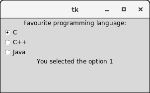
from tkinter import *

def selection():
   selection = "You selected the option " + str(radio.get())
   label.config(text = selection)

top = Tk()
top.geometry("300x150")
radio = IntVar()
lbl = Label(text = "Favourite programming language:")
lbl.pack()
R1 = Radiobutton(top, text="C", variable=radio, value=1,
                  command=selection)
R1.pack( anchor = W )

R2 = Radiobutton(top, text="C++", variable=radio, value=2,
                  command=selection)
R2.pack( anchor = W )

R3 = Radiobutton(top, text="Java", variable=radio, value=3,
                  command=selection)
R3.pack( anchor = W)

label = Label(top)
label.pack()
top.mainloop()
输出: