📌 相关文章
- Matplotlib-直方图
- Matplotlib-直方图(1)
- matplotlib 直方图 - Python 代码示例
- 使用 Matplotlib 在Python中绘制直方图(1)
- 使用 Matplotlib 在Python中绘制直方图
- 在Python中使用 Matplotlib 重叠直方图(1)
- 在Python中使用 Matplotlib 重叠直方图
- NumPy-Matplotlib
- NumPy-Matplotlib(1)
- R-直方图
- R-直方图(1)
- R直方图(1)
- R直方图
- 如何在python中使用直方图(1)
- 使用 Matplotlib 在Python中绘制二维直方图(1)
- 使用 Matplotlib 在Python中绘制二维直方图
- 直方图 |创建直方图 - Python (1)
- 如何在python代码示例中使用直方图
- 直方图 |创建直方图 - Python 代码示例
- 在 Matplotlib 中的直方图条之间添加空格
- 在 Matplotlib 中的直方图条之间添加空格(1)
- Matplotlib 直方图中的 bin 大小(1)
- Matplotlib 直方图中的 bin 大小
- 在Python中使用 NumPy 计算一组数据的直方图
- 在Python中使用 NumPy 计算一组数据的直方图(1)
- 在 Matplotlib 中创建累积直方图(1)
- 在 Matplotlib 中创建累积直方图
- 如何从 Matplotlib 中的数据列表中绘制直方图?(1)
- 如何从 Matplotlib 中的数据列表中绘制直方图?
📜 NumPy-使用Matplotlib的直方图
📅 最后修改于: 2020-11-08 07:42:58 🧑 作者: Mango
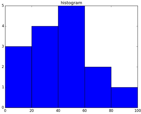
NumPy具有numpy.histogram()函数,该函数是数据频率分布的图形表示。水平大小相等的矩形对应于称为bin的类区间,而可变高度则对应于频率。
numpy.histogram()
numpy.histogram()函数将输入数组和bin作为两个参数。 bin数组中的连续元素充当每个bin的边界。
import numpy as np

a = np.array([22,87,5,43,56,73,55,54,11,20,51,5,79,31,27])
np.histogram(a,bins = [0,20,40,60,80,100])
hist,bins = np.histogram(a,bins = [0,20,40,60,80,100])
print hist
print bins
它将产生以下输出-
[3 4 5 2 1]
[0 20 40 60 80 100]
plt()
Matplotlib可以将直方图的数字表示形式转换为图形。 pyplot子模块的plt()函数将包含数据的数组和bin数组作为参数,并转换为直方图。
from matplotlib import pyplot as plt
import numpy as np

a = np.array([22,87,5,43,56,73,55,54,11,20,51,5,79,31,27])
plt.hist(a, bins = [0,20,40,60,80,100])
plt.title("histogram")
plt.show()
它应该产生以下输出-