在 Matplotlib 中创建累积直方图
直方图是数据的图形表示。我们可以以直方图格式表示任何类型的数字数据。在本文中,我们将看到如何在 Matplotlib 中创建累积直方图
累积频率:累积频率分析是对数值出现频率的分析。它是一个频率和一个频率分布中到目前为止所有频率的总和。
例子:
X contains [1,2,3,4,5] then the cumulative frequency for x is [1,3,6,10,15].
Explanation:
[1,1+2,1+2+3,1+2+3+4,1+2+3+4+5]
在Python中,我们可以使用 dataframe.hist 和累积频率 stats.cumfreq() 直方图生成直方图。
示例 1:
Python3
# importing pyplot for getting graph
import matplotlib.pyplot as plt
# importing numpy for getting array
import numpy as np
# importing scientific python
from scipy import stats
# list of values
x = [10, 40, 20, 10, 30, 10, 56, 45]
res = stats.cumfreq(x, numbins=4,
defaultreallimits=(1.5, 5))
# generating random values
rng = np.random.RandomState(seed=12345)
# normalizing
samples = stats.norm.rvs(size=1000,
random_state=rng)
res = stats.cumfreq(samples,
numbins=25)
x = res.lowerlimit + np.linspace(0, res.binsize*res.cumcount.size,
res.cumcount.size)
# specifying figure size
fig = plt.figure(figsize=(10, 4))
# adding sub plots
ax1 = fig.add_subplot(1, 2, 1)
# adding sub plots
ax2 = fig.add_subplot(1, 2, 2)
# getting histogram using hist function
ax1.hist(samples, bins=25,
color="green")
# setting up the title
ax1.set_title('Histogram')
# cumulative graph
ax2.bar(x, res.cumcount, width=4, color="blue")
# setting up the title
ax2.set_title('Cumulative histogram')
ax2.set_xlim([x.min(), x.max()])
# display hte figure(histogram)
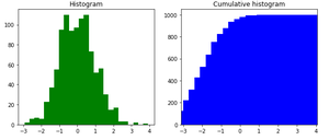
plt.show()Python3
# importing numpy for getting array
import numpy as np

# importing scientific python
from scipy import stats

# list of values
x = [10, 40, 20, 10, 30, 10, 56, 45]

res = stats.cumfreq(x, numbins=4,
                    defaultreallimits=(1.5, 5))

# generating random values
rng = np.random.RandomState(seed=12345)

# normalizing
samples = stats.norm.rvs(size=1000,
                         random_state=rng)

res = stats.cumfreq(samples,
                    numbins=25)

x = res.lowerlimit + np.linspace(0, res.binsize*res.cumcount.size,
                                 res.cumcount.size)

fig = plt.figure(figsize=(10, 4))

ax1 = fig.add_subplot(1, 2, 1)
ax2 = fig.add_subplot(1, 2, 2)

ax1.hist(samples, bins=25, color="green")

ax1.set_title('Histogram')
ax2.bar(x, x, width=2, color="blue")

ax2.set_title('Cumulative histogram')
ax2.set_xlim([x.min(), x.max()])

plt.show()
输出:
示例 2:
蟒蛇3
# importing numpy for getting array
import numpy as np

# importing scientific python
from scipy import stats

# list of values
x = [10, 40, 20, 10, 30, 10, 56, 45]

res = stats.cumfreq(x, numbins=4,
                    defaultreallimits=(1.5, 5))

# generating random values
rng = np.random.RandomState(seed=12345)

# normalizing
samples = stats.norm.rvs(size=1000,
                         random_state=rng)

res = stats.cumfreq(samples,
                    numbins=25)

x = res.lowerlimit + np.linspace(0, res.binsize*res.cumcount.size,
                                 res.cumcount.size)

fig = plt.figure(figsize=(10, 4))

ax1 = fig.add_subplot(1, 2, 1)
ax2 = fig.add_subplot(1, 2, 2)

ax1.hist(samples, bins=25, color="green")

ax1.set_title('Histogram')
ax2.bar(x, x, width=2, color="blue")

ax2.set_title('Cumulative histogram')
ax2.set_xlim([x.min(), x.max()])

plt.show()
输出:
