Flutter – 文本按钮小部件
TextButton是 Fl Flutter中的一个内置小部件,其设计源自 Google 的Material Design Library。它是一个没有任何边框的简单按钮,用于监听onPressed和onLongPress手势。它有一个 style 属性,接受 ButtonStyle 作为值,使用这个 style 属性,开发人员可以根据需要自定义 TextButton。
TextButton 类的构造函数:
const TextButton({
  Key? key,
  required void Function()? onPressed,
  void Function()? onLongPress,
  void Function(bool)? onHover,
  void Function(bool)? onFocusChange,
  ButtonStyle? style,
  FocusNode? focusNode,
  bool autofocus = false,
  Clip clipBehavior = Clip.none,
  required Widget child,
})
TextButton 小部件的属性:
- onPressed:(必需)此属性采用返回 void 的函数。每当按下 TextButton 时,都会调用该函数。
- onLongPress:此属性还接受一个返回 void 的函数。每当长按 TextButton 时,都会调用该函数。
- onHover: onHover属性采用 void函数,该函数将布尔值作为其唯一参数。如果指针进入按钮响应区域,则传递的参数为true ,当指针离开按钮响应区域时,传递的参数为false 。
- onFocusChange: onFocusChange属性也接受一个 void函数,它接受一个布尔值作为其唯一参数。如果按钮获得焦点,则传递的参数为true ,如果按钮失去焦点,则传递的参数为false 。
- style:此可选属性接受 ButtonStyle 作为对象。它用于自定义 TextButton 的外观。
- focusNode:一个可选的焦点节点,用作 TextButton 的焦点节点。
- autofocus :如果您希望在其范围内没有其他节点当前聚焦时将此小部件作为初始焦点,则传递true 。默认值为false 。
- clipBehaviour:接受 Clip 枚举类型的值。默认值为Clip.none 。
- child :(必需) TextButton Widget 的子小部件。
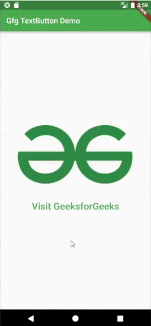
示例 1:在下面的示例中,我们使用 TextButton 的onPressed属性在按下TextButton时启动 URL。
Dart
import 'package:flutter/material.dart';
import 'package:url_launcher/url_launcher.dart';

void main() {
  runApp(const MyApp());
}

class MyApp extends StatelessWidget {
  const MyApp({Key? key}) : super(key: key);

  // This widget is the root of your application.
  @override
  Widget build(BuildContext context) {
    return MaterialApp(
      title: 'Gfg TextButton Demo',
      theme: ThemeData(
        primarySwatch: Colors.green,
      ),
      home: const Home(),
    );
  }
}

class Home extends StatelessWidget {
  const Home({Key? key}) : super(key: key);

  @override
  Widget build(BuildContext context) {
    return Scaffold(
      appBar: AppBar(
        title: Text("Gfg TextButton Demo"),
      ),
      body: Center(
        child: Column(
          mainAxisAlignment: MainAxisAlignment.center,
          children: [
            Padding(
              padding: const EdgeInsets.only(bottom: 35),
              child: Image.network(
                  "https://media.geeksforgeeks.org/wp-content/uploads/20220112153639/gfglogo-300x152.png"),
            ),
            TextButton(
              child: Text(
                "Visit GeeksforGeeks",
                style: TextStyle(fontSize: 25),
              ),
              onPressed: () async {
                const String _url = "https://www.geeksforgeeks.org";
                if (await canLaunch(_url)) {
                  launch(_url);
                } else {
                  throw "Could not launch $_url";
                }
              },
            )
          ],
        ),
      ),
    );
  }
}
Dart
import 'package:flutter/material.dart';
import 'package:url_launcher/url_launcher.dart';
void main() {
runApp(const MyApp());
}
class MyApp extends StatelessWidget {
const MyApp({Key? key}) : super(key: key);
// This widget is the root of your application.
@override
Widget build(BuildContext context) {
return MaterialApp(
title: 'Gfg TextButton Demo',
theme: ThemeData(
primarySwatch: Colors.green,
),
home: const Home(),
);
}
}
class Home extends StatefulWidget {
const Home({Key? key}) : super(key: key);
@override
State createState() => _HomeState();
}
class _HomeState extends State {
String _buttonText = "Text Button";
@override
Widget build(BuildContext context) {
return Scaffold(
appBar: AppBar(
title: Text("Gfg TextButton Demo"),
),
body: Center(
child: Column(
mainAxisAlignment: MainAxisAlignment.center,
children: [
Padding(
padding: const EdgeInsets.only(bottom: 35),
child: Image.network(
"https://media.geeksforgeeks.org/wp-content/uploads/20220112153639/gfglogo-300x152.png"),
),
TextButton(
child: Text(
_buttonText,
style: TextStyle(fontSize: 25),
),
onPressed: () {},
style: TextButton.styleFrom(
primary: Colors.red,
elevation: 2,
backgroundColor: Colors.amber),
),
],
),
),
);
}
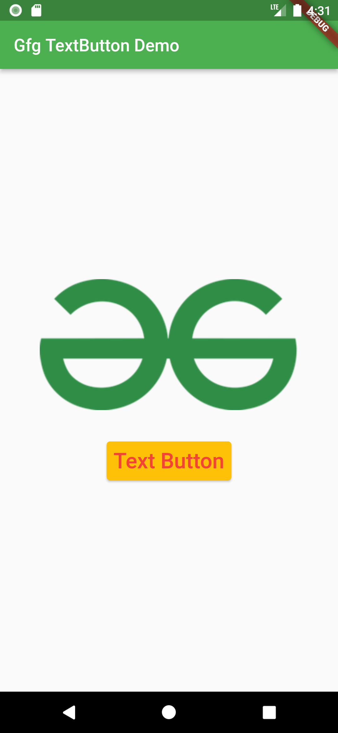
} 输出:
Example2:在这个例子中,我们使用了 TextButton 的 style 属性来改变文本按钮的样式。
Dart
import 'package:flutter/material.dart';
import 'package:url_launcher/url_launcher.dart';

void main() {
  runApp(const MyApp());
}

class MyApp extends StatelessWidget {
  const MyApp({Key? key}) : super(key: key);

  // This widget is the root of your application.
  @override
  Widget build(BuildContext context) {
    return MaterialApp(
      title: 'Gfg TextButton Demo',
      theme: ThemeData(
        primarySwatch: Colors.green,
      ),
      home: const Home(),
    );
  }
}

class Home extends StatefulWidget {
  const Home({Key? key}) : super(key: key);

  @override
  State createState() => _HomeState();
}

class _HomeState extends State {
  String _buttonText = "Text Button";
  @override
  Widget build(BuildContext context) {
    return Scaffold(
      appBar: AppBar(
        title: Text("Gfg TextButton Demo"),
      ),
      body: Center(
        child: Column(
          mainAxisAlignment: MainAxisAlignment.center,
          children: [
            Padding(
              padding: const EdgeInsets.only(bottom: 35),
              child: Image.network(
                  "https://media.geeksforgeeks.org/wp-content/uploads/20220112153639/gfglogo-300x152.png"),
            ),
            TextButton(
              child: Text(
                _buttonText,
                style: TextStyle(fontSize: 25),
              ),
              onPressed: () {},
              style: TextButton.styleFrom(
                  primary: Colors.red,
                  elevation: 2,
                  backgroundColor: Colors.amber),
            ),
          ],
        ),
      ),
    );
  }
}
输出: