使用 Matplotlib 在Python中进行简单绘图
Matplotlib 是一个Python库,可帮助可视化和分析数据,并借助可以使用 matplotlib 库进行模拟的图形化可视化帮助更好地理解数据。 Matplotlib 是一个用于静态、动画和交互式可视化的综合库。
matplotlib库的安装
第 1 步:打开命令管理器(只需在 Windows 开始搜索栏中输入“cmd”)
第 2 步:在终端中键入以下命令。
cd Desktop第三步:然后输入以下命令。
pip install matplotlib创建一个简单的绘图
Python3
# importing the required module
import matplotlib.pyplot as plt

# x axis values
x = [1,2,3]
# corresponding y axis values
y = [2,4,1]

# plotting the points
plt.plot(x, y)

# naming the x axis
plt.xlabel('x - axis')
# naming the y axis
plt.ylabel('y - axis')

# giving a title to my graph
plt.title('My first graph!')

# function to show the plot
plt.show()
Python3
import matplotlib.pyplot as plt


a = [1, 2, 3, 4, 5]
b = [0, 0.6, 0.2, 15, 10, 8, 16, 21]
plt.plot(a)

# o is for circles and r is
# for red
plt.plot(b, "or")

plt.plot(list(range(0, 22, 3)))

# naming the x-axis
plt.xlabel('Day ->')

# naming the y-axis
plt.ylabel('Temp ->')

c = [4, 2, 6, 8, 3, 20, 13, 15]
plt.plot(c, label = '4th Rep')

# get current axes command
ax = plt.gca()

# get command over the individual
# boundary line of the graph body
ax.spines['right'].set_visible(False)
ax.spines['top'].set_visible(False)

# set the range or the bounds of
# the left boundary line to fixed range
ax.spines['left'].set_bounds(-3, 40)

# set the interval by  which
# the x-axis set the marks
plt.xticks(list(range(-3, 10)))

# set the intervals by which y-axis
# set the marks
plt.yticks(list(range(-3, 20, 3)))

# legend denotes that what color
# signifies what
ax.legend(['1st Rep', '2nd Rep', '3rd Rep', '4th Rep'])

# annotate command helps to write
# ON THE GRAPH any text xy denotes
# the position on the graph
plt.annotate('Temperature V / s Days', xy = (1.01, -2.15))

# gives a title to the Graph
plt.title('All Features Discussed')

plt.show()
Python3
import matplotlib.pyplot as plt


a = [1, 2, 3, 4, 5]
b = [0, 0.6, 0.2, 15, 10, 8, 16, 21]
c = [4, 2, 6, 8, 3, 20, 13, 15]

# use fig whenever u want the
# output in a new window also
# specify the window size you
# want ans to be displayed
fig = plt.figure(figsize =(10, 10))

# creating multiple plots in a
# single plot
sub1 = plt.subplot(2, 2, 1)
sub2 = plt.subplot(2, 2, 2)
sub3 = plt.subplot(2, 2, 3)
sub4 = plt.subplot(2, 2, 4)

sub1.plot(a, 'sb')

# sets how the display subplot
# x axis values advances by 1
# within the specified range
sub1.set_xticks(list(range(0, 10, 1)))
sub1.set_title('1st Rep')

sub2.plot(b, 'or')

# sets how the display subplot x axis
# values advances by 2 within the
# specified range
sub2.set_xticks(list(range(0, 10, 2)))
sub2.set_title('2nd Rep')

# can directly pass a list in the plot
# function instead adding the reference
sub3.plot(list(range(0, 22, 3)), 'vg')
sub3.set_xticks(list(range(0, 10, 1)))
sub3.set_title('3rd Rep')

sub4.plot(c, 'Dm')

# similarly we can set the ticks for
# the y-axis range(start(inclusive),
# end(exclusive), step)
sub4.set_yticks(list(range(0, 24, 2)))
sub4.set_title('4th Rep')

# without writing plt.show() no plot
# will be visible
plt.show()
输出:

该代码似乎不言自明。遵循以下步骤:
- 将 x 轴和相应的 y 轴值定义为列表。
- 使用 .plot()函数在画布上绘制它们。
- 使用 .xlabel() 和 .ylabel() 函数为 x 轴和 y 轴命名。
- 使用 .title() 函数给你的情节一个标题。
- 最后,要查看您的绘图,我们使用 .show()函数。
下面我们来看看matplotlib中经常用到的一些基本函数。
| Method | Description |
|---|---|
| plot() | it creates the plot at the background of computer, it doesn’t displays it. We can also add a label as it’s argument that by what name we will call this plot – utilized in legend() |
| show() | it displays the created plots |
| xlabel() | it labels the x-axis |
| ylabel() | it labels the y-axis |
| title() | it gives the title to the graph |
| gca() | it helps to get access over the all the four axes of the graph |
| gca().spines[‘right/left/top/bottom’].set_visible(True/False) | it access the individual spines or the individual boundaries and helps to change theoir visibility |
| xticks() | it decides how the markings are to be made on the x-axis |
| yticks() | it decides how the markings are to be made on the y-axis |
| gca().legend() | pass a list as it’s arguments of all the plots made, if labels are not explicitly specified then add the values in the list in the same order as the plots are made |
| annotate() | it is use to write comments on the graph at the specified position |
| figure(figsize = (x, y)) | whenever we want the result to be displayed in a separate window we use this command, and figsize argument decides what will be the initial size of the window that will be displayed after the run |
| subplot(r, c, i) | it is used to create multiple plots in the same figure with r signifies the no of rows in the figure, c signifies no of columns in a figure and i specifies the positioning of the particular plot |
| set_xticks | it is used to set the range and the step size of the markings on x – axis in a subplot |
| set_yticks | it is used to set the range and the step size of the markings on y – axis in a subplot |
注意:尝试将添加的特征一一去掉,了解输出结果如何变化
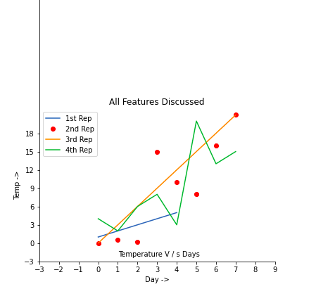
示例 1:
Python3
import matplotlib.pyplot as plt


a = [1, 2, 3, 4, 5]
b = [0, 0.6, 0.2, 15, 10, 8, 16, 21]
plt.plot(a)

# o is for circles and r is
# for red
plt.plot(b, "or")

plt.plot(list(range(0, 22, 3)))

# naming the x-axis
plt.xlabel('Day ->')

# naming the y-axis
plt.ylabel('Temp ->')

c = [4, 2, 6, 8, 3, 20, 13, 15]
plt.plot(c, label = '4th Rep')

# get current axes command
ax = plt.gca()

# get command over the individual
# boundary line of the graph body
ax.spines['right'].set_visible(False)
ax.spines['top'].set_visible(False)

# set the range or the bounds of
# the left boundary line to fixed range
ax.spines['left'].set_bounds(-3, 40)

# set the interval by  which
# the x-axis set the marks
plt.xticks(list(range(-3, 10)))

# set the intervals by which y-axis
# set the marks
plt.yticks(list(range(-3, 20, 3)))

# legend denotes that what color
# signifies what
ax.legend(['1st Rep', '2nd Rep', '3rd Rep', '4th Rep'])

# annotate command helps to write
# ON THE GRAPH any text xy denotes
# the position on the graph
plt.annotate('Temperature V / s Days', xy = (1.01, -2.15))

# gives a title to the Graph
plt.title('All Features Discussed')

plt.show()
输出:
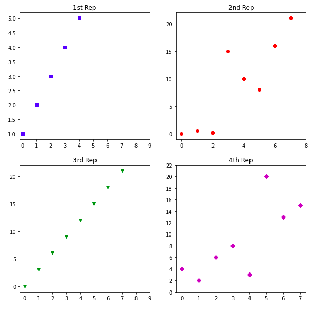
示例 2:
Python3
import matplotlib.pyplot as plt


a = [1, 2, 3, 4, 5]
b = [0, 0.6, 0.2, 15, 10, 8, 16, 21]
c = [4, 2, 6, 8, 3, 20, 13, 15]

# use fig whenever u want the
# output in a new window also
# specify the window size you
# want ans to be displayed
fig = plt.figure(figsize =(10, 10))

# creating multiple plots in a
# single plot
sub1 = plt.subplot(2, 2, 1)
sub2 = plt.subplot(2, 2, 2)
sub3 = plt.subplot(2, 2, 3)
sub4 = plt.subplot(2, 2, 4)

sub1.plot(a, 'sb')

# sets how the display subplot
# x axis values advances by 1
# within the specified range
sub1.set_xticks(list(range(0, 10, 1)))
sub1.set_title('1st Rep')

sub2.plot(b, 'or')

# sets how the display subplot x axis
# values advances by 2 within the
# specified range
sub2.set_xticks(list(range(0, 10, 2)))
sub2.set_title('2nd Rep')

# can directly pass a list in the plot
# function instead adding the reference
sub3.plot(list(range(0, 22, 3)), 'vg')
sub3.set_xticks(list(range(0, 10, 1)))
sub3.set_title('3rd Rep')

sub4.plot(c, 'Dm')

# similarly we can set the ticks for
# the y-axis range(start(inclusive),
# end(exclusive), step)
sub4.set_yticks(list(range(0, 24, 2)))
sub4.set_title('4th Rep')

# without writing plt.show() no plot
# will be visible
plt.show()
输出: