📌 相关文章
- Excel图表-图表样式
- Excel图表-图表样式(1)
- python中的图表(1)
- python代码示例中的图表
- 图表中的饼图(1)
- 图表中的饼图
- Python图表属性(1)
- Python图表属性
- javascript中的图表(1)
- 图表 js 删除旧图表 - Javascript (1)
- Excel图表-图表元素
- Excel图表-图表元素(1)
- 图表 js 删除旧图表 - Javascript 代码示例
- Excel图表-创建图表
- Excel图表-创建图表(1)
- javascript代码示例中的图表
- 图表 js 清除图表 - Javascript (1)
- 图表 js 清除图表 - Javascript 代码示例
- Excel图表-图表过滤器
- Excel图表-图表过滤器(1)
- 反应图表图表标题 - Javascript (1)
- 反应图表图表标题 - Javascript 代码示例
- 角度高图表-3D图表(1)
- 角度高图表-3D图表
- JavaScript |图表.js
- JavaScript |图表.js(1)
- JavaScript |图表.js
- JavaScript |图表.js(1)
- 反应原生图表样式渐变 - Javascript(1)
📜 Python图表样式
📅 最后修改于: 2020-12-13 14:17:31 🧑 作者: Mango
通过使用用于图表的库中的一些适当方法,可以在Python创建的图表具有进一步的样式。在本课程中,我们将看到注释,图例和图表背景的实现。我们将继续使用上一章中的代码并对其进行修改,以将这些样式添加到图表中。
添加注释
很多时候,我们需要通过突出显示图表的特定位置来对图表进行注释。在下面的示例中,我们通过在这些点添加注释来指示图表中值的急剧变化。
import numpy as np
from matplotlib import pyplot as plt

x = np.arange(0,10)
y = x ^ 2
z = x ^ 3
t = x ^ 4
# Labeling the Axes and Title
plt.title("Graph Drawing")
plt.xlabel("Time")
plt.ylabel("Distance")
plt.plot(x,y)

#Annotate
plt.annotate(xy=[2,1], s='Second Entry')
plt.annotate(xy=[4,6], s='Third Entry')
其输出如下-
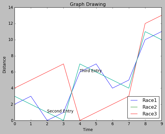
添加图例
有时我们需要绘制带有多条线的图表。图例的使用表示与每一行相关的含义。在下面的图表中,我们有3条带有相应图例的线。
import numpy as np
from matplotlib import pyplot as plt

x = np.arange(0,10)
y = x ^ 2
z = x ^ 3
t = x ^ 4
# Labeling the Axes and Title
plt.title("Graph Drawing")
plt.xlabel("Time")
plt.ylabel("Distance")
plt.plot(x,y)

#Annotate
plt.annotate(xy=[2,1], s='Second Entry')
plt.annotate(xy=[4,6], s='Third Entry')
# Adding Legends
plt.plot(x,z)
plt.plot(x,t)
plt.legend(['Race1', 'Race2','Race3'], loc=4)
其输出如下-
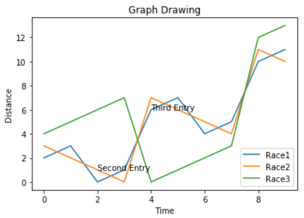
图表展示风格
我们可以使用样式包中的不同方法来修改图表的表示样式。
import numpy as np
from matplotlib import pyplot as plt

x = np.arange(0,10)
y = x ^ 2
z = x ^ 3
t = x ^ 4
# Labeling the Axes and Title
plt.title("Graph Drawing")
plt.xlabel("Time")
plt.ylabel("Distance")
plt.plot(x,y)

#Annotate
plt.annotate(xy=[2,1], s='Second Entry')
plt.annotate(xy=[4,6], s='Third Entry')
# Adding Legends
plt.plot(x,z)
plt.plot(x,t)
plt.legend(['Race1', 'Race2','Race3'], loc=4)

#Style the background
plt.style.use('fast')
plt.plot(x,z)
其输出如下-