Android 中使用 Jetpack Compose 的圆形 ImageView
许多应用程序中都使用了圆形 ImageView。这些类型的图像通常用于表示用户的个人资料图片和更多图像。我们已经看到了使用 Jetpack Compose 在 Android 中实现 ImageView。在本文中,我们将看看使用 Jetpack Compose 在 Android 中实现 Circle ImageView。
分步实施
第 1 步:创建一个新项目
想要一个更快节奏和更具竞争力的环境来学习 Android 的基础知识吗?
单击此处前往由我们的专家精心策划的指南,旨在让您立即做好行业准备!
要在 Android Studio Canary 版本中创建新项目,请参阅如何使用 Jetpack Compose 在 Android Studio Canary 版本中创建新项目。
第 2 步:将图像添加到 drawable 文件夹中
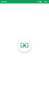
创建新项目后,我们必须在 drawable 文件夹中添加一个图像,以便在我们的 ImageView 中显示该图像。从您的文件夹位置复制您的图像并进入我们的项目。在我们的项目中导航到应用程序 > res > drawable > 右键单击 drawable 文件夹并将您的图像粘贴到那里。
步骤 3:使用 MainActivity.kt 文件
添加此图像后导航到应用程序 > Java > MainActivity.kt并将以下代码添加到其中。代码中添加了注释以更详细地理解代码。
Kotlin
import android.graphics.drawable.shapes.Shape
import android.media.Image
import android.os.Bundle
import android.widget.Toast
import androidx.appcompat.app.AppCompatActivity
import androidx.compose.foundation.BorderStroke
import androidx.compose.foundation.Image
import androidx.compose.foundation.InteractionState
import androidx.compose.foundation.Text
import androidx.compose.foundation.layout.*
import androidx.compose.foundation.shape.CircleShape
import androidx.compose.foundation.shape.RoundedCornerShape
import androidx.compose.foundation.text.KeyboardOptions
import androidx.compose.material.*
import androidx.compose.material.icons.Icons
import androidx.compose.material.icons.filled.AccountCircle
import androidx.compose.material.icons.filled.Info
import androidx.compose.material.icons.filled.Phone
import androidx.compose.runtime.*
import androidx.compose.runtime.savedinstancestate.savedInstanceState
import androidx.compose.ui.Alignment
import androidx.compose.ui.layout.ContentScale
import androidx.compose.ui.platform.setContent
import androidx.compose.ui.res.imageResource
import androidx.compose.ui.tooling.preview.Preview
import androidx.compose.ui.unit.dp
import com.example.gfgapp.ui.GFGAppTheme
import androidx.compose.ui.Modifier
import androidx.compose.ui.draw.clip
import androidx.compose.ui.graphics.Color
import androidx.compose.ui.graphics.SolidColor
import androidx.compose.ui.platform.ContextAmbient
import androidx.compose.ui.platform.testTag
import androidx.compose.ui.res.colorResource
import androidx.compose.ui.text.TextStyle
import androidx.compose.ui.text.font.FontFamily
import androidx.compose.ui.text.input.*
import androidx.compose.ui.unit.Dp
import androidx.compose.ui.unit.TextUnit

class MainActivity : AppCompatActivity() {
    override fun onCreate(savedInstanceState: Bundle?) {
        super.onCreate(savedInstanceState)
        setContent {
            GFGAppTheme {
                // A surface container using the 'background' color from the theme
                Surface(color = MaterialTheme.colors.background) {
                    // at below line we are calling
                      // our function for button.
                    CircleImg();
                }
            }
        }
    }
}

@Preview(showBackground = true)
@Composable
fun DefaultPreview() {
    GFGAppTheme {
        CircleImg();
    }
}

@Composable
fun CircleImg() {

    Column(

          // we are using column to align our imageview
          // to center of the screen.
        modifier = Modifier.fillMaxWidth().fillMaxHeight(),

        // below line is used for specifying
          // vertical arrangement.
        verticalArrangement = Arrangement.Center,

        // below line is used for specifying
          // horizontal arrangement.
        horizontalAlignment = Alignment.CenterHorizontally,

        ) {
        // creating a card for creating a circle image view.
        Card(
            // below line is use to add size to our image view and
              // test tag is use to add tag to our image.
            modifier = Modifier.preferredSize(100.dp).testTag(tag = "circle"),

              // below line is use to
              // add shape to our image view.
            shape = CircleShape,

            // below line is use to add
              // elevation to our image view.
            elevation = 12.dp
        ) {
            // below line we are creating a new image.
            Image(
                // in below line we are providing image
                  // resource from drawable folder.
                imageResource(id = R.drawable.gfgimage),

                  // below line is use to give scaling
                  // to our image view.
                contentScale = ContentScale.Crop,

                  // below line is use to add modifier
                  // to our image view.
                modifier = Modifier.fillMaxSize()
            )
        }
    }
}
现在运行您的应用程序并查看应用程序的输出。
输出: