Power BI – 交互式 BI 仪表板
仪表板包括各种交互式可视化,可帮助获取信息并做出重要的商业智能决策。本文讨论了在 Power BI 中创建交互式仪表板的各种概念。主题包括:
- 填充地图
- 饼状图
- 箱分布
- 树状图
使用的数据集
使用的数据集是BankCustomers 。在 Power BI 中上传数据集并参考数据集以跟随本文下面给出的部分。您可以从这里下载数据集: Dataset

填充地图:
填充地图使用阴影或图案来显示值在地理或区域中的比例差异。在 Power BI Desktop 中创建地图可视化效果时,位置、纬度和经度(用于创建该可视化效果)中的数据将发送到 Bing。
Steps Involved:

Step 1 - Select Filled Map from Visualization panel.
Step 2 - Select Region from BankCustomers dataset and drag and drop it into Location.
Step 3 - Select Region from BankCustomers dataset and drag and drop it into Legend.

(As shown in Fig 1)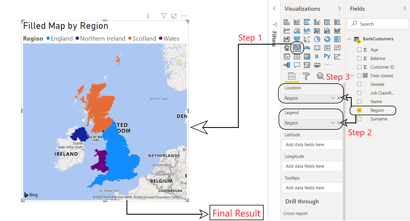
图 1:Power BI:填充地图
饼状图:
饼图用于说明不同值对总数的贡献。例如,与银行相关的男性和女性客户的数量。
Steps Involved:
Step 0 - Select the '+' symbol on bottom left to create a new page and rename it as Gender.
Step 1 - Select Pie Chart from Visualization panel.
Step 2 - Select Customer ID from BankCustomers dataset and drag and drop it into Values.
Step 3 - Select Gender from BankCustomers dataset and drag and drop it into Legend.

(As shown in Fig 2)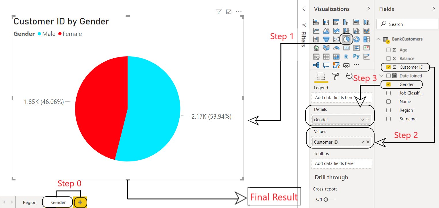
图 2:Power BI:饼图
分组和分箱分布:
分组是一种通过手动设置其所有参数(例如类型、大小、范围等)来创建新度量的方法。例如,创建特定数据列(例如balance或age )的 bin。 Power BI 中的 bin 可用于创建一系列数据。它有助于将数据整合为更可展示或更有意义的可视化。例如,银行客户的年龄范围。
Steps Involved:

Step 0 - Select the '+' symbol on bottom left to create a new page and rename it as Age.
Step 1 - Select Age from Fields. Right click on it and select New group. This will pop up a new window named Groups.
Step 2 - In Groups window, set the bin size to 5.
Step 3 - Press OK.
This will create a new column of Age(bins) in BankCustomers dataset.

(As shown in Fig 3)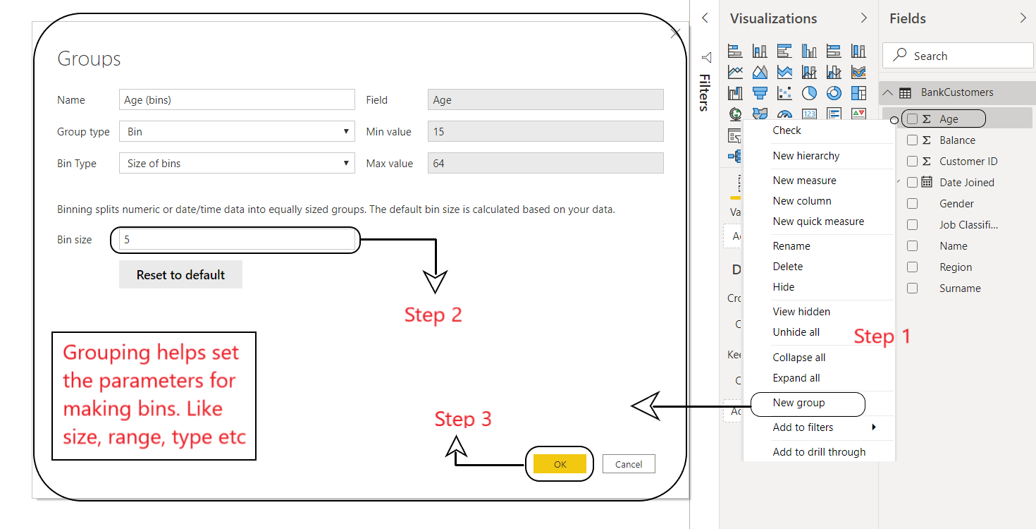
图 3:Power BI:分组
Step 4 - Select Age(bins) from BankCustomers dataset and drag and drop it into the empty workspace.
Step 5 - Add Customer ID from BankCustomers dataset and drag and drop it into values.

This will create a bin distribution of customers in a bank as per their ages.

(As shown in Fig 4)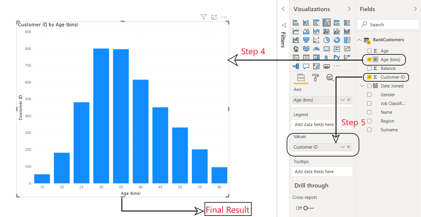
图 4:Power BI:Bin 分布
树状图:
树形图将分层数据显示为一组嵌套的矩形。层次结构的每个级别都由包含较小矩形(叶子)的彩色矩形(分支)表示。例如,我们可以根据工作类型来隔离银行的客户。
Steps Involved:

Step 0 - Select the '+' symbol on bottom left to create a new page and rename it as Job type.
Step 1 - Select Treemap from Visualization panel.
Step 2 - Select the following from BankCustomers dataset and drag and drop it into the empty visualization.
     2.a - Customer ID
    2.b - Gender
    2.c - Job Classification

(As shown in Fig 5)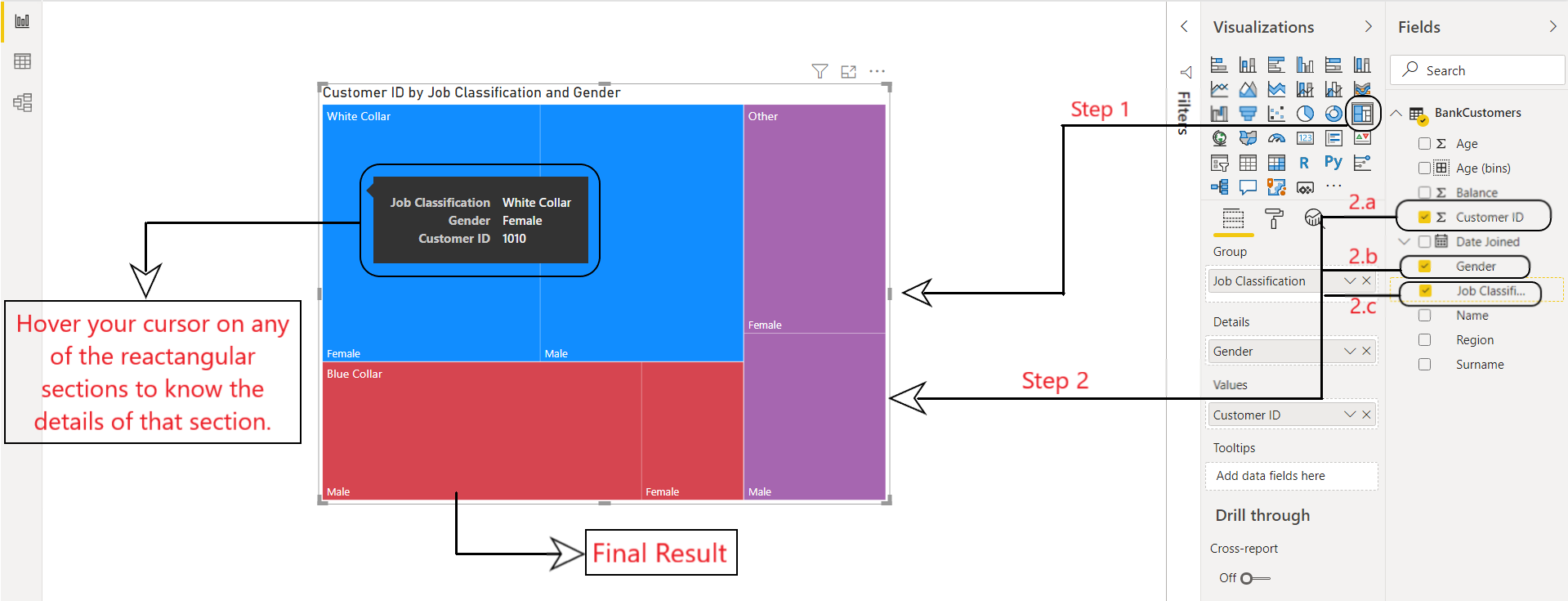
图 5:Power BI:树状图
交互式仪表板:
在制作商业智能报告时,交互式仪表板很重要。为了做出明智的决定,您的仪表板应该包含精确的和信息丰富的可视化。现在我们将使用上面创建的所有可视化来创建我们的仪表板。
Steps Involved:

Step 1 - Select the '+' symbol on bottom left to create a new page and rename it as Dashboard.
Step 2 - Copy and paste visuals from all your pages into this new page.
Step 3 - Add slicers (discussed in previous articles) to your dashboard to make it more interactive
      and visually appealing. Then drag and drop the following from BankCustomers dataset:
        3.a - Date Joined
    3.b - Region

This will create an interactive dashboard for your BI Report in Power BI.
(As shown in Fig 6)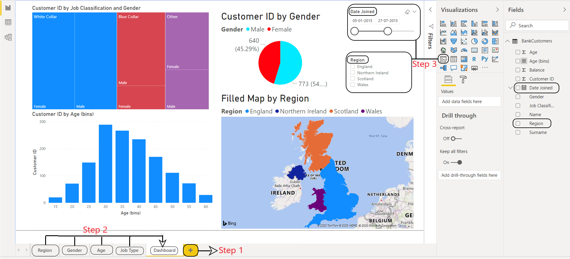
图 6:Power BI:交互式 BI 仪表板
许多商人使用仪表板来分析数据,以便做出明智的商业决策。您现在可以查看各种可视化效果并将它们与筛选器和切片器合并,以便在 Power BI 中制作您自己的仪表板。如有任何疑问/疑问,请在下方评论。