在 Android Jetpack Compose 中更改按钮大小
在 Android 中,Button 是一个非常常见的 UI 元素,用于在用户单击时调用函数或执行任务。默认情况下,Button 会根据其显示的文本占用特定空间。如果 Button 文本较长或字体较大,则 Button 的宽度和高度会增加。同样,如果 Button 文本较小或字体较小,则 Button 宽度和高度会减小。但是,我们可以为 Button 设置预定义的宽度和高度,而不考虑文本属性。
因此,在本文中,我们将向您展示如何使用 Jetpack Compose 在 Android 中更改 Button 大小。 IDE 准备就绪后,请按照以下步骤操作。
分步实施
第 1 步:在 Android Studio 中创建一个新项目
要在 Android Studio 中创建新项目,请参阅如何在 Android Studio 中创建/启动新项目。选择模板时,选择Empty Compose Activity 。如果您没有找到此模板,请尝试将 Android Studio 升级到最新版本。我们在Kotlin中演示了该应用程序,因此请确保在创建新项目时选择 Kotlin 作为主要语言。
第 2 步:使用 MainActivity.kt 文件
转到MainActivity.kt文件并参考以下代码。下面是MainActivity.kt文件的代码。代码中添加了注释以更详细地理解代码。
Kotlin
package com.geeksforgeeks.changebuttonsize
import android.os.Bundle
import androidx.activity.ComponentActivity
import androidx.activity.compose.setContent
import androidx.compose.foundation.layout.*
import androidx.compose.material.*
import androidx.compose.runtime.Composable
import androidx.compose.ui.Alignment
import androidx.compose.ui.Modifier
import androidx.compose.ui.graphics.Color
import androidx.compose.ui.tooling.preview.Preview
import androidx.compose.ui.unit.dp
import androidx.compose.ui.unit.sp
import com.geeksforgeeks.changebuttonsize.ui.theme.ChangeButtonSizeTheme
class MainActivity : ComponentActivity() {
override fun onCreate(savedInstanceState: Bundle?) {
super.onCreate(savedInstanceState)
setContent {
// Calling the composable function
// to display the elements and the content
MainContent()
}
}
}
// Creating a composable
// function to display the Top bar
@Composable
fun MainContent(){
Scaffold(
topBar = {TopAppBar(
title = {Text(
"GFG | Change Button Size",
color = Color.White)},
backgroundColor = Color(0xff0f9d58)
) },
content = { MyContent()}
)
}
// Creating a composable function to
// display three buttons of different sizes.
// This function is called in the
// content of the above function
@Composable
fun MyContent(){
// Creating a normal button at a margin of 100dp from the top
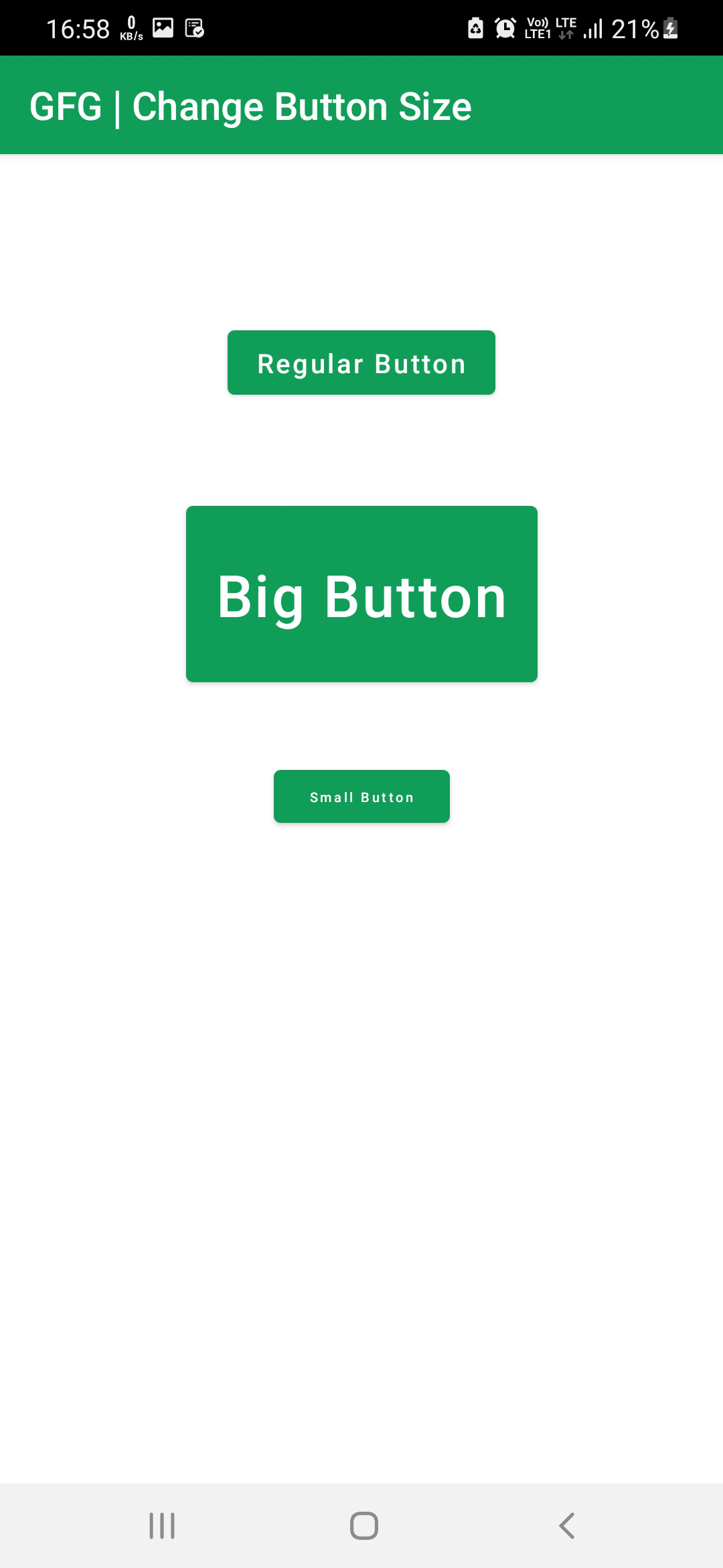
Column(Modifier.fillMaxWidth().absolutePadding(10.dp, 100.dp, 10.dp, 0.dp), horizontalAlignment = Alignment.CenterHorizontally) {
Button(onClick = { /*TODO*/ },
colors = ButtonDefaults.buttonColors(backgroundColor = Color(0XFF0F9D58)),
) {
Text("Regular Button", color = Color.White)
}
}
// Creating a Bigger button with height and width as 100dp and 200dp,
// font size as 30sp, at a margin of 200dp from the top
Column(Modifier.fillMaxWidth().absolutePadding(10.dp, 200.dp, 10.dp, 0.dp), horizontalAlignment = Alignment.CenterHorizontally) {
Button(onClick = { /*TODO*/ },
colors = ButtonDefaults.buttonColors(backgroundColor = Color(0XFF0F9D58)),
modifier = Modifier.height(100.dp).width(200.dp)
) {
Text("Big Button", color = Color.White, fontSize = 30.sp)
}
}
// Creating a Smaller button with height and width as 30dp and 100dp,
// font size as 7sp, at a margin of 350dp from the top
Column(Modifier.fillMaxWidth().absolutePadding(10.dp, 350.dp, 10.dp, 0.dp), horizontalAlignment = Alignment.CenterHorizontally) {
Button(onClick = { /*TODO*/ },
colors = ButtonDefaults.buttonColors(backgroundColor = Color(0XFF0F9D58)),
modifier = Modifier.height(30.dp).width(100.dp)
) {
Text("Small Button", color = Color.White, fontSize = 7.sp)
}
}
}
// Displaying the preview in the
// Android Studio IDE Real time emulator
@Preview(showBackground = true)
@Composable
fun DefaultPreview() {
MainContent()
}输出:
运行应用程序时,您将看到三个不同固定大小的按钮,如下图所示。