将置信带添加到 R 中的 ggplot2 绘图
在本文中,我们将讨论如何在 R 编程语言中将 Add Confidence Band 添加到 ggplot2 Plot。
置信带是散点图或拟合线图上的线条,描绘了数据范围内所有点的置信上限和下限。这有助于我们可视化无法保证准确值的数据的误差范围。为了向 R 中的散点图添加置信带,我们使用 ggplot2 包的 geom_ribbon函数。
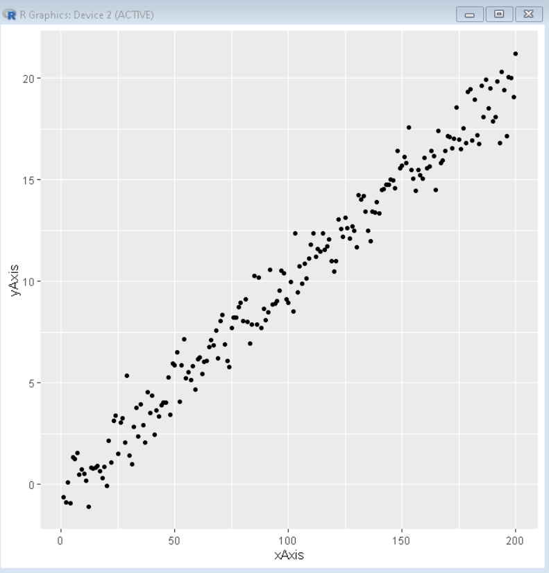
首先,我们将使用 ggplot2 包的 geom_point()函数制作一个基本的散点图。
Syntax:
ggplot( dataframe, aes( x, y ) ) + geom_point( )
示例:这里是使用 R 语言中 ggplot2 包的 ggplot() 和 geom_point()函数制作的基本散点图。
R
# create data vectors
xAxis <- 1:200
yAxis <- rnorm(200) + xAxis / 10

# create data frame from above data vectors
sample_data <- data.frame(xAxis, yAxis)

# load library ggplot2
library("ggplot2")

# create ggplot2 scatter plot
ggplot(sample_data, aes(xAxis, yAxis)) +
          geom_point()
R
# create data vectors
xAxis <- 1:200
yAxis <- rnorm(200) + xAxis / 10
lowBand <- yAxis + rnorm(200, - 1.5, 0.1)
highBand <- yAxis + rnorm(200, + 1.5, 0.1)

# create data frame from above data vectors
sample_data <- data.frame(xAxis, yAxis, lowBand, highBand)

# load library ggplot2
library("ggplot2")

# create ggplot2 scatter plot
ggplot(sample_data, aes(xAxis, yAxis)) +
          geom_point()+
# geom_ribbon function is used to add confidence interval
          geom_ribbon(aes(ymin = lowBand, ymax = highBand),
                      alpha = 0.2)
R
# create data vectors
xAxis <- 1:200
yAxis <- rnorm(200) + xAxis / 10
lowBand <- yAxis + rnorm(200, - 1.5, 0.1)
highBand <- yAxis + rnorm(200, + 1.5, 0.1)

# create data frame from above data vectors
sample_data <- data.frame(xAxis, yAxis, lowBand, highBand)

# load library ggplot2
library("ggplot2")

# create ggplot2 scatter plot
ggplot(sample_data, aes(xAxis, yAxis)) +
          geom_point()+
# geom_ribbon function is used to add confidence interval
          geom_ribbon(aes(ymin = lowBand, ymax = highBand),
                      alpha = 0.2, fill="green", color="green")
输出:
要添加置信带,我们需要为 xAxis 和 yAxis 向量的每个数据变量再添加两个变量,我们需要一个相应的低向量和高向量来创建置信区间的限制。我们可以在 geom_ribbon()函数中使用这些值来围绕散点图创建置信带。
Syntax:
plot + geom_ribbon( aes(ymin, ymax) )
Parameter:
- ymin: determines the lower limit of band
- ymax: determines the upper limit of band
示例:这是使用 R 语言中 ggplot2 包的 geom_ribbon()函数制作的带有置信带的散点图。
R
# create data vectors
xAxis <- 1:200
yAxis <- rnorm(200) + xAxis / 10
lowBand <- yAxis + rnorm(200, - 1.5, 0.1)
highBand <- yAxis + rnorm(200, + 1.5, 0.1)

# create data frame from above data vectors
sample_data <- data.frame(xAxis, yAxis, lowBand, highBand)

# load library ggplot2
library("ggplot2")

# create ggplot2 scatter plot
ggplot(sample_data, aes(xAxis, yAxis)) +
          geom_point()+
# geom_ribbon function is used to add confidence interval
          geom_ribbon(aes(ymin = lowBand, ymax = highBand),
                      alpha = 0.2)
输出:

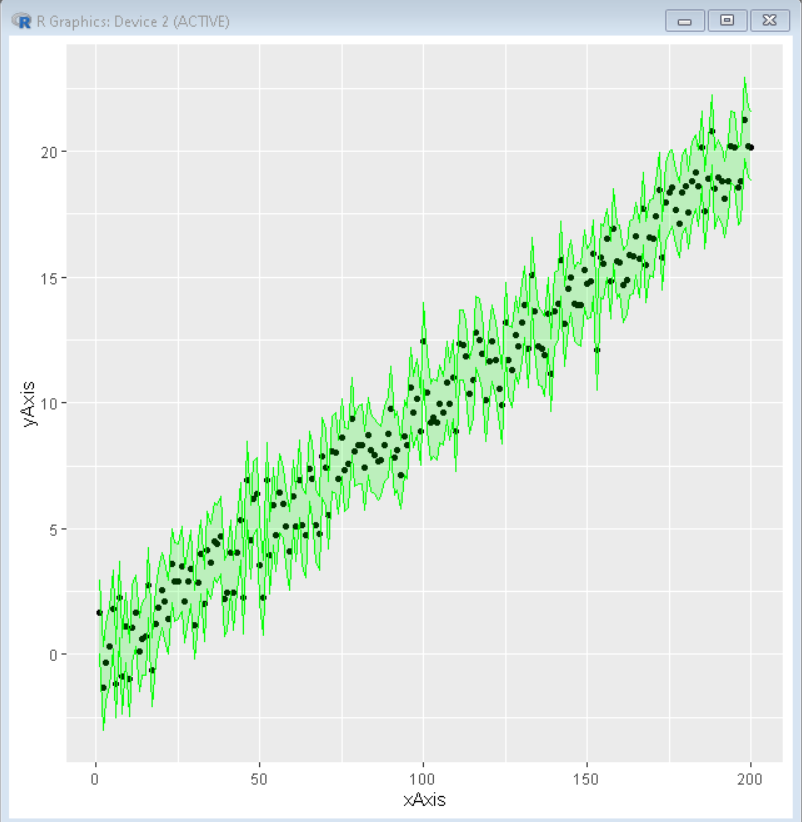
我们可以使用 geom_ribbon()函数的颜色、填充和 alpha 参数来分别改变置信带的轮廓颜色、背景颜色和透明度。这些属性可以单独使用或组合使用,以创建所需的情节外观。
Syntax:
plot + geom_ribbon( aes(ymin, ymax), color, fill, alpha )
Parameter:
- color: determines the color of the outline
- fill: determines the color of the background
- alpha: determines the transparency of confidence band
示例:在这里,我们制作了一个带有置信带的散点图,使用颜色突出显示
R
# create data vectors
xAxis <- 1:200
yAxis <- rnorm(200) + xAxis / 10
lowBand <- yAxis + rnorm(200, - 1.5, 0.1)
highBand <- yAxis + rnorm(200, + 1.5, 0.1)

# create data frame from above data vectors
sample_data <- data.frame(xAxis, yAxis, lowBand, highBand)

# load library ggplot2
library("ggplot2")

# create ggplot2 scatter plot
ggplot(sample_data, aes(xAxis, yAxis)) +
          geom_point()+
# geom_ribbon function is used to add confidence interval
          geom_ribbon(aes(ymin = lowBand, ymax = highBand),
                      alpha = 0.2, fill="green", color="green")
输出: