Python – 使用 Bokeh 进行数据可视化
Bokeh是Python中的数据可视化库,提供高性能的交互式图表和绘图。 Bokeh 输出可以在笔记本、html 和服务器等各种媒体中获得。可以在 Django 和烧瓶应用程序中嵌入散景图。 Bokeh 为用户提供了两个可视化界面:
bokeh.models : A low level interface that provides high flexibility to application developers.
bokeh.plotting : A high level interface for creating visual glyphs.
要安装 bokeh 包,请在终端中运行以下命令:
pip install bokeh用于生成散景图的数据集是从 Kaggle 收集的。
代码 #1:分散标记
要创建散点圆标记,使用 circle() 方法。
# import modules
from bokeh.plotting import figure, output_notebook, show

# output to notebook
output_notebook()

# create figure
p = figure(plot_width = 400, plot_height = 400)

# add a circle renderer with
# size, color and alpha
p.circle([1, 2, 3, 4, 5], [4, 7, 1, 6, 3],
         size = 10, color = "navy", alpha = 0.5)

# show the results
show(p)
输出 : 
代码#2:单行
要创建单行,使用 line() 方法。
# import modules
from bokeh.plotting import figure, output_notebook, show

# output to notebook
output_notebook()

# create figure
p = figure(plot_width = 400, plot_height = 400)

# add a line renderer
p.line([1, 2, 3, 4, 5], [3, 1, 2, 6, 5],
        line_width = 2, color = "green")

# show the results
show(p)
输出 : 
代码 #3:条形图
条形图用矩形条显示分类数据。条的长度与表示的值成比例。
# import necessary modules
import pandas as pd
from bokeh.charts import Bar, output_notebook, show

# output to notebook
output_notebook()

# read data in dataframe
df = pd.read_csv(r"D:/kaggle/mcdonald/menu.csv")

# create bar
p = Bar(df, "Category", values = "Calories",
        title = "Total Calories by Category",
                        legend = "top_right")

# show the results
show(p)
输出 : 
代码 #4:箱线图
箱线图用于表示图上的统计数据。它有助于总结数据中存在的各种数据组的统计属性。
# import necessary modules
from bokeh.charts import BoxPlot, output_notebook, show
import pandas as pd

# output to notebook
output_notebook()

# read data in dataframe
df = pd.read_csv(r"D:/kaggle / mcdonald / menu.csv")

# create bar
p = BoxPlot(df, values = "Protein", label = "Category",
            color = "yellow", title = "Protein Summary (grouped by category)",
             legend = "top_right")

# show the results
show(p)
输出 : 
代码 #5:直方图
直方图用于表示数值数据的分布。直方图中矩形的高度与类间隔中值的频率成正比。
# import necessary modules
from bokeh.charts import Histogram, output_notebook, show
import pandas as pd

# output to notebook
output_notebook()

# read data in dataframe
df = pd.read_csv(r"D:/kaggle / mcdonald / menu.csv")

# create histogram
p = Histogram(df, values = "Total Fat",
               title = "Total Fat Distribution",
               color = "navy")

# show the results
show(p)
输出 : 
代码 #6:散点图
散点图用于绘制数据集中两个变量的值。它有助于找到所选的两个变量之间的相关性。
# import necessary modules
from bokeh.charts import Scatter, output_notebook, show
import pandas as pd

# output to notebook
output_notebook()

# read data in dataframe
df = pd.read_csv(r"D:/kaggle / mcdonald / menu.csv")

# create scatter plot
p = Scatter(df, x = "Carbohydrates", y = "Saturated Fat",
            title = "Saturated Fat vs Carbohydrates",
            xlabel = "Carbohydrates", ylabel = "Saturated Fat",
            color = "orange")

# show the results
show(p)
输出 : 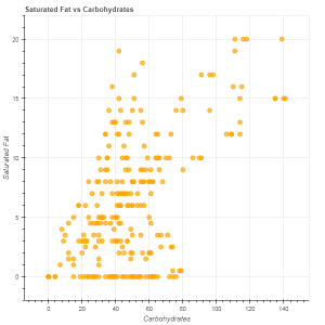 参考资料: https://bokeh.pydata.org/en/latest/